Showing posts with label Classes. Show all posts

Monday, June 3, 2013

Creative Adventures Downunder - Part 6 (Final)

The final US tutor we were blessed to spend time with was the incredibly talented, perpetually positive and all around nice lady - Donna Downey. We had one class with Donna, over either two or three sessions depending upon which group you were with. The Pink group were the last ones to get down and dirty with Donna's unique "hands-on" style of teaching.
This was the class I was both most looking forward to and most nervous about. Unlike many scrappers and crafters, my own exploration of mixed media crafting and art journaling had, until this class, been little more than dipping a toe in the water, so to speak. I knew who Donna was, had seen some of her videos and tutorials and knew a little bit about her product range, but boy was this class an eye opener!
I was pre-warned from people in the other classes that it didn't matter where we sat as Donna was a move about the class room kind of teacher... a plus in my book. So with all my goodies on my desk I sat patiently waiting for all the fun to start.
The first thing we had to do was pick one of Donna's signature journals to create in. These have a fabric and canvas cover, hand sewn, with the hugest big button on the front and an elastic closure to hold it all together.
The signature inside (the pages to us newbies) were a mix of Bazzill cardstock cut to size inter-mixed with tags and envelopes. All of this is held together with a coordinating ribbon threaded through some grommets in the spine. I fell in love with these lime green dots the moment I saw them. (It helped it was the only one of its kind left in the box as well!)
Opened up, these are what all the pages looked like. The Bazzill cardstock is all pre-cut to 12" x 9", so when folded in half the album size is 6" wide and 9" tall.
The first two pages we created were to compare the results of Faber Castell Gelatos on backgrounds with and without gesso. We had to chose either a warm or cool colour palette and use 2 or 3 colours from that palette to experiment with how they blended differently on the background as well. We coloured the two pages with the various shades of gelatos, then spritzed with water and blended with our fingers... time to get dirty!!
This page didn't have any gesso on it. It really soaked up the gelatos and water mix so gave a more subtle and even blending of the different tones of colour. However in doing this I found that I had to be careful not to over blend the colours as then the paper itself seemed to separate and bits were coming off into the colour mixing which I then had to remove. Of course this may have been because it was the back side of the paper as well.
This page had been coasted with the gesso. This time the gelatos felt like they skimmed across the surface of the page rather than soaking into it. This meant they also maintained their individual colours more and didn't blend as well (or as subtly) as when used on the non-gessoed paper.
The second step was to compare the difference between gesso and non-gessoed backgrounds when painted with acrylic paint. Again we had to use 2 or 3 warm or cool paints and blend them together. The above is without gesso. I did noticed the paints looked a little flatter on the non-gessoed paper than on the background that was gessoed.
This is with the gesso on the background paper. Of all the exercises this was the one I didn't really get or see any difference. I'm not sure if it was because I just didn't get it, or because the acrylic paints I used were cheap craft quality and not a good quality artist acrylic paint.
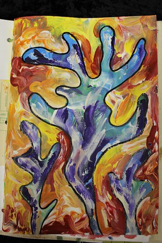
This was the next page we did. Finger painting!! Such a revelation, it was like being a kid again!
This time was finger painting with acrylic paints. We had to pick either a warm or cold palette once again. This time I went with a cold palette using light blue, green and purple together with white. Using our fingers only (quite liberating I might add), we covered the entire background page. The emphasis this time was on blending the colours to create new colours and new tones as well as a texture though the technique.
Once this layer was dry we then drew a shape or image using a 6B charcoal pencil. From the cool coloured background I had painted I could see almost like a underwater scene, so this provided the inspiration for my image. I drew some (very) abstract coral. Around the coral images I then finger painted over the top using the same technique but this time using a warm palette.
The final step (to get to this stage) was to go over the drawn lines once the paint had dried, though instead of using the charcoal pencil again, I used Indian Ink. I still haven't decided if I am going to do any more to this page or not. Part of me is saying yes it needs more, but I also really love the colours just the way they are.
The next page we did we adhered a canvas heart onto one of the pages then coloured it one colour with acrylic paint (either light or dark) and the background another colour, the opposite of what we had used for the heart. If the heart was a dark colour, then the background was light. I of course did the other, which was the harder combination for the next step... typical!!
This exercise was about how to add depth and shading/shadowing to give a three dimensional look to an image/item. Over the top of the painted areas around the inside of the heart (and outside of the heart on the background) we added the Crayola Water Soluble Oil Pastels which we blended together with a spritzing of water.
I really like the way that the texture of the canvas and the background cardstock show through the colouring and shading. I still want to work on the shading a bit, but I'm sure this will continue to develop with time.
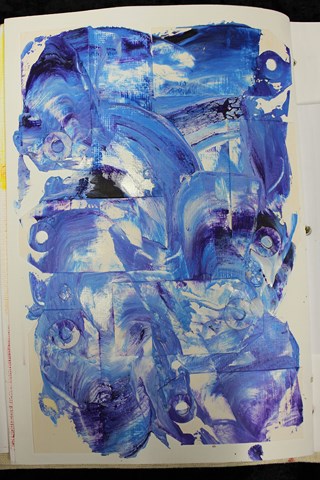
The next exercise was to adhere some mini tags to a page. The entire page was then covered in gesso. Once this was dry we then added some blobs of paint across the page before smearing them over the page using a palette knife to highlight the texture of the background.
We then had to adhere down some string to a page and cover this in gesso as well. To add even more texture, I tied small knots along the length of the string as well. I adhered the string on both a full page as well as one of the tags (half an envelope) between two pages.
We covered each page using the finger painting method used earlier on and then highlighted the texture of the string using a complementary colour (i.e. opposite it in the colour wheel). We also used the palette knife to add some scrapes of colour around the edge of the page.
The final step was to attempt to add some additional texture using an image transfer technique to copy the text from a page of text from a book. I used a matte gel that Donna hadn't tried before, so the unsure result was untested as to whether or not it would work. Donna explained two techniques, so I gave them both a go to see which would work best. One worked... the other didn't, though even the one that worked still needs some refining.
Here is a bit more of a close-up of the image transfer. There is still the look of the paper in the image hence the need to work on this technique a bit more but I still like the way it has come out.
The final technique we tried was to stamp using one of Donna's signature stamps using the gelatos. I' stamped my image onto the inside back canvas cover of my journal. I think the key is to be VERY generous with the colour on the stamp and spritz it with water, but then having done that, you can then stamp multiple images without having to refresh the colour.
This particular class was the one that I had to buy the most new products for and I think the class that had the longest bring to class list. I know for some this was an issue (there were one or two quite vocal about it), but these did tend to be the people who felt the least comfortable about the class content. I had no problem at all buying these products and I know I will continue to use them again and again... I already have used them again.
By the end of the class I think I could safely speculate that the people in the class were polarised into one of two extremes - they either totally loved the class and couldn't wait to try more mixed media creativity or they really didn't like it and intended to never try anything like this again. I'm the type of person who believes  don't knock something until you have tried it as you never know if you will like something or not until you have actually tried it. I can safely say that thanks to the terrific teaching of the lovely Donna Downey, I am definitely a convert and I will be trying more very soon!
I had to do the obligatory photo with Donna, but to be different I wanted to take a "Dirty Hands" picture even though our hands weren't that dirty as we had both cleaned them during the class (several times). 
Thank you so much for the wonderful class Donna!!

Sunday, June 2, 2013

Creative Adventures Downunder - Part 5

The second big name tutor over from the US for the Creative Adventures Downunder Event 2013, was Teresa Collins, a name I am very familiar with in terms of her products as I stock several ranges in my shop.
Teresa was due to teach us two classes as well over the event.
My first impression of Teresa... beautiful long blonde hair, gorgeous smile that just lights up her face and OMG is she expecting to wear heels that high while teaching all day... and the answer was YES!!
Like Heidi, Teresa is incredibly open and forthcoming about her private persona. I certainly appreciated the openness and honesty as well as the story behind her designs and creations. I have to confess that I haven't really thought much about why I scrapbook other than the fact I enjoy the creativity as well wanting to keep a record of our life and events for future generations. So hearing Teresa's reasons for why she scrapbook's has certainly given me food for thought as to why I scrapbook and what I really want my scrapbooks to say.

Class 1 - Memories Layout:
In this class we created a two page layout using some of Teresa's "Memories" range. Right from the start Teresa was very insistent that although we were following her page design, we were more than welcome to change it or step it up however we wanted. As someone who NEVER follows a recipe this was somewhat of a relief to me... so I did!!

Once again the class was quite speedy, especially when for those of us who did extra things such as inking the edges of embellishments, that were outside of the page design. I was impressed with the explanations Teresa gave us about some of her page designs. Not only did she give us the "why" of the page design, but she also gave us a number of different ideas as to "how" we could then use the pages she had designed. This showed me that she had put a great deal of thought not only into the image design, but also how the pages and other products could be best utilised by the end user of her products.
Like all my other classes, I didn't get the layout finished and I definitely still need to add some photographs, but I was still pleased with the way the double layout turned out.

Class 2 - Far & Away Travel Journal:
This class was our final class of the event. Despite this, the enthusiasm level was still very high from all of our group. This time we used Teresa's Far and Away collection. I had one complaint about the kit and that was that one of the cardstock pieces wasn't cut well and I ended spending far too much time resolving this problem. Part of this was my being such a perfectionist and crooked lines and edges really bug me but I accept that sometimes when you are making kits in bulk there are going to be one or two bits that goes a little awry. It wasn't a big deal (despite the fact that is noted a comment in here) but it was a flaw in the otherwise great class.
Once again Teresa used her "this is my design, but change it up however you like" class structure. Although we were sent the photo requirements prior to the event, she did still offer alternatives for those who didn't have photos (like me) so you didn't feel completely out of place or unable to bind your finished project.
Again the class was a little rushed but that was because half of the class time was reserved for the binding of each of the journals. Although I didn't get mine bound there as I have my own binding machine at home, it was certainly essential for everyone else who was not so lucky to have the access at home.
The travel journal pages expanded out to see all the pages created. This includes a sheet of plain cardstock which I have not shown below as well as some of Teresa's mini file folders which we didn't do anything to, so additional photos have not been included of these either.
The front of the journal is supposed to be two photos backed on to each other... but as I didn't have any photos, this is for now the front page. I just LOVE the pack of bling - "Tell Your Story - Medallions". So totally gorgeous... I could have used a dozen packs of these!!
Very simple treatment but doesn't it just look so smart!
Page 2 -  the addition of the border strips just really finished this page off. More of the gorgeous bling. One thing that has come through from all of the classes is simple ways of adding extras photos onto the one page though the likes of mini file folders, openables and photo-flips and this page is no exception.
Page 3 - another simple to way to add lots of pictures without having to add a lot of extra pages or bulk; and very cute with the use of the ribbon to hold it closed. With these being pockets they are also ideal for holding some of all the memorabilia you collect while on your holiday. I love the variety and the number of borders included in the pack (we received a full pack which included 12 different borders).
Page 4 - pocket pages are perfect for mini albums regardless of the theme. You always end up with odd or unusual things that you want to keep but which you may not want to put any holes in and pocket pages are the perfect solution to storing these and keeping them within the album.
Page 5 - I love this as an alternative way of using up some of those journal block pages that so many companies are now including as a part of their collections. Rather than cut them all up into individual journal blocks, cut them into a larger block of four journal blocks and use this as a page.
Here I am still looking haggard while the lovely Teresa looks cool, calm and collected... yes I aspire to look this pulled together!!

Saturday, June 1, 2013

Creative Adventures Downunder - Part 4

We were lucky enough to have some incredibly talented crafters over from the US of A for this event. All three ladies are names that I have heard around the scrapping scene for a number of years. All three names produce 'oohs' and 'aahs' when mentioned in scrapping and crafting circles. And all three names design and create not only incredibly popular products, but countless inspiring videos, photos, blog posts and pins on pinterest.
As soon as I saw the names of the three US tutors that would be here for the event, I just knew I had to find a way to be a part of this event. None disappointed! There are as inspiring in real life as they are on the internet. So let me start by sharing the two classes we had with the wonderfully humourous and ever so chirpy Heidi Swapp.

I just want to say upfront, that Heidi comes across as being totally down to earth and incredibly honest about who she is, especially in her role as a wife and mother. Her stories and anecdotes elicit from peals of laughter to tears of understanding. And I could happily listen to her talk about crafting and family and anything else for many an hour. The fact her husband plays and coaches rugby (yes as in NZ rugby) and she kind of understands the game is also a huge bonus for us Kiwi's and the Aussies in the room.

Class 1 - Memory Files:
This was the first class we had with Heidi. Our class kits consisted of a selection of her memory file products including Memory Files, Mini Memory Files, Instaframes, Openables, Banners, Definition Stickers, Clear Pop Bare Pockets, Clear Pop Tags, some Serendipity 12" x 12" papers, Window Frames. (I hope I managed to remember everything there!!)

The class started with some equipment failure. And though perhaps a little panicked, Heidi really didn't let it slow her down. The stories kept coming as she pushed buttons and plugs and eventually resolved all the technology issues... and yes Heidi, perhaps it wasn't your best idea bringing a brand new and completely untested laptop to teach way over here in New Zealand... but we got there.

A few personal stories down, and a lead in as to why and how this product range of Heidi's came about and then we were soon into cutting and folding and sticking and placing and measuring and generally trying to keep up with the ever energetic Heidi. The instructions were clear and easy to follow though sometimes we did struggle with knowing which product we should be using. Heidi refers to items by their product name which is great once you know what she's talking about, but until she holds up an example of an "openable", if you've never seen one before it can be a little bit perplexing.
I did manage to take one picture of Heidi in action as she showed us examples of what we were about to create.
The colour range is terrific, nice and bright even though they are what I would call "candy colours" and if you are at all familiar with my dislike of washed out colours (especially pastels), you are probably already guessing this was a plus for me.
Here are the two File Folders were created... from the outside. They are still both incomplete but this will give you an idea of what we did in class as well as just how colourful all these terrific products are.

These two pictures show the inside of the left hand file folder. (Rainbow striped front cover)
There are heaps of places for photos and journaling not to mention a lot of space to add some of the banners and clear pop tags that I still have left over after the class.
And this is the inside of the second file folder. (Chevron with grey and white striped edge)
Like many scrapbookers who put hours of love and devotion into their scrap books I am very precious about them, and they do tend to stay tucked away safely in the cupboard in my studio mainly because they are just so big and bulky.
What I really loved about this range from Heidi is that you can create individual file folders on an event and still hold just as many photos, but without all the bulk which makes them just so much easier to share and leave out where people can look at them.
These will also make ideal gifts for non-scrappers who just want somewhere to put photos and maybe write a bit about who is in the photos. They are definitely way cooler than a boring old slip in photo album but don't need all the trappings of your usual scrapbook page. Perfect for scrapping on the run as well.
I don't know that they will replace my traditional albums completely, but I do think that these will make useful addition to my scrapbook display and I will make some more and add some photos to these in the near future.

Class 2 - Shadowbox Frame:
This was first thing on day 2 for the pink group. We had all had a taste of file folders the day before and had been carrying around the naked shadowbox frame since then as well so we were all really keen to get stuck in to the class and see what we were going to create. The other cool thing was that on the desks as we walked in a sampling of some of Heidi's Colour Shine Mists... and who doesn't like to play with mists??
Today we were re-introduced to some products we had met the previous day but this time we got to experience the full versatility of them and what can be done when Heidi's Colour Shine is misted on and wiped off. The colour resist patterns are so amazing and really do come to life when sprayed with the mists and this means they can truly be matched to whatever colour scheme you want.
We misted the frame as well as some of the paper and fabric products. Then put together a mini file folder to fit inside the frame.
Here is the shadowbox frame misted in Tinsel and Black Velvet. There is just so much you could do with it. The tray is about 1 inch deep so you could fill it with some reasonably substantial items.
This is the outside of the mini folder we made to fit inside the Shadowbox frame. You can see it inside the frame, further down the post. The pennant, flowers and two of the scalloped trims have all been coloured with Colour Shine Mists.
Inside the mini folder there are more openables, instaframes and flip-ups for photos and journaling. You can add even more of these inside each other or add photos with washi tape hinges to include countless extra photos as well.
And right in the centre is a gate-fold opening with a frame for another picture... closed...
And then open. Many others put this particular paper the other way around, but I loved the sheet music so much that I made sure more of it would be seen.
And finally here is the mini file folder inside the shadowbox frame.
With something like this you could easily and quickly change the mini file folder inside the frame each season, or after each event. You can add additional decorations to the frame to match the colour scheme of the mini file folder inside it as well. So many options!!
This blog post wouldn't be complete without my obligatory picture with the lovely lady herself...
Isn't she just lovely... me... well I'm just looking a little grungey around the edges already :-)

Friday, May 31, 2013

Creative Adventures Downunder - Part 3

Now we are getting down to the good bits... the actual classes.

My first class was with Maggie Armstrong a tutor from here in New Zealand. In Maggie's class we created a "Creative Adventure Commemorative Layout" with a little bit of mixed media Kiwiana thrown in for good measure.
We had 3 hours to create this layout which sounds like a lot of time, but really, really isn't in a class room situation. This is my still to be completed layout... but I wanted to share (publicly) what I was able to achieve in class at the time. I will finish the layout (especially some fussy cutting I managed to get half done during class) and post a picture of the completed layout once done.
Note:
1 - My little camera charm fell off. It is supposed to be attached to the grommet but it decided not to cooperate so I need to re-attach it.
2 - I didn't get my photo taken at the photo-booth at the dinner on Friday evening. Too many people, not enough time, but I will find a picture to add to the pull out photo mat which is hidden inside the camera. I also need to add a paperclip or turning mount to keep the camera in place (it flops down otherwise, by design).
3 - There is some fussy cut flowers and scrolls to be added, a chipboard logo for CAD and some more feathers as well.
Close up of the mixed media detailing we added with the paua shell and feathers. Can I just add these a really teeny tiny pieces of paua and they were not  easy to work with which is why I think I fell behind in class... but they still look really good!
This part was definitely my favourite. We learnt a new technique and tried out a new product (that I had never used)... melted bees wax with Perfect Pearls over a wooden laser cut word.
I really enjoyed this technique, so have bought some extra bees wax to try this technique again in my studio, so I will post a tutorial on what I create.
The delightful Maggie Armstrong and myself. (And yes she was bending so as to not look so tall next to me)

Wednesday, May 22, 2013

Creative Adventures Downunder

I've been more than a little distracted the past few weeks as I have a HUGE scrapbooking/crafting event coming up... well the first of a couple really.
This coming weekend is the Creative Adventures Downunder weekend and I have been hanging out for this for the past six months or so and I can't believe it is nearly here.
This is going to be so HUGE... so amazing... and I'm lost for words...
I have two and a half days of non-stop classes with... wait for it...

  • Heidi Swapp (US)
  • Donna Downey (US)
  • Teresa Collins (US)
  • Maggie Armstrong (NZ)
It is just going to be crafting heaven for the 130 odd people attending the classes.

There will be six classes starting 9.00 am Friday morning and running through until Sunday midday. They include:

  • Inspirational Journal - Donna Downey (Mixed Media Art Journal)
  • Memory File and Shadow Box with Layout - Heidi Swapp
  • Travel Workshop and Memories Workshop - Teresa Collins (Mini Album Class and Layout Class)
  • Mixed Media Layout - Maggie Armstrong
And then there is the Mix and Mingle and Carnival Dinner on Friday night.
There is going to be an ATC swap for anyone who wants to join in, as well as some competitions for some totally amazing goods that have been donated.

I will add some pictures of my ATC's tomorrow... I've made 144 of them!!! And you can be sure I will definitely be posting some pictures of the the weekend including the completed creations from all the the classes.
I feel so incredibly blessed to be able to attend this event and I look forward to being a sponge and soaking up as much inspiration as I can from these talented ladies, not to mention all the wonderful crafters who will also been in attendance.
I'm so excited, I'm not sure I can sleep!!

Tuesday, October 16, 2012

Designer Diary Day


If you are anything like me, then your diary is one of your most important tools for day to day planning and time management. When it's so important to you,why settle for a diary that looks just like every one else?

At the Designer Diary Day, we will turn your boring every day diary into a work of art. Personalise your diary with covers you design and add extra pages to suit your needs such as monthly planners and birthday lists.

If a diary doesn't take take your fancy then you can create a journal, an art journal, a junk journal, a wine journal or anything else that meets your needs. You can alter a wire bound diary or journal or create something from scratch using items from your stash.

BYO diary, patterned paper, card stock, adhesives and basic papercrafting tools. If you want to make a journal from scratch be sure to bring enough product to create all your pages – cardstock, patterned paper, journal blocks, and covers. Don't forget items to embellish your diary/creation.
I have a Bind-It-All available for use and binder coils and binder rings for purchase if you don't have your own.

Spend the day creating with like minded crafters at our studio in Papakura, South Auckland. Spaces are limited, so first in first served.

And as an added bonus... this counts as one of your creations for the Christmas Craft Challenge coming up in December.

When: Saturday 24th November 2012
Time: From 10.00am until the last person leaves
Where: Scrap FX craft studio in Papakura, South Auckland
Cost: $5.00 per person - please bring a plate for a shared lunch

If you would like more information, leave a comment with a contact email or email me at paula@scrapfx.co.nz

Saturday, October 13, 2012

Post 250 - Who wants candy?

Finally the milestone is reached... blog post number 250!!!

Lots to share with you...
Firstly thank you for reading and following my blog. It's really been a pleasure sharing my crafting with you. Everyone who reads my humble blog continues to inspire me to keep creating, keep experimenting and keep sharing and I am truly grateful to each and every one of you for that. It doesn't matter if you are a dedicated follower or you just happen to stumble on by some random hand of fate, I really do appreciate that you've taken time out of your busy day to spend some time here... thank you one and all.

I really can't believe I've reached this milestone. I know there are patches of irregular blog posting and then I have my patches of dedicated daily posting - especially during my annual Christmas Craft Challenge. My life seems to rarely run smoothly and my blog, like my life, needs to be flexible and able to move with the ebb and flow of reality, but I made it this far and I am so damned proud of myself for sticking with this, when so many others try and give up.

Anyway...
Firstly, or really secondly after patting myself on the back, I want to share the results of the classes I taught up at the Caz Dezign Scrap Retreat. I created a sample page... the original blog posting is here... but knew that I wanted to create something a little different on the day. Even though the classes were themed "Halloween", as it's a holiday we don't really celebrate here in New Zealand, I wanted to show that the same page layout could be used for any theme because really the classes were all about the techniques and sharing my love of some totally cool tools, which I need to create a "My Favourite Tools" post about.

Both the tag and layout were all about using Tim Holtz Distress Inks, which I totally love and how versatile these inks really are. One of the reasons I love them so much is that you can create totally unique, personalised backgrounds for your photos without too much effort. I also love the intensity of the colours that can be achieved as this is something truly dear to my heart. I've said it before and I will say it again... I'm NOT a pastel person. Sorry if you are... I'm just not. I love my colours to be big and bold and bright and intense and stand out and just say I'M HERE!!! (A bit like me at times!!).

Anyway...
I am also a HUGE True Blood Fan. I've seen every episode of every season of the HBO show. I've read each of the True Blood books that Charlaine Harris has written at least four times (and there are a dozen or so books). The wallpaper on my laptop is True Blood, I own the first three season on DVD (soon to buy season four)... so yes I am a fan!!

I decided a while ago that I wanted to scrap some pages, purely for my own indulgence of my favourite show and it's characters. So every now and then I look for photos from the show and download them for later use. On one of these googling sessions, I found an incredible wallpaper/photograph on the HBO official website of the the main character Sookie Stackhouse (played by the adorable Anna Paquin) surrounded by three hotties... the three men in her life in the show - Eric Northman (Alexander Skarsgard), Bill Compton (Stephen Moyer) and Alcide Herveaux (Joe Manganiello). I just knew this photo would be in my fantasy album!! This was the photo I took along to scrap for the class as I knew the techniques I was going to demonstrate would be perfect for the photo in question.

So here is the end result...
 Completed layout
 Embellishment grouping - flowers and rosettes created using Sizzix Tim Holtz dies.
The tag created in the first class and added to the layout in the second class.

I really think this layout turned out better than I had hoped for. The colours are amazing and despite the intensity, still allow the photo to stand out itself.

Here are the original and the one created in class...

And now for the good bit...

To celebrate this milestone blog - post number 250 - I am going to give away some blog candy. 
I will be adding some more goodies to the stash, but for now, hopefully that grabs your interest.
In order to go into the draw you need to do the following:
  1. Follow my blog - just simply click on follow on the right hand side of the blog if you are not already a follower.
  2. Like me on Facebook - Scrap FX
  3. Leave a comment on this post to let me know you have entered the draw.
I will draw a name at random on Saturday 20th October 2012 and post the winner's name. Good luck and thank you for joining me for this celebration.

I love you all xxooxx

Wednesday, October 10, 2012

DIY - Swatches

This past weekend I taught a couple of classes at the Caz Dezign Scrapbook Retreat. You can see the class samples here. My creations on the day will be posted in a soon to follow blog.
Rather than have a class where the participants had to follow what I showed them exactly to the letter, so we all ended up with the same end product, I gave everyone options throughout the class such as colour combination of inks they wanted to use, selection of beads for their stick pin, colour of flowers to use etc. 
I provided the products, special tools and inks for the ladies to use but the risk of this was that they would not be familiar with what each colour of ink and mist would look like actually on the paper just from looking at the respective ink pad or mist bottle. I decided to create some swatches for the colours so everyone could pick their respective colours based on what they would actually look like, rather than me trying to explain what the end result might look like. 
I trolled the internet, as you do, for some ideas and found a couple of really great ideas on different swatches but the one that I really liked was created by "Madgrans Moments" as it showed three distinct looks for Distress Inks.
For each colour of Distress Ink pad I cut three 2" x 2" cardstock squares. I then inked them as follows:
  • Ink direct to cardstock
  • Ink swirled on with foam ink applicator
  • Ink swirled on with foam ink applicator then spritzed with water and dried, finished with a stamped image in the same colour
Why these three - because the looks are so different using exactly the same ink pad.
Once all the squares were dried I then attached them onto a backing rectangle of cardstock and adhered the name of the ink which I had printed using my label maker. To finish I punched a hole in one corner and then threaded them onto a binder ring. 

Once I'd completed the swatch I then created once for my Glimmer Mists, glazes and special paints. These swatches were smaller as I didn't need the three different versions of the same colour. When they were all dried, I threaded these all onto a separate binder ring.


I love both of these colour swatches and think they will be useful for more than just in classes. I can now take my swatches with me when I go shopping and not buy colours I already have, whereas it would be totally impractical to take all my ink pads or mist bottles with me. My swatches will also make it easier when deciding what colours to combine for tags or layouts. 

 Be sure to check back on my next blog post as it is post number 250!!! I will be giving away some blog candy to a lucky blog reader so it will definitely be worth the visit!!