Showing posts with label Techniques. Show all posts

Tuesday, March 17, 2015

Art Journal - Illustrated Alphabet - C is for Collage & Crackle

Going into this page I was really worried because I was planning on attempting a couple of techniques / styles that I've never done before, well not like this anyway. Sure I've stuck various different items on layouts, mini albums, art journal pages, even off the page projects, but I've never done anything that I consider to be "Collage" in the strictest sense of the word and I've certainly never used images from magazines on any of my projects... only under to catch the paint and glue drips. I've also not done a lot of crackle work on my projects in the past though I have done heat embossing with a crackle stamp which I really loved on a canvas project. But I had made up my mind that these were going to be the two techniques for this page and I wasn't about to let inexperience stop me from doing what I wanted. (Yes I can be incredibly stubborn and when I make up my mind about something, then come what may I'm going to stick with my decision... even if that is on a soon to be published world-wide video.)

If you've already watched the video, then you will have heard in my voice-over than there were one or two (or more) moments of complete and utter panic when I wondered if I was completely screwing up the page and a definite moment when I thought I might have to scrap it all and start over from the beginning. I chose to stick with it and keep going (and not let this page get the better of me) and now that I've completed the page, in hindsight I can happily say I do actually like the end result and the process from start to finish really wasn't that bad. Let's just say it contained lots of learning opportunities.

Anyway, enough blathering, let's get on with the good bits... what did I use and how did I do it.

Products Used:

  • Black gessoed page
  • Liquitex Matte Gel
  • Tim Holtz Idea-ology Tissue Wrap - Postale
  • Vintage book pages
  • Magazine cut-out images
  • Washi Tape - various
  • Pebeo Studio Acrylics High Viscosity - Iridescent Blue Green, Iridescent Green Blue, Iridescent Blue Black, Iridescent Orange Yellow, Iridescent Green Yellow, Iridescent Violet Blue and Iridescent Red Blue
  • Ranger Tim Holtz Distress Crackle Paint - Black Soot
  • Faber-Castell PITT Artist Pens - 114 Light Skin, 132 Light Flesh, 131 Medium Flesh, 199 Black
  • Faber-Castell Gelatos - Peach, Guava, Metallic Melon, Bubblegum, Chocolate, Gold Champagne, Red Cherry
  • Faber-Castell Gesso - White
  • Stabilo All Pencil - Black
  • Faber-Castell - Allbecht Durer Pencils - Burnt Sienna, Walnut Brown, Dark Sepia
Tools Used:
  • Zig Water Pen
  • Colour Shapers
  • Wet Wipes
  • Heat Tool
  • Craft Mat
Process Steps:
  1. I started with a page I had pre-gessoed with black gesso. I coated the page with a thin layer of matte gel then coated some torn pieces of tissue wrap on the underneath side and adhere in place. Then brush a light coat of matte gel over the top as well. To get rid of any excess gel and ensure strong adhesion in place, I then ran over the piece of tissue with a credit card. I repeated this step with multiple pieces of tissue wrap.
  2. I then did the same with some torn pieces of vintage book paper to give the background some contrast. I was interested to see how much the black gesso background showed through the various materials used.
  3. I fussy cut a couple of images I had found in fashion magazines. Once I had decided where I was going to place the two images, I adhered them in a similar manner as the tissue wrap. Having completed the page, I suspect I removed too much of the matte gel or pressed/scraped too hard when rubbing the image of the face. When I added colour (in a few steps) it didn't flow as much as expected instead it soaked into the page or worse took off more colour than it added... note to self to watch this next time!!
  4. To add some contrast and bring a bit more black back into the page, I added some strips of washi tape, all of which were predominantly black. To ensure these didn't lift off, I coasted them with the matte gel as well, then ensured that the page was well and truly dry by leaving it overnight to "cure".
  5. The next step was to colour some of the cork ends in the second image with the iridescent paints. I had only purchased them earlier in the day, so I was really keen to see what they looked like away from the swatches in the shop. For most "dots" I gave them three coats of paint to get the intensity of colour I desired.
  6. Once I was sure the painted dots were dry (which didn't take that long really), I generously coated each coloured dot with a thick dot of black crackle paint. I used a pair of colour shapers for this step to get a thick enough coating while maintaining the shape and size of the coloured dots. This was a little more difficult than I had expected and to be honest about half way through I was screaming on the inside "what have I done????" while I waited to see if my moment of brilliance was actually going to work.
  7. Wait impatiently for black crackle paint to dry... to too impatient so pull out heat tool for a wee bit... then smack one's own hands and let it dry naturally.
  8. This next step got a little bit messy, a little bit hair raising and a little bit panicky as it all seemed to go horribly wrong on several occasions and though you can't see it on camera... I spent a considerable amount of time thinking I had completely ruined all my hard work up until this step. Given my considerable panic, I have to confess I can't remember exactly what I did here, but it looked something like this - tried to cover the patches where the colour had bleached or been rubbed off the magazine image, first with PITT Artist Pens in flesh tones, then when that didn't work I tried gelatos in flesh tones. I tried water to blend the gelatos but this seemed to lift off even more colour off the magazine image (insert more panic)... so I tried heat setting the gelatos to see if that would get them to "stick" to the page... finally something seemed to go right, sort of. 
  9. I still wasn't happy with the colour and what was happening so to prevent myself from throwing all my toys out of the cot (not that I would do that)... I had a moment of inspiration and decided to do a thin layer of gesso to create a base on which to try to recolour the face. I painted the gesso over all the exposed skin on the face and upper torso covering everything but the eyes and eye brows.
  10. Once the gesso had dried I tried colouring with the PITT pens once again but they just seemed to soak into the gesso rather than "float" on top of it, so I soon moved back to the gelatos to try them again. I did a light layer of gelatos then heat set them to see if they would create a good base for whatever else I was going to try. The good news was that this did work and I was able to blend in additional layers a lot easier, though I did still have to be careful that I didn't take off as much colour as I added back on. Once I had the skin tone base back again, I added some red for a rouge on her cheeks as well as some shadows and highlights to make the face look more natural, though still painted. Finally it actually looked pretty good.
  11. I added some colour to her eyes brows again (to make them look less magazine and more art-like) as well as eyes lashes... though in hind sight I may have added to many as I'm not 100% sure that they look all that natural... but hey artist's impression right!
  12. Having done this, I then decided that the hair needed some extra highlights to match with what I had already done with the image. I added some highlights using metallic gelatos as well as ordinary gelatos to add some interest. I really liked the end result of the hair.
  13. I lined the images with my Stabilo All pencil which I then blended with my water pen. Note to self - sharpen pencil before using it on each project otherwise the line will just end up being really thick and won't look as good. (In the video I said something about it looking like a drag queen had done your eye liner... no offence to drag queens as their make-up is usually impeccable and I which I looked as good as they do all dolled up).
  14. To add some more depth to the images I then coloured around them with a little water colour pencil which I also blended out using my water pen. This step gave the page a great deal of depth so it didn't look as one dimensional.
  15. To frame the page I repeated the water colour blending around the edge of the page. This really finished off the page.
Here are some close-ups of the page as well as a few pictures showing you some more of the magical iridescent paints... these are the excesses I scraped onto a random page in another art journal.
Here is the finished page. After a few false starts and a few moments of panic, I ended up actually quite liking the end result.
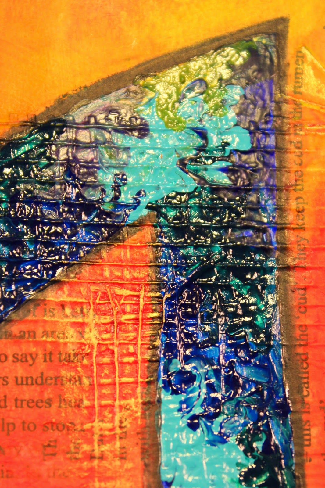
Maybe some overkill here, but I really loved the end result of the crackle paint over the top of these bright iridescent paints. The worked out even better than I hoped.
 It's hard to say what my favourite colour is as they all turned out so gorgeous. Part of me hated the idea of painting over these sumptuous colours, but I think the end result is so worth it.
 Sigh... love!!
This shows a little of the highlighting added to the hair. I love the effect and wish colouring my hair was this easy and looked this good afterwards. 
Though I wasn't entirely sure at the time, once I had finished the eye lashes and eye brow I really did like the end result... though I think I need to examine eyes a little more closing as I think I may have "over" extended the eyes lashes around the eye. 
Sharing some of the over flow of paint that I didn't want to waste ('cos it's just so yum!!) so I just smeared the excess onto this random art journal page. I love the colours here so much whether thick or a very thin coating as they just have so much shimmer to them. 
 Isn't this orange just gorgeous!!
This one really shows that even when applied really thin so that they appear almost transparent, the shimmer still just shines through. Love the effect over the heading in the background. 
Not sure if this was the Blue - Green or the Green - Blue with the Red - Blue who cares... still YUM! 
Ahhhh... this just makes my heart sore... love this almost but not really transparent look.
And again the finished page... just a bit bigger.

Friday, February 13, 2015

Art Journal - Illustrated Alphabet - A is for Abstract

Having come up with inspired idea for a theme for my A - Z Art Journal, I then sat down to come up with my list of techniques and styles in preparation for creating page 1... the letter "A".

Some might say this is cheating but I have to beg to differ. I did this step because...

  1. I am a planner and organiser type personality;
  2. I have in mind some specific techniques and products that I want to try and I wanted to make sure that they were included... and I didn't forget about them until I got down to X, Y and Z.
  3. And because when I started to think about the list, I realised that some letters are really hard to come up with art styles and techniques for... like "Q" and "X"... so the planning stage gave me an opportunity to answer the difficult questions... up front.
  4. And because this was something I could do at work in my lunch break. (30 minutes is not really long enough to pull out paints and paint brush especially if I want to video my creative musings.)
Now before anyone starts pointing fingers and asking me what about the cover page... which I mentioned in the first video of the series about preparing the album... yes I have purposely left this until further down the track.

I happily, openly and with full disclosure admit that I am a perfectionist. I'm a Virgo. It comes with the territory. Having confessed this... I am also happy to add that I have learnt that this little personality trait means I tend to put a great deal of pressure upon myself because I have such incredibly high expectations of myself... sometimes unachievably high expectations. Over time and with a great deal of soul searching, I have learnt ways of reducing the pressure I place on myself and one of them is by not doing the first thing that you will ever see on a project, or in a book... well first. I allow myself time to get into the groove of things until such time as I can really feel the inspiration and motivation and MOJO are right there, in this moment and now is the time. I'll let you know when that time arrives...!

So let's get down to business...

Products Used:
  • Pre-gessoed page (Faber-Castell Gesso)
  • Fibatape - Drywall Joint Tape (Available at Hardware/DIY Store)
  • Printed Deli Wrap
  • Liquitex Matte Gel
  • Golden Fluid Acrylics - Pyrrole Red; Pyrrole Orange; Hansa Yellow; Quinacridone Magenta; Burnt Sienna; Green Gold; Teal; Ultramarine Violet; Ultramarine Blue; Phthalo Green (Blue Shade); Phthalo Blue (Green Shade)
  • Golden Acrylic Glazing Liquid (Gloss)
  • 2B Pencil
  • Stabilo "All" Pencil Black
  • Faber-Castell Gelatos - Lemon; Banana; Mango; Tangerine; Blood Orange; Red Cherry; Chocolate
  • Viva Decor /Inka Gold - Gold
  • Faber-Castell PITT Artist Pens - Walnut Brown; Black
Tools Used:
  • Palette Knives (various styles and sizes)
  • Paint Brushes (various styles and sizes, including Zig Water Pen)
  • Royal Sovereign Ltd - Colour Shaper #2 Taper Point - Firm
  • Water Spritz Bottle
  • Paint Palette
  • Tim Holtz Tonic Scissors
  • Baby Wipes
Process Steps:
With the theme of "Abstract" I knew I wanted this page to be bright and out there and in your face and I knew I had to have a bloody great big "A" on it, but that was pretty much all I really had in mind when I started out.
  1. Cut and adhered down some strips of drywall joint tape. I cut the tape different lengths and widths and stuck it down. Even though it is self-adhesive, I did go over the tape with some matte gel, just to be on the safe side.
  2. Tore up some of the printed deli wrap and adhered this in place with the matte gel as well. I wasn't too specific, just overlapped some of the pieces from both of these two steps.
  3. Put some drops of the warm paint colours directly on the page, spritzed a little water, then covered the entire page in colour blending the paint and water just with my finger tips.
  4. I wanted the colour to be more intense, so following the colour blocks laid down in the previous step with the acrylic paint, I added some coordinating gelatos over the top blending them in with a little water and again just using my finger tips. Some areas ended up getting three or four layers of gelatos while some only needed a couple of layers. Once I was happy with the colour intensity, I heat set the gelatos so they wouldn't move as I added the next layers.
  5. I sketched in my "A" with the 2B pencil, then went over these sketch lines with the Stabilo All Pencil when I was happy with the size and form of the outline. I then lightly painted in the pencil lines with a water brush to turn this from pencil lines into permanent India ink lines.
  6. I painted a couple of layers of white gesso inside the letter with a small brush so I would have a blank canvas to add the next layer onto. (I did actually like the plain white letter and was tempted to just leave it white but didn't think this was "abstract" enough like that.)
  7. I selected my cool colours and put three drops of each colour into my paint palette, then added equal amounts of glazing fluid. I mixed these thoroughly then painted a light coat in a random patchwork type design using a small paint brush. (I will confess that I was quite disappointed at this stage and was tempted to wipe the paint off and go back to just plain white but then I remembered that that wouldn't be abstract enough so I decided, ahh well, there's no turning back now, so just make the most of it.)
  8. I wasn't happy with the look from the paint brush so I decided to experiment with a fine tipped colour shaper. These are like a paint brush, but instead of having a brush made out of individual fibres, they have a rubber head shaped like a brush head. I figured if nothing else, at least it should be easier to clean than a paint brush. (Can you spot Miss Perfection's ugly head making an appearance??)
  9. When I tried adding the paint using the colour shaper, I couldn't get an even paint layer. Some parts came out ultra thick and some were thin and almost watercolour like. I tried emphasizing the blended areas where two paint colours met and rather than making the blended a smooth transition, I encouraged the two colours to blend, but still remain distinct. (Sorry but this bit really needs to be seen to be understood). The other thing I noticed was that this technique was making my acrylic paints act as a faux oil paint and even though they are very small peaks and troughs, the dimension is nonetheless still very evident. 
  10. Just to clarify... I am no oil painter. I don't have the patience to wait for the oil paint to dry and I'm too much of a perfectionist that I'd never get my brushes, palette knives and palettes clean enough to actually do any oil painting. My mother however, loves oil painting. (A debate that will last forever between us as neither of us will ever concede to the other's product of choice.) As a child and teenager, I used to watch her paint with oils. I watch how she created dimension using both brushes and palette knives to add interest to her sea scapes and sunsets and I guess somewhere along the way I may have learnt some techniques from her even if I did (please forgive the term) bastardize them to use with acrylic paints. Anyway I really love the end result!
  11. Once the paint inside the letter had dried I went around it again with the Stabilo All Pencil and water brush just to darken up the framing.
  12. I added some gold highlights on the raised bits of the drywall joint tape that were still just the background colours.
  13. To frame the piece I added some Chocolate gelato around the edge of the page and blended this with my finger. I then added a thin line of PITT artist pen which I also blended in with my finger and finished with edging the external edge with black just to hide any lighter bits that I might have missed earlier.
  14. I added the title "Abstract" again using the Stabilo All Pencil and water brush.
I really love the end result of the page especially the faux oil painting technique. Will be definitely trying that again!

 The finished Art Journal Page.
 Above and below - close up of the faux oil paint texture, made using fluid acrylic paints and glazing fluid.
 I really love the distinctive blending I was able to achieve with this technique, using the fine tipped colour shaper.
 Gold accents to highlight the texture of the drywall joint tape.
And a hand lettered title to finish the page.

Friday, February 6, 2015

Illustrated Alphabet Art Journal Album - Part 1 - The Preparation

If you haven't already seen it then I suggest you take a wander over to my YouTube Channel and check out the video I posted, the first of many, that shows the start of my new Art Journal project for 2015.

I was inspired by my good friend Aaron over on his YouTube Channel - Imperfect Impulses. Last year he created an A - Z album which I really enjoyed watching him create. I thought this would be a great idea for me to do this year, but I wanted to put my own spin on it (as you do).

So I pondered the theme of my art journal for a few months... yes it took a while to come up with my own twist. Of course having just returned from the States meant I was really inspired... I just had too much work to catch up on at my "real" job (you know the one that pays the mortgage and power and food bill) so the actual turning the inspiring into reality took a little longer than I hoped.

Over the Christmas and New Year break (here in New Zealand it's Summer, so we have a long holiday break at this time of the year) I caught up on some YouTube watching and I watched a few videos demonstrating Calligraphy. Now this was an art form I tried back in my teenage years so it was almost like going home. It didn't take too many videos to click on what my theme would be for my art journal... An Illustrated Alphabet.

To take it one step further I decided that the theme of the illustrations would be art styles and techniques so my completed art journal could also be used, once it's completed, as a source book or handbook of styles and techniques for any time I get stuck for an idea and need something to help re-ignite my crafting MOJO.

I considered the selection of art journals that I had in my stash and eventually decided to use the Prima Marketing Mixed Media Art Journal 9" x 6", but use it vertically rather than horizontally. It just seemed to fit the stylings of an alphabet better, especially when I was considering that some letters might have long tails or uprights... depending upon how I ended up actually creating them.

As it is also going to fulfil the purpose of being a handbook of techniques, I also decided I was going to experiment with all those products that I have in my stash as well as any that I happen to acquire during the creative process. Which is why you will see a long list of different gessos in a paragraph or two.

My art journal journey will be as much about experimenting with various tools and products as well as investigating the interaction between products used, as it will be a documentation of the techniques tried.

I hope that I can give you ideas for new or different ways that you can use your tools as well as your products, because let's be honest there can be a lot of money invested in them so we want to make sure we are getting our money's worth out of them. And just quietly, I'm really not a huge fan of tools that can only be used one way. In fact I flat our try to avoid buying anything like that. I want versatility and multiple uses so I can rest assured that I am getting value for my hard earned money spent.

Getting off soapbox now...

Products used in Album Preparation:

  • Prima Marketing Mixed Media Art Journal 9" x 6"
  • Elmer's Glue Clear & White (stick pages together)
  • Gesso: Faber-Castell Gesso; Golden White & Black Gessos; Liquitex Clear Gesso; Prima Marketing Finnabair Art Basics Clear & White Heavy Gessos
Tools used in Album Preparation:
  • Recycled Credit Card (For gluing pages together step & painting gesso)
  • Brayer (To ensure good adhesion of pages together)
  • Princeton Catalyst Blade (Shape 6 30mm)
  • Paint Brush
  • Wet wipes
  • Paper Towels


Tuesday, October 15, 2013

Neon Testing...

When I finally got my Golden Paints Florescent Colours home I couldn't wait to try them out so I just had to throw together a really quick journal page... though to be honest it's not really a journal page it's just some paint splatters that look so totally awesome on the page.
Golden High Flow Acrylics are a new paint line that can go from brush to marker to dip pen. From fine lines to broad strokes, High Flow Acrylic has an ink-like consistency that is incredibly versatile. The paints are quite liquid (hence "high flow") yet don't lose any of their intensity of colour. When added on top of other water based products such as the Lindy's Stamp Gang Flat Fabio Mist on this page, the colours blend easily to create even more depth and variety.
The colours used here are:
Fluorescent Chartreuse
Fluorescent Orange
Fluorescent Pink
Fluorescent Blue
Fluorescent Green
I started by misting my page with Lindy's Stamp Gang Flat Fabio "Danny Zuko's Denim". I placed down some punchinella (sequin remnants) in two sizes on my page then misted parts of the page. I then turned each piece of punchinella over to colour the page using the reverse print of the stencil.
I dropped individual drips of each of the Golden High Flow Fluorescent colours onto the page then using an ordinary drinking straw, blew the paint around the page.
I love the colours...
I love the fine detailed lines I was able to achieve through this technique...
I love the blending between the paints and the mists...
I love the background from both misted and stencil reverse print from the punchinella...
I will definitely be trying this again on a proper art journal page, very soon!!

Wednesday, July 17, 2013

In my spare time I made 30 coffins...

Well technically they were coffin cards... but that wouldn't have raised as many eye brows.
This month my step daughter Alysha turns 21. She decided very early on that she wanted a party and the theme of the party would be Zombies.
The invitations therefore needed to be appropriate to the theme, so after some googling for Halloween ideas, coffins were the stand out idea to try. As some invitations had to be posted out around the country, I wanted a flat coffin design rather than making three dimensional boxes which would probably be squished along the way through the postal service.
I found a pattern for a bi-fold card in a coffin shape. I wanted a little bit more design than this, so I adapted the pattern to a tri-fold card still in the same coffin shape. The folds are all on the long side of the coffin. As I had to make 30 invitations, I cut a template for the card from plastic so that all invitations would end up the same size and shape.
This is the card as it looked when taken out of the envelope. Each card was cut by hand from white cardstock. The outside of the card was given a wood grain effect using acrylic paint and Tim Holtz Distress Stains.
I cut small rectangles of recycled cardboard to size then covered them with metallic silver duct tape. I then ran these through my Cuttlebug using the Cuttlebug RIP Tombstone Embossing Folder from the combo set of the same name. I had to be very careful with the placement to ensure only the "RIP" was embossed in each instance. Each embossed plate was then run through my Xyron 150 before being adhered in place on the front of each card.
The left side of the card was opened and the right side then showed scratch marks to show the Zombie trying to escape from their coffin... cool touch I know. The scratches were made using my Tonic Studios Tim Holtz Retractable Craft Scratcher Tool.
Inside the right side of the card I adhered a small rectangle with contact phone numbers for the RSVP. Inside the card was a separate coffin shaped piece of kraft cardstock which had all the important details printed on. I utilised the SF Gushing Meadows Font to highlight the theme in a couple of places on the invite... doesn't it just look like dripping blood!! Both the insert and the RSVP slip were also edged in Walnut Stain Distress Ink.
The card opened out to show the outside and the wood grain effect. The wood graining was intentionally done to follow the line of each section of the card.
The inside of the card was vintaged using liquid Walnut Inks in Walnut and Terracotta which I watered down further to give an aged look. Close up the effect is that of white fabric which has become stained and aged through time.
I really love the finished look of these invites and both aging techniques as well. I will definitely be using these techniques again in other projects!

Monday, June 17, 2013

Art Journal Page

I've finally been working on some more pages in my art journal. Here is the first page.
I used the techniques that I learnt from Donna Downey at Creative Adventures Downunder 2013, and repeated the exercises that we did in class, though this time I started with a cool palette of colours - light blue, dark blue, green and purple acrylic paints mixed with white gesso.
When I drew the image this time, I drew discrete images rather than one continuous line. I then coloured the background once again but this time with a warm palette of colours - yellow, orange, red and hot pink acrylic paints with white gesso.
When I went over the lines I had drawn with Indian Ink, I extended these inside the image to add additional dimension, then added texture to the image with fine detail lines. Doing this, brought back memories of being a teenager and doing many a pen and ink drawing for art class.
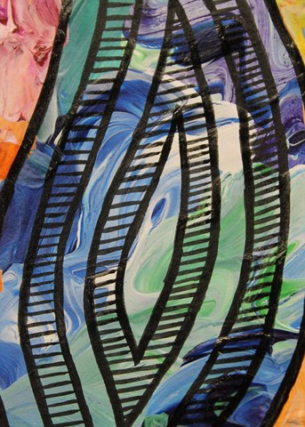
Close up of some of the detailing as well as the texturing of the background.


I really love the way the colours mixed yet still retained their vibrancy in this painting.
After I had finished my art page I created an extra background by swirling and dabbing the leftover paint onto another page. I REALLY love the way this background turned out and I will definitely be doing something more with it soon.

Friday, June 7, 2013

Swap - Mixed Media Postcards

The second swap for the month were mixed media postcards, and having just done the class with Donna Downey at Creative Adventures Downunder, I was really keen to try some of the techniques we had learned from Donna at home on my own. (Let's be honest to see if I had actually paid attention!!)

The postcards had to be 4" x 6" and because they were mixed media designs, I wanted a bit more strength to the base of the postcard so I recycled some cardboard boxes for each postcard. 
I painted each side of the postcard base with a couple of layers of gesso to hide the print on one side and provide a even coat on the other side. 
I added some flowers using a template from The Crafters Workshop with some Texture Paste over a portion of the front of the postcard. Once the texture paste had completely dried, I misted the entire front of each postcard with a different colour. Some were Tattered Angels Glimmer Mists and others were Heidi Swapp Color Shine Mist.
In the top right corner I added some layered flowers. I started with half of a large white fabric flower which I folded in half (so it was the equivalent of a quarter flower). I then layered half a batik paper flower (I only had three flowers, so I was clutching at straws and making do so I used what was in my stash). I then added a full white paper flower and top the stack off with some bling which were the only things I did buy (and they were from the discount store.)
On the left I layered a strip of antique embroidered lace which I picked up at the local hospice shop - definitely a bargain buy!!!
I traced around the frame of the heart from the Heidi Swapp Clear Pop Tags we received at Creative Adventures Downunder. We had used the heart in one of Heidi's projects that we created, but I really liked the shape of it, so I used the leftovers as a template to draw the hearts. I once again used recycled cardboard packaging for the hearts. I coloured each heart randomly using a warm colour palette from my Crayola Water Soluble Oil Pastels. (Yes I'm making sure I get plenty of use from them after I invested in them). I blended them with some spritzed water.
I misted over the top using a KaiserCraft stencil with Mr Hueys Mist - white and Tattered Angels Glimmer Mist - Pearl. 
And then everything went wrong...
I wanted to protect the stencil so it wouldn't rub off or smudge so I painted on a thin coat of gloss varnish... however, instead of protecting the stenciled image it just blurred everything and turned it into a white wash. I still liked the end result so didn't scrap it but decided to work with what I had.
I stamped randomly some script images from one of the Glitz Distress Stamps in Archival Ink - Coffee.
To finish off the hearts I wrapped some lurex embroidery threads in red, hot pink and silver randomly across the surface of the hearts. Then I randomly added some pearl bling to secure the threads in place... more as a security precaution, but I love the end result!!
The finished hearts were then attached in place on top of the antique lace.
I have a postcard stamp but it wasn't big enough to cover the back of the postcard and to be honest would have looked silly stamped on the back as it was. I loved the style of the word "Postcard" so I masked this off before inking it and stamping it onto the centre back of each postcard. I then used the same ink and with my water brush drew each of the lines on the back of the postcard by hand. (Something I will never be doing again!!!)
Front and back of the postcards. 
I really enjoyed making these mixed media postcards and I love the end results... very me with the lovely bright colours. The hardest part was trying to decide which one I wanted to keep for myself!!

Friday, May 31, 2013

Creative Adventures Downunder - Part 3

Now we are getting down to the good bits... the actual classes.

My first class was with Maggie Armstrong a tutor from here in New Zealand. In Maggie's class we created a "Creative Adventure Commemorative Layout" with a little bit of mixed media Kiwiana thrown in for good measure.
We had 3 hours to create this layout which sounds like a lot of time, but really, really isn't in a class room situation. This is my still to be completed layout... but I wanted to share (publicly) what I was able to achieve in class at the time. I will finish the layout (especially some fussy cutting I managed to get half done during class) and post a picture of the completed layout once done.
Note:
1 - My little camera charm fell off. It is supposed to be attached to the grommet but it decided not to cooperate so I need to re-attach it.
2 - I didn't get my photo taken at the photo-booth at the dinner on Friday evening. Too many people, not enough time, but I will find a picture to add to the pull out photo mat which is hidden inside the camera. I also need to add a paperclip or turning mount to keep the camera in place (it flops down otherwise, by design).
3 - There is some fussy cut flowers and scrolls to be added, a chipboard logo for CAD and some more feathers as well.
Close up of the mixed media detailing we added with the paua shell and feathers. Can I just add these a really teeny tiny pieces of paua and they were not  easy to work with which is why I think I fell behind in class... but they still look really good!
This part was definitely my favourite. We learnt a new technique and tried out a new product (that I had never used)... melted bees wax with Perfect Pearls over a wooden laser cut word.
I really enjoyed this technique, so have bought some extra bees wax to try this technique again in my studio, so I will post a tutorial on what I create.
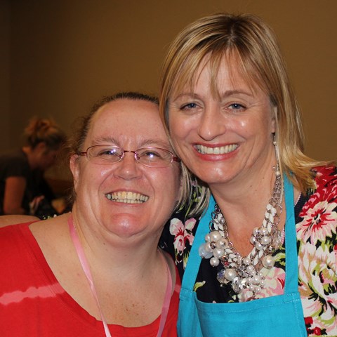
The delightful Maggie Armstrong and myself. (And yes she was bending so as to not look so tall next to me)

Saturday, April 27, 2013

Layout - Rare Thing


Project 3 - Rare Thing Layout
I really, really don't like getting my photo taken.
I would much rather be behind the camera than in front of it.
This of course means that there are not many pictures of me and of the few pictures that there are of me, I really don't like many (because I am just so self critical) so this is what this layout is about. This picture was taken Christmas Day 2012. I think it was taken by my husband, but it might have been taken by my niece. I wasn't 100% happy about the photo but it is the most recent photo of me that I like the most.
I needed a picture of myself for the Circle Journal swap I am in at the moment, so I've manipulated the colour on this photo and added some digital distressing to improve the picture. I printed the three versions I'd made - black and white, sepia and the third with a white vintage frame.
For this layout I started with Bazzill Kraft Cardstock. I dry brushed on some KaiserCraft Vintage White paint then misted with Mister Huey's Color Mist - White.
I cut an off-centre bracket shaped block using one of my templates from one of the sheets in the KaiserCraft Timeless Classics 12" Paper Pad. I added some Tim Holtz Distress inks in Antique Linen, Vintage Photo and Walnut Ink to give it some more depth before adhering it in place with my Teresa Collins Mega Runner from Xyron. I love the flexibility this gives me especially on curves and sharp points so it is ideal for adhering cut outs like this patterned paper.
I layered my photos (which I had hand cut to add to the distressed look) and sanded.
I adhered some of the leftover patterned paper to a chipboard dress form from Dusty Attic then cut around the chipboard dress form with my knife. I sanded the edges to hide any dodgy cutting out then inked the edges the same way as I had the patterned paper block. After heat setting the distress ink with my heat tool, I dry brushed more of the KaiserCraft Vintage White paint and misted lightly with Mister Huey's Colour Mist - White. I added two strings of mini pearls using some Helmar 450 Quick Dry Adhesive, my quick drying, hold anything permanently glue of choice.
I then painted a clock face die cut I was given in a die-cut swap with some Plaid Folk Art Acrylic Paint - Metallic Champagne for a tonal look. I finished this off with a light swabbing of Tim Holtz Distress Inks in Vintage Photo and Walnut Ink to maintain the common colour scheme across the page.
I offset the clock face and trimmed it to the paper edge then adhered the dress form in place using foam dots.
I finished this with four skeleton leaves I had received in a swap from my friend Gail in Australia. I really like the tone on tone look of this layout and was over joyed to have so many complementary neutral shades in my usual bright colour palette.
When Gail sent me her Junk Journal creation in a partner swap on Scrappers Obsessionz, she also gave me a bag of goodies to add to my journal. Included in the bag along with the white flowers I used on the Dance Layout and the skeleton leaves was a creamy die cut felt strip. I thought it was a little too heavy to use on this layout as a whole strip (it was 2.5 inches wide), so I cut it up into smaller pieces and trimmed out some excess flowers and leaves so it looked less chunky and more delicate. (If only it was that easy to get rid of chunkiness!!!)
I ended up with three pieces of various sizes. I painted these all with KaiserCraft Vintage White as the colour just wasn't quite right for the rest of the elements then I adhered them in place - top right hand corner, bottom right hand corner overlapping one of the photos and wrapped around the stand of the dress form. To these I then added clusters of KaiserCraft mini roses - Coconut, Buttercream and Honey, again with the twisted stems.
To finish off the layout I added a title which I cut using my Cuttlebug from sheets of cork. I matched this with two small journaling blocks I had received in a die-cut swap which I distressed with Tim Holtz Distress Inks in Antique Linen, Vintage Photo and Walnut Ink, again to coordinate across the layout. I hand wrote my journaling on with a black journaling pen.

Friday, April 26, 2013

Layout - Dance


Project 2 - Dance Layout
I took these photos of my granddaughter Sonia-Marie dancing in the new dancing dress I bought her in mid-January of this year. She has always loved music and dancing and as a former dancer teacher I want to encourage her love of dance (and music and crafting and reading...). I found this outfit in K-Mart and just couldn't resist. As soon as we got it home she put it on and began dancing around in our (messy) lounge. She loves the pretty flowing skirt and the way it moves when she twirls around.
I just have to add... I really love the sports function on my Canon camera, especially for moments like this!!!
I started with a base of Bazzill White Cardstock. I placed a Butterfly Stencil from KaiserCraft in the bottom right corner and misted the area with Tattered Angels Mists - Abominable Snowman, Pink Poodle and Trunk Bay. LOVE... this colour combination and how delicate it looks with this stencil!!!
I cut some Teresa Collins patterned paper Posh: Butterfly Script and Posh: Posh Butterflies to size then distressed the edges with a edge distresser. I layered these onto the cardstock so as to highlight my lovely misted butterfly.
I added the photos which I had cropped tightly and then sanded to focus solely on my granddaughter. I overlapped them slightly so they would fit on the page better as well as adding a movement and flow across the page to better fit the theme of the layout.
I love this Dusty Attic chipboard scroll border and knew I wanted to add this to the page. I painted it with Tim Holtz Paint Dauber - Picket Fence, then covered this with a mixture of Making Memories Pink Lipstick paint and Reeves Iridescent Medium. I finished this off with a coat of Iridescent Medium on its own to give it a real sparkle (though it doesn't show that well when photographed).
I adhered the chipboard scroll in place with Ranger Glossy Accents along the left hand side of the layout.
I added some handwritten journaling with a black journaling pen then adhered some white glittered flowers I received in a swap from Gail in Australia. (A girl can not have enough bling or glitter in her life... especially a little "big" girl.) I added a self adhesive clear rhinestones into the centre of each flower.
To finish off the layout I added a title using Making Memories Mini Shimmer Alphas - Blue Metro.
Close up of the painted chipboard.
Close up of glittered flowers (they are just so cute!!!)