Showing posts with label Layout. Show all posts

Friday, May 31, 2013

Creative Adventures Downunder - Part 3

Now we are getting down to the good bits... the actual classes.

My first class was with Maggie Armstrong a tutor from here in New Zealand. In Maggie's class we created a "Creative Adventure Commemorative Layout" with a little bit of mixed media Kiwiana thrown in for good measure.
We had 3 hours to create this layout which sounds like a lot of time, but really, really isn't in a class room situation. This is my still to be completed layout... but I wanted to share (publicly) what I was able to achieve in class at the time. I will finish the layout (especially some fussy cutting I managed to get half done during class) and post a picture of the completed layout once done.
Note:
1 - My little camera charm fell off. It is supposed to be attached to the grommet but it decided not to cooperate so I need to re-attach it.
2 - I didn't get my photo taken at the photo-booth at the dinner on Friday evening. Too many people, not enough time, but I will find a picture to add to the pull out photo mat which is hidden inside the camera. I also need to add a paperclip or turning mount to keep the camera in place (it flops down otherwise, by design).
3 - There is some fussy cut flowers and scrolls to be added, a chipboard logo for CAD and some more feathers as well.
Close up of the mixed media detailing we added with the paua shell and feathers. Can I just add these a really teeny tiny pieces of paua and they were not  easy to work with which is why I think I fell behind in class... but they still look really good!
This part was definitely my favourite. We learnt a new technique and tried out a new product (that I had never used)... melted bees wax with Perfect Pearls over a wooden laser cut word.
I really enjoyed this technique, so have bought some extra bees wax to try this technique again in my studio, so I will post a tutorial on what I create.
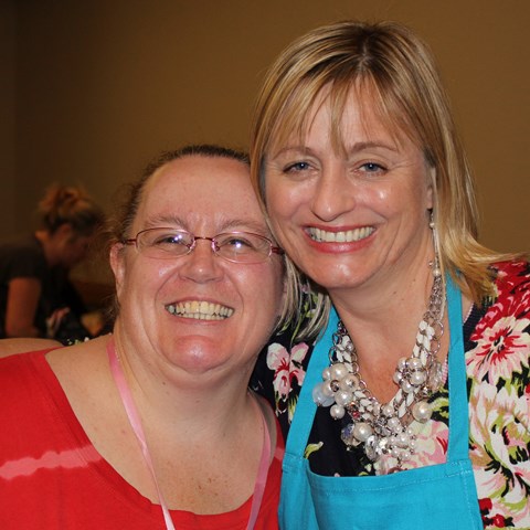
The delightful Maggie Armstrong and myself. (And yes she was bending so as to not look so tall next to me)

Saturday, April 27, 2013

Layout - Rare Thing


Project 3 - Rare Thing Layout
I really, really don't like getting my photo taken.
I would much rather be behind the camera than in front of it.
This of course means that there are not many pictures of me and of the few pictures that there are of me, I really don't like many (because I am just so self critical) so this is what this layout is about. This picture was taken Christmas Day 2012. I think it was taken by my husband, but it might have been taken by my niece. I wasn't 100% happy about the photo but it is the most recent photo of me that I like the most.
I needed a picture of myself for the Circle Journal swap I am in at the moment, so I've manipulated the colour on this photo and added some digital distressing to improve the picture. I printed the three versions I'd made - black and white, sepia and the third with a white vintage frame.
For this layout I started with Bazzill Kraft Cardstock. I dry brushed on some KaiserCraft Vintage White paint then misted with Mister Huey's Color Mist - White.
I cut an off-centre bracket shaped block using one of my templates from one of the sheets in the KaiserCraft Timeless Classics 12" Paper Pad. I added some Tim Holtz Distress inks in Antique Linen, Vintage Photo and Walnut Ink to give it some more depth before adhering it in place with my Teresa Collins Mega Runner from Xyron. I love the flexibility this gives me especially on curves and sharp points so it is ideal for adhering cut outs like this patterned paper.
I layered my photos (which I had hand cut to add to the distressed look) and sanded.
I adhered some of the leftover patterned paper to a chipboard dress form from Dusty Attic then cut around the chipboard dress form with my knife. I sanded the edges to hide any dodgy cutting out then inked the edges the same way as I had the patterned paper block. After heat setting the distress ink with my heat tool, I dry brushed more of the KaiserCraft Vintage White paint and misted lightly with Mister Huey's Colour Mist - White. I added two strings of mini pearls using some Helmar 450 Quick Dry Adhesive, my quick drying, hold anything permanently glue of choice.
I then painted a clock face die cut I was given in a die-cut swap with some Plaid Folk Art Acrylic Paint - Metallic Champagne for a tonal look. I finished this off with a light swabbing of Tim Holtz Distress Inks in Vintage Photo and Walnut Ink to maintain the common colour scheme across the page.
I offset the clock face and trimmed it to the paper edge then adhered the dress form in place using foam dots.
I finished this with four skeleton leaves I had received in a swap from my friend Gail in Australia. I really like the tone on tone look of this layout and was over joyed to have so many complementary neutral shades in my usual bright colour palette.
When Gail sent me her Junk Journal creation in a partner swap on Scrappers Obsessionz, she also gave me a bag of goodies to add to my journal. Included in the bag along with the white flowers I used on the Dance Layout and the skeleton leaves was a creamy die cut felt strip. I thought it was a little too heavy to use on this layout as a whole strip (it was 2.5 inches wide), so I cut it up into smaller pieces and trimmed out some excess flowers and leaves so it looked less chunky and more delicate. (If only it was that easy to get rid of chunkiness!!!)
I ended up with three pieces of various sizes. I painted these all with KaiserCraft Vintage White as the colour just wasn't quite right for the rest of the elements then I adhered them in place - top right hand corner, bottom right hand corner overlapping one of the photos and wrapped around the stand of the dress form. To these I then added clusters of KaiserCraft mini roses - Coconut, Buttercream and Honey, again with the twisted stems.
To finish off the layout I added a title which I cut using my Cuttlebug from sheets of cork. I matched this with two small journaling blocks I had received in a die-cut swap which I distressed with Tim Holtz Distress Inks in Antique Linen, Vintage Photo and Walnut Ink, again to coordinate across the layout. I hand wrote my journaling on with a black journaling pen.

Friday, April 26, 2013

Layout - Dance


Project 2 - Dance Layout
I took these photos of my granddaughter Sonia-Marie dancing in the new dancing dress I bought her in mid-January of this year. She has always loved music and dancing and as a former dancer teacher I want to encourage her love of dance (and music and crafting and reading...). I found this outfit in K-Mart and just couldn't resist. As soon as we got it home she put it on and began dancing around in our (messy) lounge. She loves the pretty flowing skirt and the way it moves when she twirls around.
I just have to add... I really love the sports function on my Canon camera, especially for moments like this!!!
I started with a base of Bazzill White Cardstock. I placed a Butterfly Stencil from KaiserCraft in the bottom right corner and misted the area with Tattered Angels Mists - Abominable Snowman, Pink Poodle and Trunk Bay. LOVE... this colour combination and how delicate it looks with this stencil!!!
I cut some Teresa Collins patterned paper Posh: Butterfly Script and Posh: Posh Butterflies to size then distressed the edges with a edge distresser. I layered these onto the cardstock so as to highlight my lovely misted butterfly.
I added the photos which I had cropped tightly and then sanded to focus solely on my granddaughter. I overlapped them slightly so they would fit on the page better as well as adding a movement and flow across the page to better fit the theme of the layout.
I love this Dusty Attic chipboard scroll border and knew I wanted to add this to the page. I painted it with Tim Holtz Paint Dauber - Picket Fence, then covered this with a mixture of Making Memories Pink Lipstick paint and Reeves Iridescent Medium. I finished this off with a coat of Iridescent Medium on its own to give it a real sparkle (though it doesn't show that well when photographed).
I adhered the chipboard scroll in place with Ranger Glossy Accents along the left hand side of the layout.
I added some handwritten journaling with a black journaling pen then adhered some white glittered flowers I received in a swap from Gail in Australia. (A girl can not have enough bling or glitter in her life... especially a little "big" girl.) I added a self adhesive clear rhinestones into the centre of each flower.
To finish off the layout I added a title using Making Memories Mini Shimmer Alphas - Blue Metro.
Close up of the painted chipboard.
Close up of glittered flowers (they are just so cute!!!)

Wednesday, April 24, 2013

Putting it out there...

Prelude... I wrote this blog in it's entirety then when I went back and proof read it decided it was just far too long, so I have decided to split it up into more manageable chunks. If some where along the way I miss changing a reference from later in this post to the next post and here is a link... my apologies!

I've been busy the past week or so... busy on a mission to put myself out there again. I have received a few notices for upcoming Design Team calls for manufacturers and I decided to give one a go. (There may be others but I'm taking it one application at a time.)
This is not my first DT application and it won't be my last as this is definitely something I would love to do and besides I work on the theory that if I don't try then I have no chance of achieving my goal.
This application is for the Prima Design Team. Like many others I love their products, I just wish I had more of them... so this opportunity was definitely too good to pass up. All I had to do was answer some questions, send some links and pictures of three creations that demonstrated my style... and here is my first dilemma.
This is a question (and answer) that I still struggle with after seven odd years of scrapping and paper crafting. I don't really have a style, at least not one that I can discern myself... maybe someone else has a name for it and if you do then I'd be interested to hear.
I don't have a signature style, or design element, or technique that makes my layouts stand out. If I was to display a few of my layouts along with those of other people, I doubt that anyone would be able to pick them all out from the others. I'm not complaining... I like this about my "style". It means I'm not tied to anything in particular. It means I have a creative versatility and fluidity that adapts to whatever project I am working on. I can think outside the box.
Along with this lack of apparent style, I also tend not to follow trends. It may be that I'm just too slow to pick up on them, but I'd rather think it was that I focus on classic products and tools and designs rather than following (or falling for) the latest hot thing or fad. Of course it may also have something to do with a strict budgetary containment (read lack of disposable income at the moment) I am maintaining.
Anyway enough psycho-babble... let's get on to the good bits. Here are the three creations I sent through to Prima. These photos are the ones I sent through to Prima Manufacturing together with my application. I will be writing some more blog posts with some additional photos to show you more detail of each of these projects.

Friday, September 28, 2012

Super Star

I took these pictures one day over a very short time period when my granddaughter was out in the backyard playing. She's wearing her Auntie's hat backwards which just looked so cute that I had to take the photos. Little did I know at the time, how photogenic she was becoming.

Tuesday, September 18, 2012

Our New Kitten

I've been sitting on these pictures for a while of our then new kitten going out into our backyard (which looks like a jungle as we back onto native bush) for the very first time. Every now and then I pull them out, move them around the page several times, then put them back in the bag until next time. Finally I put my foot down and said do something with them!!!
It's a very simple page... just lots of photos which we all know can often be hard to decide what to do with. I spent a fair bit of time getting the layout of the photos just so. I wanted it clean but not too uniform... which was easier said than done when you are a perfectionist.
I hand stitched the cross bars to anchor the page then decided it also needed a simple frame as well... good thing I had some videos to watch last night!!!
To finish it off I simply added a title in glitter letters to compliment the grey in her coat before added some pre-made embellishments.

Monday, September 17, 2012

Those Smiles


The tag came about from some of my experimenting... then I found a photo in matched. The page design is based along the lines of the Halloween Class I am teaching at the Caz Dezign Retreat in October. This is the first time I've ever really used such dimensional flowers on a layout but I do quite like the look, particularly when they are teamed with the softness of the skeleton leaves. 
I absolutely love this picture of my darling husband and granddaughter which I took earlier this year.

For more information about participating in the classes you can either contact Carrie of Caz Dezigns who is running the retreat or ask me directly.

Tuesday, July 17, 2012

So Big, So Fast

After the "Baby Boy" layout I created for my nephew's baby album, I still had enough product left over from the kit to create a second layout.
This second layout is about showing how much Troy has grown already. 
There are a number of similarities between the two layouts. Not only are the products the same but I have also utilised a number of similar design elements in both layouts.

  • Distressed edge around each page
  • Photo layout similar
  • Use of diagonal design elements
  • Grouped embellishments (flowers for the younger page, cogs for the older page)
  • Journaling and title placement the same

The pages can either go into his album as a double layout, or just as individual pages. Either way will still look effective.

Sunday, July 15, 2012

Baby Boy Layout

When I first started scrapping I started out as a consultant for TLC (Top Line Creations). Their products were based around collections which included kits and coordinated embellishments. I love kits for classes and workshops especially for those new to scrapbooking. They are also an excellent tool if you don't have a great deal of time for either scrapping itself or for hunting around your local scrapbooking store for the perfect products for your project.
As my scrapping style (and technical ability) have developed I've found that in general the TLC kits no longer suit my style of scrapping, though every now and then I use some that are left in my stash. I tend to be a lot more experimental in my scrapping these days and build my layouts with a broader range of products from a much wider range of manufacturers.
I pulled out one of the TLC kits for this layout. I had two adorable pictures of my nephew Troy which I wanted to put on an equally adorable layout for his baby album (even though he's now two!!) This kit came with two sheets of baby blue cardstock, two sheets single sided patterned paper and a 7" x 7" sheet of flocked, die-cut cardstock embellishments.
I cut a 6" x 6" square from each of the patterned paper. I distress inked around each of the patterned paper squares as well as the sheet of cardstock using Tim Holtz Antique Linen and Walnut Stain distress inks. The patterned paper squares were then adhered to the cardstock in diagonally opposite corners with a slight overlap.
I rounded the corners of the photos just to soften them a little then adhered them so as to offset the patterned paper. The die cut title was self-adhesive, so I adhered this against the darker patterned paper. 
The layout looked quite good just like that but I felt it needed some more softening (cos Troy was just so cute and cuddly and snuggley in these pictures), so I added some pale yellowy-cream flowers and highlighted them with dark brown rhinestones.
I added a small rectangle of manilla cardstock which I distressed the same as the cardstock and patterned paper. I hand wrote Troy's full name in a glitter gel pen and adhered this in close to the photos.
The final addition was a couple of small brown rub-on scrolls just to balance out the two opposite corners of the layout.
I love the final look of the layout. It's simple, yet soft but not overly feminine so my sister (a non-scrapper) won't think it's too girly.

Sunday, July 8, 2012

Jungle Kitteh

This is a layout that has been in progress for some time. I printed the photos a while ago, picked out some cardstock and patterned paper, kind of planned the page but when I laid everything out didn't like the way it looked so put everything into a bag. Every now and then I pulled the bag out... rearranged things, tried new patterned paper then put everything back in the bag. I'm sure you know what I'm talking about.
This week I've been trying to clear up some of these long unfinished projects and layouts... with some success I might add. Finally things seemed to fall into place. Funny that it seems to happen when you just say to yourself... "dammit I need to get these bloody pictures on the page... like it or lump it".


I started by changing the cardstock. Instead of a green background, I went for Kraft. Though I loved the green so it didn't disappear too far.
Given the subject matter... kitten up a tree... I wanted to have some trees somewhere on the page... to keep up the theme. I couldn't have green trees on a Kraft background that just wouldn't look right, but I also didn't want to go back to a boring green background with Kraft trees. So I experimented...

  1. In order to have the Kraft cardstock as my background and be my trees I had to use the green as negative space. 
  2. On the back of the green cardstock I sketched a couple of rough trees. 
  3. To get a natural look, I tore the tree shapes out by hand. 
  4. I temporarily adhered the green trees in place and lightly traced around them.
  5. Using the traced lines as a guide I loosely inked a tree shape using Tim Holtz Distress Inks. I made sure to ink well beyond the traced lines so that I had lee-way to move my green negative spaces slightly to alter the final shape of my trees.
  6. When I was happy with the colouring of my "trees", I temporarily placed the green negative spaces. At this point I made a few slight adjustments to the green shapes to give the final look of my trees before permanently adhering the shapes in place.
  7. I adhered my photos in place taking care to make up my eye-balled spacing was even. (I usually don't measure)
  8. I added my title across the bottom part of the layout.
At this point I wasn't sure if I was finished or not, so I took a couple of photos and decided it needed more, though I wasn't sure what... so I left it overnight and contemplated it in my sleep LOL.
  1. I tore some thin strips from the green trees bits I had discarded. I roughly bent each strip in half following the line of the strips.
  2. I chalked the two sides of the strips in two shades of green chalk. I wanted the strips to stand out from the green background rather than blend in.
  3. I adhered the strips in place with Elmers Glue.
  4. The title didn't really stand out enough, so I outlined the letters with white pen to coordinate with the white borders of the photos.
  5. Having sorted the bottom section of the layout the top needed something extra. I found some old "jungle leaves" I'd die cut years ago but never used. Even though they were already green patterned paper, I distress inked the leaves to look more tropical.
  6. I adhered the leaves in place giving them a little dimensionality.
And here is the final result...

Sunday, May 27, 2012

Sports Fans

Don't ask me how long it's been, I just know it's been a long while since I last created a layout. Just felt in the mood to do some actual "scrapping" last night, so here it is.
I love this picture of my sister, brother-in-law and nephews so I have created two copies of this layout. One for my family album and one to send to my sister for her family album.

Tuesday, March 27, 2012

WTH - A Layout a Last

I finally felt like doing some scrapping over the weekend. Only one layout but its a start. I've looked at these photos time and time again and wondered what on earth to do with them. Finally it came to me... something a little tongue in check and definitely humourous!! I just hope that my sister Keryn and friend Raylene don't hate me when they find out I've done it. Oh well... C'est la vie.
I created this for a sketch challenge on the Crafting Passionz Forum.
Cream cardstock; Patterned Paper - My Mind's Eye Lost & Found; Tickets & Notes - Pink Paislee Parisian Anthology; Glitter Letters - Bella; Tim Holtz Walnut Ink Distressing Ink, Photo Mounts, Glossy Accents, Journaling Pen... and three unforgettable photos.


The journaling reads:
"I always thought the photographer was supposed to catch you looking totally gorgeous on your wedding day... NOT like something that even Atilla the Hun would cower from!!!"

Tuesday, January 10, 2012

New Year's Resolutions and Bathrooms

Don't you hate it when you realise that you couldn't see the wood for the trees, and instead of being happy that you finally saw the trees, you are instead annoyed at yourself that it took so long for you to change your perspective so your could see the trees. And the smaller the change in perspective from before until now, the more annoyed you are with yourself.
It just hit me this afternoon how to summarise my New Year's Resolutions into something meaningful to me. I've been thinking about it few a couple of weeks and I knew I was close... I was in the forest, but I just couldn't distinguish one tree from the other. What was important and what wasn't, what did I want to commit to and what wasn't important enough to do it right now. I should have known that all I needed was a light-bulb moment in my usual light-bulb producing location... the bathroom!
Yes I know it is a bit weird, but the bathroom has always been my go-to location when I am struggling. I can remember being only 9 or 10 and coming to this realisation and since then it has always been true. If I am stuck on a problem, struggling for inspiration, questioning the best path or the optimal solution I don't "Go to the mattresses" a la The Godfather... I go to the bathroom. Some how I can't see this being the inspiration for a movie, nor one of the more memorable lines that people will quote, but it works for me.


Moving right along...


This year my word is "Organisation". It is a common theme for a lot of people because it seems that wherever I look, everyone is talking about getting organised. Some people favour an intense go for broke, hell for leather, all in one month approach. Others, like myself, have a made a 12 month commitment to get organised. Personally I think the later is a more realistic. I know I can't devote such an intense amount of time to get organised... I have a life (believe it or not). The other reason I prefer my version is that realistically I don't expect myself, let alone my family to make such wholesale and dramatic changes to the habits we currently have and then stick to them if I make a whole lot of changes all at once. At least if I make smaller, more subtle changes, then I have a chance of some of them sticking and being followed by the family. I am a realist.
I wanted my New Year's Resolutions to reflect my commitment to getting organised this year as well as all the different aspects of my life that I am focusing on - Household, my business, my scrapping area and my studio. I also wanted to ensure there were some challenges built in in terms of my scrapping and crafting to make sure that this did not go by the way-side in deference to everything else I am trying to do.
There was one final thing I needed to do... make sure that whatever I came with was not so overwhelming that I would give up after a week and wouldn't stick out the whole year.
So here is the double page layout I've created to record my Resolutions for 2012. Once again I have gone for a simple colour scheme - black with one colour with a simple page style as well.


Each week I will:

  • create at least one meaningful scrapbooking layout
  • do one thing that inspires the organisation of our household
  • learn one new scrapbooking or crafting technique
  • do at least one thing that strengthens my business
  • create at least one card
  • do one thing that contributes to my personal development
  • do at least one thing that improves the organisation of my scrapping space and studio
  • make progress towards the completion of my monthly Off-The-Page project
Oh and can I just say... for a change I really love my handwriting on these pages LOL!!!!

Thursday, March 10, 2011

Layouts - For Grandad 2

A double layout for Grandad. I wanted a nice picture of him with each of the kids.

Sunday, March 6, 2011

Scrapping Style?

I was reading the January 2011 edition of Creating Keepsakes and they have an article on changing your scrapping style which I enjoyed reading. It did however get me started (once again) on trying to decide "what is my scrapping style?"
I'm sure those who know me and some of my creations will probably be able to answer the question - about my style - relatively easily but I'm still lost as to what my style is.
I don't know that I have a particularly style as I tend to change the style of the page I am creating depending upon a number of factors...

  • The theme of the page I am creating
  • The look of the photos and their style
  • The patterned paper I end up using
  • My mood (sometimes I am in the mood for lots of embellishments, sometimes I go minimalist)
  • Sometimes the layout just seems to tell me it needs a little bit more here or there and sometimes when I place the little bit more it just doesn't look right so I take it right back off
  • I tend not to plan my pages (general statement though I am trying to plan a bit more so I can be a bit more productive instead of relying on the inspiration flowing) so how the style flows is what the page ends up like.
Anyway... so I spent some of my creative time this afternoon instead, trolling the internet looking for definitions of what are scrapbooking styles so I could determine which one I fit into. And basically I came to the conclusion there is no clear definition of what one scrapping style is compared to another as everyone has their own opinion. So I turn full circle and go back to the aforementioned article and refer to the eight (though I am sure some people may say there are more) styles that they refer to and how to achieve this style.
  1. Artsy Style - Combine patterns; add ink & paint; create your own backgrounds
  2. Graphic Style - Use minimal supplies; use straight lines; create white space
  3. Clean & Simple Style - Use a grid or template; limit embellishments; use patterns sparingly
  4. Shabby Chic Style - Add clusters of accents; layer embellishments and ribbons; rough up the edges of your pages
  5. Sophisticated Style - Dress up an accent; add personal touches; use patterned paper strips as ribbon
  6. Cutesy Style - Add pre-made products; use a nickname for your title; use bright, fun colours
  7. Whimsical Style - Create a scene on your background; use playful fonts; choose fanciful products
  8. Classy Style - Use solid colours; keep it clean; focus on the photos
So reading through that I would have to say I tend towards...

A graphic, clean & simple, sometimes shabby chic look which uses cutesy colours with a whimsical style of fonts and classy solid colours.

Do you agree?
And what is your style?

Saturday, March 5, 2011

Handmade - Templates

Today I've been busy trying new techniques, cleaning, scrapping, organising, planning and downloading.
Tonight as my handmade items I've been hand-cutting some templates of some new shapes and designs. That sounds fairly straight forward and it is, though most of my templates I cut out of plastic so that I can re-use them hundreds if not thousands of times without the slightest sign of any damage.
I would post some pictures but they are all clear plastic so they don't photograph well. I will however point out some of my templates as I use them.


How do I create my templates?


First you need a design that you like and think you will use time and time again. It may be a die cut piece of paper that you really like the shape of or an image you have downloaded that you think would make a great background.
If I download an image I like, I print it out onto ordinary printer paper then cut it out with scissors. If its a die-cut piece of paper then I just use that.
I use re-positional adhesive dots to hold the paper template on to my plastic so I can then trace around it with a soft pencil - like a 3B - 6B.
I know you are asking what plastic do I use for my templates...
Go to your local $2 shop and look for packs of 2 clear plastic place mats. You can use coloured ones if you like, though I like the clear as then I can see the patterned paper beneath, just in case I am trying to line up a particular part of the pattern.
Having drawn or traced your pattern on the plastic, cut out the design using sharp but smallish scissors.
I then cut a small hole in one of the corners so that I can feed them onto the binder rings I have all my other templates on.
I have 4 or 5 rings now each with different sized templates on them.
The plastic can be quite firm to cut, so I wouldn't cut out too many at once, not unless you really like blisters across your fingers - just take my word for it on that.
And then when you have cut out your templates use them to cut patterned paper & cardstock for your scrapbook pages, cards and OTP projects.

Friday, March 4, 2011

Photo Techniques - Adding Words to Photos

Sometimes we take photos of the people & animals we love that are incredible photos. They are perfectly clear, the lighting is fantastic, brilliant colour, everything is just so... except for that one big patch of background "blankness" that we just can't crop out of the photo without lessening the impact of the photo as a whole.
Don't disparage you do have options.

  1. Get over it and just live with it as it is.
  2. Disguise it somehow.
Sometimes I choose option 1 when nothing else I try works. It doesn't mean I have failed as a scrapper, it just means for the time being I am allowing it to be seen as it is - it doesn't mean I won't change my mind... it just is what it is.
If I go with option 2, I have a number of techniques at my disposal with which to disguise the big blank blob (from hell).
  1. Hide it with rub-ons - for more on this see my earlier blog post.
  2. Cover it with a decorative element or embellishment.
  3. Cover it partially through the use of layering materials such as other photos, journaling, titles etc over it.
  4. Disguise it using journaling or a title directly onto your photo using your photo software - in my case PHOTOSCAPE.
Whatever you favourite photo software is, it should be able to do something similar one way or another.
  1. Open Photoscape
  2. Select Editor
  3. Open the photo you want to add the title or journaling to
  4. Select the object tab
  5. Select the text tool - this brings up a pop-up menu
  6. Type in your journaling or title. You will see the text box automatically increases in size to accommodate the amount of typing you have entered.
  7. Once you have keyed in what you want to include you can then start to alter the appearance. Try changing the colour of the font, adding a shadow, change the font size or font style until you get a look you are happy with.
  8. Click OK to finishing editing the text box. This closes the pop-up box, though you can re-open it at any stage by double clicking on the text box.
  9. Now move your text box to where you want to add it. You can at this stage resize the box to fit the available space and even alter the angle of the text box for added interest.
  10. Once you are happy with the new look, save your photo to a new file name. Remember don't save over the top of your original photo... just in case!!!
  11. Then you can print out your photo as you would normally print your photos and scrapbook.
Here are some before and after pictures...
This was just a sample to show the difference so I don't have a layout with picture... yet, but here are some examples of layouts.
With "Air Jordan" I kept the background as the original background - sky in this case. However in the picture below, I wanted to remove some of the background distraction (sorry Aunty Jean) so added a small heart onto which I then added the text block and this time changed the angle of the text box so the words would align with the heart frame.


Thursday, March 3, 2011

Layouts - For Grandad

I created these to go with the other pages we had on display for Grandad Steve's funeral, Tuesday last week.

We gave him this picture enlarged and framed for Christmas. It's a nice picture of all of the grandkids, though it is a pity that Steve is not looking his normal chirpy self. It was his 73rd birthday and we shared a picnic at the Auckland Botanical Gardens with the lovely and ever so cute Miss Vienna who let us share her first birthday celebration.
This is the man that most people know. Quiet, reflective... a man who listened rather than saying much.

Wednesday, February 23, 2011

Change to your scheduled programme...

I know today is supposed to be an off-the-page project but at 12.51pm yesterday afternoon my hometown, Christchurch, was hit by a 6.3 earthquake. Though not as strong as the first earthquake in September last year that kicked of the nightmare that has been the lives of so many people down there, it was however considerably more devastating due to the depth and proximity to the city.
I can't comprehend the feelings and emotions that people are experiencing now, I only know how I feel knowing so many of my family and friends are in the middle of it all. They are living the horrors of it all every hour of every day.
I know in the scheme of things this probably isn't much, but I have to share some of the few memories I have scrapped of sharing my hometown with my family who are currently all safe here in Auckland. 
As I looked through my albums looking for pages I feel a loss for all the pictures I have not taken, not through a lack of opportunity, just because they are scenes and buildings that have always been there and I like so many other people, thought always would be there.
My heart goes out not only to my own family and friends but to all of Christchurch and indeed New Zealand. As we all work together, finding strength from each other I can't help saying, I've never been more proud to be a KIWI!!!
Good luck, you are all in our thoughts and prayers.