Showing posts with label Design Teams. Show all posts

Thursday, August 22, 2013

Mixed Media Canvas... and a technology fail (for now)

I slaved over this project for a few days... longer than I expected it to take.
Then I slaved over the video so I could post it on my YouTube channel and use it as my Design Team Application for Faber Castell Design Memory Craft but the technology in my life decided it was not going to cooperate so after three attempts at editing the video I missed the deadline... oh well there is always next year.
If anyone is willing to sponsor a completely new video recording system, then all donations will be gratefully accepted and used... just putting it out there to the universe LOL.

Anyway...
In lieu of a step by step video tutorial... for now I wanted to share some pictures of the finished project... my first but definitely not my last altered canvas. I will attempt to edit the video once more having downloaded an updated version of my software... so fingers crossed it works this time. If I'm successful (and you will probably hear the hoops and hollers of joy) then I will update you with the link... if not, then I guess I won't. (You all know that right about now it's personal... it's me or the software and I'm not giving up just yet!!)

The canvas is 6" x 12".
Background colouring done with Faber Castell Gelatos - Peach, Guava, Lavender, Bubble Gum and Earl Grey blended together into a random pattern.
Heat embossed over the top with VersaMark ink and Detail Black Embossing Powder from Stamp Effects using the KaiserCraft "Crackle" clear stamp.
Edges all inked with Tim Holtz Distress Inks - Walnut Stain and Black Soot.
Torn corrugated cardboard, lightly painted with Adirondack Acrylic Paint Dabber - Snow Cap.
The sentiment (my own creation) was stamped onto white cardstock scraps which I had coloured using the same colour combination of gelatos. It was stamped with Archival Ink - Jet Black using Hero Arts Basic Upper and Lower Case Peg Stamps.
The words were all cut out individually then edged with a Tombow dual tip pen using the brush end before being adhered in place with Glossy Accents.
The polymer clay torso from Kimi at Unique Scrappiness was washed with a mix of gelatos and water.
The flowers from I Am Roses were all coloured in one of the following techniques:

  • Gelatos with water to create a water colour - painted
  • Gelatos with water in a spritzer bottle - misted
  • Lindy's Stamp Gang - misted
The twisted stems are chenille pipe cleaners covered with florists tape which was then rubbed with Faber Castell Gelato - Chocolate and misted with Lindy's Stamp Gang Mists - Cadbury Milk Chocolate and Dark Chocolate Truffle.
The tag was a "Luggage Tag" from Jillibean Soup. This was scrunched up and distressed with Tim Holtz Distress Inks in Walnut Ink and Black Soot.
I included some Steampunk Metal Charms from Faith at Artistic Creationz. They were painted lightly with Faber Castell Gesso which was wiped off with a baby wipe before it had dried.
And finally close up of the two sides showing the embossing wrapping completely around the canvas... easier said than done, but well worth all the effort.
I really love the end result of this project. All the stress and technology EPIC FAILS... aside, it was well worth it and I can't wait to find the perfect spot to put it, so it can inspire me every time I look at it.

Thursday, August 1, 2013

Lindy's Stamp Gang Color Challenge

About a month or so ago I ordered some new products to my store in time for the SENZ Craft Show. I had heard only good comments about the Lindy's Stamp Gang Mists from those in the know, so I ordered some having only ever seen them on YouTube videos.
Having tried them at SENZ and on some projects I have created since, I can now honestly say that I am definitely a convert to Lindy's Stamp Gang and so much so that I am applying for their design team because that is how much I love the products. For more information about applying for the Lindy's Stamp Gang Design Team you can check out their blog post here.
In order to apply for their design team we have been asked to participate in this months "Color Challenge" on their blog (blog post here). And anyone can enter their Color Challenge - just entering the challenge puts you in the running for some very cool Lindy's Stamp Gang Products.
This is the first Color Challenge they have run but it is certainly not going to be the last. Be sure to follow their blog and keep an eye out for this image for the next Color Challenge. (I'm used to spelling it as "Colour" so need to double check every time I type it LOL)
The rules are pretty simple...

1. Help spread the word about the Lindy's Color Challenge - done and with pleasure! The more people that enter each month's Color Challenge - the more giveaways they will giveaway!
2. Use Lindy's Stamp Gang Products - done! If you don't have any Lindy's Stamp Gang products then you can buy them from my online store at www.scrapfx.co.nz. Look under "Essentials" for their products.
3. Use a minimum of two colours in the Color Challenge (see the image below) - done!
4. Link the Lindy's Stamp Gang Products to their store - done (well will be by the time you are reading this)!
This month's challenge was these colours...

For this challenge I altered a key holder I had purchased at a discount store.
I white washed the entire item, inside and out, with watered down white gesso. While the gesso was still wet, I then dabbed it with a paper towel to add some depth by making the white wash less even and to allow the wood grain to show through better.
I then adhered some K & Company "Citronella Waves" patterned paper from my stash, inside to cover the back wall of the key holder. In this top picture (taken without the flash) you can see some of the swirling waves (if you look closely enough) but you can't see any of the glitter accents and the colour looks a little darker than what it is in reality.
Around the outside I adhered some red patterned paper - source unknown - also from my stash. It was just the perfect colour to coordinate with the red I had used for my flowers... and I love red so it was the obvious choice.
In the picture below... same angle but with the camera flash, the colour is closer and you can see the glitter reflected in the glass door but you lose the waves pattern... I think I need to work on my photography skills!!
I stamped onto the paper for both sides with VersaMark Watermark Ink using one of the Hero Arts Mixed Design Border acrylic stamps then sprinkled on Lindy's Stamp Gang Embossing Powder in Angel Wings Ruby. This is a clear embossing powder with a red shimmer. When stamped onto the red paper I had chosen for the outside of my altered key holder, the heat embossed image really took on the red of the paper, though is accented oh so beautifully by the red shimmer as well. Below are pictures taken without and then with the camera flash, as well as a close up of the embossed image showing off that beautiful shimmer.


I took some close-ups to help you see what I had done (and see that patterned paper a bit better). It's just gorgeous and I so wish it showed up better in the pictures!!
Bottom cluster of flowers but this time with the flash - now you can really see that paper and some of the shimmer on the flowers as well.
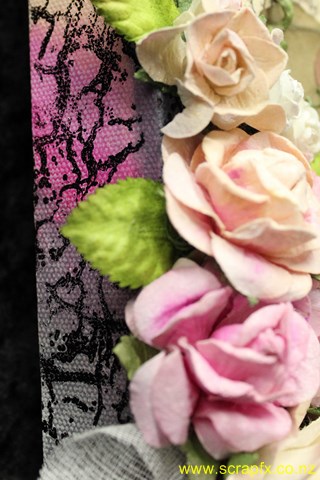
In this picture and the one below, you can see where I really went to town with my Lindy's Stamp Gang mists. All the flowers started out as plain white flowers... either dimensional roses from I Am Roses (yes you can get them from my online shop) or flat Bree flowers from  Ada available in my shop here.
I used a number of Lindy's Stamp Gang mists to colour my flowers (and some non-Lindy's for colours I didn't have), but all flowers feature Lindy's Stamp Gang Starburst mists on them.
To colour the flowers, I misted them all generously with water first. I misted my chosen colour onto my craft mat then using my water brush I gently dabbed each colour along the edge of the flower petals. As each of the flowers is made of paper, they quickly soaked up the colour despite being already wet. Being so wet actually aided the spread of the colour and enabled the colour to dissipate to give quite a natural look.
The light blue flowers were painted with Lindy's Stamp Gang Tiffany Lou Blue (though mine is under the old name of Tiffany's Blue) and then I misted them once they had dried with Lindy's Stamp Gang Teeth Chattering Teal.
The dark blue were painted with Tattered Angels Glimmer Mist - Night B4 Christmas and accented with Lindy's Stamp Gang Twinkling Tinsel misted generously.
The red flowers were painted with Tattered Angels Glimmer Mist - Lobster or Luminarte Radiant Rain Color Concentrate Poppy Red and were accented with Lindy's Stamp Gang Frostbitten Fuschia.
The white flowers were all left plain but were misted with a combination of Lindy's Stamp Gang mists in Creme Brulee Cream (I love this name!!!); Frozen Jack Frost and Don't Eat Golden Snow (another great name for a color).
For all my flowers I was sure to use "The Gripper" a fabulous tool that enables you to dry or heat emboss with your heat gun (and we all know how much I love my heat gun) but without the risk of burning your fingers. Once again I love this tool so much... you can find it in my online store.
Once the flowers were all coloured and dried I then selected some to curl the stems on for a little pop of something something then I adhered the flowers all in place using Helmar 450 Quick Dry Adhesive. As I have said before... this glue is like a glue gun but without the burnt fingers!
I really, really love these products from Lindy's Stamp Gang and as I mentioned I am a convert. I will continue to grow my stash of mists and increase my colour range and you can be sure I will share them with you. 
All the colours I used on this project were from the Starbursts range of mists from Lindy's Stamp Gang. To see a project I created using the Moon Shadow Mists also from Lindy's Stamp Gang be sure to check out this blog post - Book of the Undead. The title might sound a bit suspect, but I know you will love the grungey look of the Moon Shadow Mists as much as I do. 
Be sure to follow my blog to keep up with any more projects I create with not only the Lindy's Stamp Gang Mists but also their embossing powders, Magicals and stamps.

Saturday, April 27, 2013

Layout - Rare Thing


Project 3 - Rare Thing Layout
I really, really don't like getting my photo taken.
I would much rather be behind the camera than in front of it.
This of course means that there are not many pictures of me and of the few pictures that there are of me, I really don't like many (because I am just so self critical) so this is what this layout is about. This picture was taken Christmas Day 2012. I think it was taken by my husband, but it might have been taken by my niece. I wasn't 100% happy about the photo but it is the most recent photo of me that I like the most.
I needed a picture of myself for the Circle Journal swap I am in at the moment, so I've manipulated the colour on this photo and added some digital distressing to improve the picture. I printed the three versions I'd made - black and white, sepia and the third with a white vintage frame.
For this layout I started with Bazzill Kraft Cardstock. I dry brushed on some KaiserCraft Vintage White paint then misted with Mister Huey's Color Mist - White.
I cut an off-centre bracket shaped block using one of my templates from one of the sheets in the KaiserCraft Timeless Classics 12" Paper Pad. I added some Tim Holtz Distress inks in Antique Linen, Vintage Photo and Walnut Ink to give it some more depth before adhering it in place with my Teresa Collins Mega Runner from Xyron. I love the flexibility this gives me especially on curves and sharp points so it is ideal for adhering cut outs like this patterned paper.
I layered my photos (which I had hand cut to add to the distressed look) and sanded.
I adhered some of the leftover patterned paper to a chipboard dress form from Dusty Attic then cut around the chipboard dress form with my knife. I sanded the edges to hide any dodgy cutting out then inked the edges the same way as I had the patterned paper block. After heat setting the distress ink with my heat tool, I dry brushed more of the KaiserCraft Vintage White paint and misted lightly with Mister Huey's Colour Mist - White. I added two strings of mini pearls using some Helmar 450 Quick Dry Adhesive, my quick drying, hold anything permanently glue of choice.
I then painted a clock face die cut I was given in a die-cut swap with some Plaid Folk Art Acrylic Paint - Metallic Champagne for a tonal look. I finished this off with a light swabbing of Tim Holtz Distress Inks in Vintage Photo and Walnut Ink to maintain the common colour scheme across the page.
I offset the clock face and trimmed it to the paper edge then adhered the dress form in place using foam dots.
I finished this with four skeleton leaves I had received in a swap from my friend Gail in Australia. I really like the tone on tone look of this layout and was over joyed to have so many complementary neutral shades in my usual bright colour palette.
When Gail sent me her Junk Journal creation in a partner swap on Scrappers Obsessionz, she also gave me a bag of goodies to add to my journal. Included in the bag along with the white flowers I used on the Dance Layout and the skeleton leaves was a creamy die cut felt strip. I thought it was a little too heavy to use on this layout as a whole strip (it was 2.5 inches wide), so I cut it up into smaller pieces and trimmed out some excess flowers and leaves so it looked less chunky and more delicate. (If only it was that easy to get rid of chunkiness!!!)
I ended up with three pieces of various sizes. I painted these all with KaiserCraft Vintage White as the colour just wasn't quite right for the rest of the elements then I adhered them in place - top right hand corner, bottom right hand corner overlapping one of the photos and wrapped around the stand of the dress form. To these I then added clusters of KaiserCraft mini roses - Coconut, Buttercream and Honey, again with the twisted stems.
To finish off the layout I added a title which I cut using my Cuttlebug from sheets of cork. I matched this with two small journaling blocks I had received in a die-cut swap which I distressed with Tim Holtz Distress Inks in Antique Linen, Vintage Photo and Walnut Ink, again to coordinate across the layout. I hand wrote my journaling on with a black journaling pen.

Friday, April 26, 2013

Layout - Dance


Project 2 - Dance Layout
I took these photos of my granddaughter Sonia-Marie dancing in the new dancing dress I bought her in mid-January of this year. She has always loved music and dancing and as a former dancer teacher I want to encourage her love of dance (and music and crafting and reading...). I found this outfit in K-Mart and just couldn't resist. As soon as we got it home she put it on and began dancing around in our (messy) lounge. She loves the pretty flowing skirt and the way it moves when she twirls around.
I just have to add... I really love the sports function on my Canon camera, especially for moments like this!!!
I started with a base of Bazzill White Cardstock. I placed a Butterfly Stencil from KaiserCraft in the bottom right corner and misted the area with Tattered Angels Mists - Abominable Snowman, Pink Poodle and Trunk Bay. LOVE... this colour combination and how delicate it looks with this stencil!!!
I cut some Teresa Collins patterned paper Posh: Butterfly Script and Posh: Posh Butterflies to size then distressed the edges with a edge distresser. I layered these onto the cardstock so as to highlight my lovely misted butterfly.
I added the photos which I had cropped tightly and then sanded to focus solely on my granddaughter. I overlapped them slightly so they would fit on the page better as well as adding a movement and flow across the page to better fit the theme of the layout.
I love this Dusty Attic chipboard scroll border and knew I wanted to add this to the page. I painted it with Tim Holtz Paint Dauber - Picket Fence, then covered this with a mixture of Making Memories Pink Lipstick paint and Reeves Iridescent Medium. I finished this off with a coat of Iridescent Medium on its own to give it a real sparkle (though it doesn't show that well when photographed).
I adhered the chipboard scroll in place with Ranger Glossy Accents along the left hand side of the layout.
I added some handwritten journaling with a black journaling pen then adhered some white glittered flowers I received in a swap from Gail in Australia. (A girl can not have enough bling or glitter in her life... especially a little "big" girl.) I added a self adhesive clear rhinestones into the centre of each flower.
To finish off the layout I added a title using Making Memories Mini Shimmer Alphas - Blue Metro.
Close up of the painted chipboard.
Close up of glittered flowers (they are just so cute!!!)

Thursday, April 25, 2013

Altered Box

My first creation for the Prima Manufacturing Design Team Application.


Project 1 - Altered Box
I picked up this box at the local Warehouse. It was marked down from $25.00 to $7.00 (give or take a bit). Apart from the great price, there was just something about the potential of this box that I fell in love with.
After I pulled the box apart, I started by white washing the box inside and out to add to it's already aged look. I even added white wash to the wire netting in the lid... easier said than done.
I then added some Tim Holtz Distress Inks - Vintage Paper and Walnut Ink, just around the edges to add some warmth to the aging and make it just look for worn from use.
When I lifted the lid, it was a little ugly looking with some really out of place square dowel holding the wire netting in place. I couldn't remove it, so chose instead to disguise it with some cream lace. You can see this a little in one of the later pictures.
I painted some Dusty Attic chipboard scrolls (2 pairs) with KaiserCraft Vintage White acrylic paint. One pair I attached to the back of the box as above. The other pair I took to with my knife and cut each into a couple of pieces so I could rearrange them slightly.
I adhered a KaiserCraft ecru mini doily onto one corner (see the final picture in this series for a closer look) and added the chipboard scroll pieces in place on top of the box. Then I added a selection of roses from I Am Roses and KaiserCraft after winding their stems around a bamboo skewer and then spreading the curls. To lift the flower clusters a little, I added some leaves for a hint of colour.
As an aside, I have added all my metal charms into the tray and drawers and you can see these through the wire in the lid.
After reassembling the box completely I added a single leaf and rose to cover some less than vintage looking screws holding the handle together. I also added some small clusters of KaiserCraft mini roses to the front of the box and drawer.
When I bought the box, it had the two loops of jute on the lid and drawer though nothing to hold them together. I cut a piece of dowel about 2 inches long and sanded the ends. I then altered it with Tim Holtz Distress Inks so it better suited the colour scheme. (Above I have used the dowel to hold the lid up). I hold it closed by twisting the two loops and slipping the dowel through the loop ends like a toggle to hold them closed.
Close up of the smaller flower cluster, right front corner. You can see the coiled stems in more detail here.
Close up of the flower cluster on the left hand side together with part of the scrolls on the back. You can just see the doily underneath the flower cluster.

Wednesday, April 24, 2013

Putting it out there...

Prelude... I wrote this blog in it's entirety then when I went back and proof read it decided it was just far too long, so I have decided to split it up into more manageable chunks. If some where along the way I miss changing a reference from later in this post to the next post and here is a link... my apologies!

I've been busy the past week or so... busy on a mission to put myself out there again. I have received a few notices for upcoming Design Team calls for manufacturers and I decided to give one a go. (There may be others but I'm taking it one application at a time.)
This is not my first DT application and it won't be my last as this is definitely something I would love to do and besides I work on the theory that if I don't try then I have no chance of achieving my goal.
This application is for the Prima Design Team. Like many others I love their products, I just wish I had more of them... so this opportunity was definitely too good to pass up. All I had to do was answer some questions, send some links and pictures of three creations that demonstrated my style... and here is my first dilemma.
This is a question (and answer) that I still struggle with after seven odd years of scrapping and paper crafting. I don't really have a style, at least not one that I can discern myself... maybe someone else has a name for it and if you do then I'd be interested to hear.
I don't have a signature style, or design element, or technique that makes my layouts stand out. If I was to display a few of my layouts along with those of other people, I doubt that anyone would be able to pick them all out from the others. I'm not complaining... I like this about my "style". It means I'm not tied to anything in particular. It means I have a creative versatility and fluidity that adapts to whatever project I am working on. I can think outside the box.
Along with this lack of apparent style, I also tend not to follow trends. It may be that I'm just too slow to pick up on them, but I'd rather think it was that I focus on classic products and tools and designs rather than following (or falling for) the latest hot thing or fad. Of course it may also have something to do with a strict budgetary containment (read lack of disposable income at the moment) I am maintaining.
Anyway enough psycho-babble... let's get on to the good bits. Here are the three creations I sent through to Prima. These photos are the ones I sent through to Prima Manufacturing together with my application. I will be writing some more blog posts with some additional photos to show you more detail of each of these projects.

Monday, March 5, 2012

Simple Stories Design Team Application

Alas I wasn't one of the lucky winner's in this competition but then given it was my first EVER Manufacturer's Design Team Application, so I'm not too distraught. I've chalked it up as learning experience and confidence booster and proof to myself that I can do it. No more putting off opportunities... now is the time to just go for it.


I'm sure the successful members of the Simple Stories will be absolutely amazing and I for one look forward to seeing what they come up with for this amazing range of products.


So here are the two projects that I created using the Simple Stories products specifically for my application.


LAYOUT - "Poppa and Me"
This is a picture of my darling Hubbie and my equally darling Granddaughter. It was taken the day of the funeral of my step children's late maternal Grandfather. This was also the day of the devastating earthquake down in Christchurch that killed so many people and destroyed so many lives.
Before the funeral we went and placed flowers on their Mother's and Great Grandmother's graves as well, to let them know we were thinking of them. Hubbie took GD for a walk (in reality he went chasing after her when she ran off). She walked down to a rubbish bin, took off one shoe, then he finally convinced her to walk back, albeit one shoe on, one shoe off.
I remember thinking how absolutely adorable they looked together.
The background is red cardstock (brand unknown), layered on are two papers from the Simple Stories "Year-ography" range. The White with words is "Blue/Newsprint" while the red is the "Red/Mini Calendar". I shaped them using two of my trusty self-cut templates then distressed inked the edges using Tim Holtz Distress Ink "Vintage Photo". I then splashed and dripped watered down gold acrylic paint to add to the shimmer on the page.
I simply embellished the page using some Rosies Paper Lace in cream which I lightly distressed with the left over gold paint and one of the 4" x 6" Sentiment blocks from the "Vertical Journaling Card Elements" patterned paper. I distressed the edges lightly with a little more gold paint to tie it with the rest of the background.
The photo I aged digitally using one of the vignette's from Photoscape.


MINI ALBUM - "Destination - Earthquake Central"
At the end of March I am heading down to my home town of Christchurch. This will be the first time I have been there since all the earthquakes started in September 2010. I wanted to create a mini album to record my first visit and the changes that I recognise from when I used to live down there.
The mini album is held together with three ring binders, so I can easily add additional pages on the go while I am down in Christchurch or after I get back to Auckland.
I used patterned pages from Simple Stories "Destinations" collection. The front and back covers are covered in Destinations - Journey patterned paper. The insert is the reverse of the burgundy. I distressed the hounds tooth pattern with Tim Holtz Distress Inks in Mustard Seed, Vintage Photo, Fired Brick and Crushed Olive. I wrapped the patterned paper around from the inside of the cover and distressed the edges. For more on this technique see here. The letters on the front are also part of the Destinations collection.
The pages are all created using various pages from the Destinations collection. Some are full size (5 1/2" x 8") while others are smaller. I also have three pages that are made from paper bags in various sizes. These all form pockets that I can put memorabilia in, journaling cards or additional pictures.
Hopefully you can see these and the fold out pages as well in some of the pictures of the album below.


Once I return from Christchurch and have added some journaling, pictures and memorabilia I will share the finished Mini to show all the pages and tags and bits and pieces.