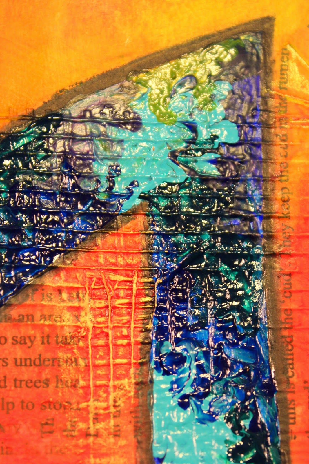
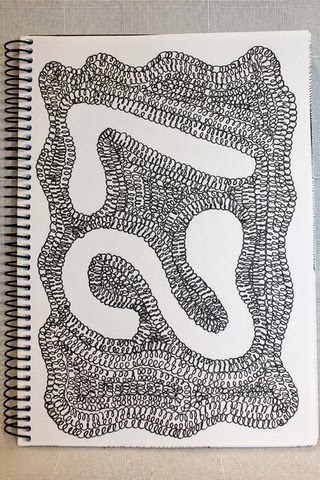
Saturday, February 21, 2015

Art Journal - Illustrated Alphabet - B is for Background

If you've just arrived at my blog having watched my new video on YouTube... hello, hello, hello. You're either here to know what are the 22 mists/sprays that she used on this page or you want to know... did she really use 22 different mists/sprays on this page or was that an exaggeration?
The answer to all these questions and more is further down the page... but please don't skip down straight away, you might miss something interesting.
If you've arrived at my blog because you follow it or you stumbled onto it by some random twist of fate then welcome, welcome, welcome. If you haven't checked out my video, then you really must as it shows you how I created this art journal page,  albeit at a great rate of knots.
I'm typing this up while I wait for the aforementioned video to upload to YouTube... I call it multi-tasking... and as it just takes so long to upload it's also a boredom prevention for me at least.
This week's page was "B" for Background. If you think the page looks unfinished, and I totally respect your assessment if you do, then that's okay. To some extent I agree with you. I could have done a lot more, even just a few more things to finish it off... but, having said that, I also disagree on the grounds that because the page is all about "backgrounds" then that is what I wanted to show and I didn't want a lot of embellishing to over power the back grounds... they are after all the "stars" of the page.
The page was created over a couple of days as I allowed for some drying time overnight, particularly for the moulding/texture paste to dry. As much as I just love my heat tool, I do find that with texture paste all it tends to do is bubble up when you try to force dry it. I have used this to my advantage on earlier art journal pages to give me some puffy looking circles I had wet embossed onto my project but in general it's not something I tend to create all that often. I also tend to take my time when I'm creating so I can enjoy the process. I know I will never win any speed creating prizes, cos that's just not my style.

So let's get down to business...

Products Used:
  • Pre-gessoed page (Faber-Castell Gesso)
  • Die-cut Chipboard "B" approximately 6" x 3 1/2"
  • UmWow Studio - Star Confetti
  • Faber-Castell Whipped Spackle
  • Liquitex Matte Gel
  • Lindy's Stamp Gang Magical - Tiffany's Blue
  • Pearl Ex - #685 - Spring Green; #686 - Turquoise; #687 - True Blue & #688 - Misty Lavender
  • Lindy's Stamp Gang Mists
    • Flat Fabio - Danny Zuko's Denim (1)
    • Starburst - Tibetan Poppy Teal; Screamin' Banshee Black; Hydrangea Blue; Whale Watch Blue; Sea Grass Green; Freaky Franken-Lime; Ponderosa Pines Olive; Tiffany's Blue and Lucky Shamrock Green (9)
    • Moonshadows - Ethereal Emerald; Gossamer Gold; Buccaneer Bay Blue; Mystic Malichite and Tawny Turquoise (5)
  • Prima Color Bloom - Lime Wedge; Summer Sky and Storm Cloud (3)
  • Heidi Swapp Color Shine - Chartreuse (1)
  • Tattered Angels Glimmer Mist - Gold and Monster Mash (2)
  • Tim Holtz Adirondack Color Wash - Stream (1 - total 22)
  • Tsukineko - Versamark Ink Pad
  • Donna Salazar's Mix'd Media Inx Embossing Powder - Denim
Tools Used:
  • Mechanical HB Pencil
  • Palette Knife
  • UmWow Studio Mask/Stencil - Star Confetti Mask
  • Cake/Clay Modelling Tools
  • Small head and large head paint brushes
  • Heat Tool
  • Tweezers
  • Upsy Daisy - Joyful Jots Acrylic Stamp Set
Process Steps:
As soon as I had decided my theme would be background techniques, I knew I wanted to create a page that showed off a number of very distinct and very different styles / techniques but with a cohesion to the overall look of the final page. I decided that the best way to "blend" the various styles would be to blur the edges between one technique and the next rather than leave them in distinct boxed areas. The second key tool to creating a cohesive look would be my use of colour to draw the various components into one complete unit and my all-time favourite way to add colour, is to use mists and sprays. 
  1. Starting with my pre-gessoed page, I aligned the chipboard "B" on the page and drew around the edges so I knew where I could and couldn't add texture to my page.
  2. Starting in the bottom left corner (using the visual heavier weight to anchor the page), I started to randomly adhere pieces of the chipboard Star Confetti using the matte gel. I started with the larger pieces first then gradually selected smaller and smaller pieces adding them between the larger pieces as well as "fading" out from the heavier centre of the chipboard area in the corner of the page.
  3. In the top right hand corner I then added some more stars using the coordinating mask/template - Star Confetti with some whipped spackle. This was a little bit trickier to stay outside of the "B" shape, so I did have to clean up a little over flow so that it didn't impede the chipboard "B"'s ability to lie flat.
  4. In the top left hand corner I spread some whipped spackle out with my palette knife then I drew wavy lines into it to create texture reminiscent of tree bark or vines. The inspiration for this technique came from Aaron on his YouTube Channel - Imperfect Impulses. I made sure to bring this right down the page to inter-weave the pattern amongst the upper-most stars which I had purposely left more open than further down the page.
  5. In the final corner I wanted to experiment a little with pre-colouring some of the whipped spackle. I put a generous couple of scoops into a small resealable container then added some colourants - magical and pearl ex powders being mixed together to try to get the perfect colour. Side note - although the colour was quite nice, it just wasn't what I wanted (not that I really knew what I wanted). Rather than keep blending for the sake of experimenting, I decided to settle for the colour created - for the time being.
  6. I spread some of the tinted whipped spackle onto the remaining space around the "B". Using a icing/clay moulding tool with fine corrugations on it, I created a series of peaks and valleys which kind of swirled from one point out in slightly different directions. I think it looks almost like the veins of a feather, not the fluffy ones, but the slick, flat feathers that kind of look fused together.
  7. At this stage I left all the gel and moulding paste to dry overnight.
  8. I wasn't happy with the intensity of colour in the tinted moulding paste, so I added some more of the magical and pearl-ex in small patches across the tinted area then using a small brush I spread the colour across the surface making sure to get the additional colour both in the valleys and peaks of the surface. I then dusted off any excess with a large soft headed brush. Much better and the shimmer considerably more visible as well.
  9. Step 9 is the colouring of the page and through it's just listed as one step here, in reality it's a lot of little steps all rolled into one for the sakes of brevity. I did all of the rest of the colouring of the page using various mists and sprays - 22 different colours to be exact. Do you have to use that many - no. Use what you have and what you like. You can give the impression of having more colours than you really have, by varying the intensity of the spray that you use. Spray a lot in one area but only a little in another. Spray from different heights. Dry in between layers or mix colours while they are wet. This all combines and mixes and mashes to create a totally unique and individual look that no one else will ever be able to recreate - not even you. My first layer of colour is usually the only layer that I cover the entire piece. After that it's usually a patch or a section only. I generally also use between one and three colours before drying with my heat tool. I may cover the entire page or only a portion before I dry the colour as well. And I use my heat tool as well as tilting my page to assist with mixing and blending the colours. Just keep layering with more mists/sprays and more colours or add more of the same colours until you reach the look that you like.I have been known to add so many layers I lose count not to mention not knowing how long this step takes. The final layer is also usually a light layer across most or all of the page with either a silver or gold just to add that final touch of opulence. For this page it was a light mist of gold.
  10. Phew nearly there... last step was to add the title - "Background". I knew the fit for the alphabet stamps I was using was going to be very tight width wise. I laid them all out along the backbone of the "B" and they didn't quite fit - but only just. The only way I would be able to make it fit would be to ink and stamp each letter individually then eye-ball how much space I wanted to leave between it and the next letter. If I was using a coloured ink, not too big a deal, but as I was using a clear ink to then heat emboss, I had to create each letter start to finish before moving on to the next one. Otherwise I wouldn't have been able to get the spacing right because I couldn't see the letter I'd just stamped. Usual process for this... stamp with VersaMark ink (my ink of choice for embossing but you can use whatever you prefer). Generously sprinkle with embossing powder - usually I sprinkle directly out of the pot but I wanted a little more control over where the powder landed given there was just so much texture on this page. Using a wide palette knife allowed me allowed me to do this. Shake off the excess embossing powder and clean up the image with a small paint brush then heat set with my trusty heat tool.
And that's all there is to it. I didn't add a border to the page this time as I didn't feel it needed it and the texture is so strong that I don't think it would have actually looked right.
I love this finished page. It's very me, very much my style as far as backgrounds. And I have lots of texture myself... (If you've ever met me, you'll get what I mean LOL).
There are some photos below and of course you can see the finished product in the video, but neither seems to capture the colours how I see them in real life... not sure how to resolve this... maybe you all just need to pop on over to New Zealand to check it out yourself!!

Top left hand corner of the page. The bark / vine look inspired by Aaron from Imperfect Impulses (believe it or not). I definitely need to try this technique on a tree form to see if I can create realistic looking tree bark... challenge issued! 
Love the colour blending and striation. This also shows how two distinct techniques / styles blurred / ran together rather than being segmented by a harsh border.
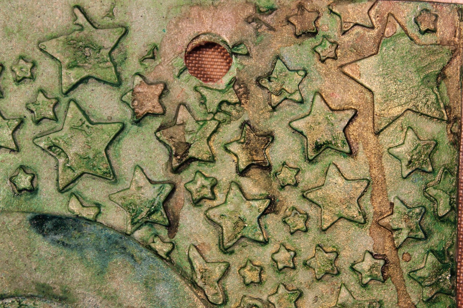
 
Stars created using mask / stencil from UmWow Studio. 
Stars created using die cut chipboard Star Confetti from UmWow Studio. This has got to be my favourite section of colouring. I love the deep, dark, moody blue-ish black look with just a hint of gold to break it up.
 This has got to be my favourite textured part of this page. I think it almost looks like a peacock feather. I'm really pleased with the way the colouring worked out. The rivulets of colour were intentional and looked even better than I expected.
Heat embossing so that the letters would stand out a little as colour wise they almost blended into the background which is what I wanted.
Love, love, love this grungey, distressed style. 
The next few photos are all about showing the dimension of the page created by the varying techniques used. It may also have been just a little of me playing with perspective when I was taking these photos.
 Hmmmm more of the delicious moody blues.
This piece looks even better from this angle. 
Love these stars. The green looks slightly warmer, more golden but still a great colour. Love me some green!! 
Considering this was merely a filler upper of a gap, I'm really pleased with the way they turned out. I had no expectations so the final look is awesome. Almost looks like craters on the moon LOL. 
Maybe another one of those mysterious perspective photos that just slipped in... 
At last the final page in all it's glory. Love it, even if I do say so myself! Just wish the colouring looked a bet closer to reality.

I do have the following products available in my online shop. Be sure to get yours before they are all gone. If you haven't already subscribed to my YouTube Channel please be sure to head over and click the button. I'd hate for you to miss out on any other pages I create for this A - Z Illustrated Alphabet Art Journal of Art and Craft Styles and Techniques.
You can also find me on Facebook, Instagram, Twitter, Pinterest and Google+.

Lindy's Stamp Gang Starburst Set - Sweet Treats - I used Tiffany's Blue from this set but the other colours in the set are equally gorgeous in their own right. I've just had some new sets arrive so these will be going up on the website this week.

Friday, February 13, 2015

Art Journal - Illustrated Alphabet - A is for Abstract

Having come up with inspired idea for a theme for my A - Z Art Journal, I then sat down to come up with my list of techniques and styles in preparation for creating page 1... the letter "A".

Some might say this is cheating but I have to beg to differ. I did this step because...

  1. I am a planner and organiser type personality;
  2. I have in mind some specific techniques and products that I want to try and I wanted to make sure that they were included... and I didn't forget about them until I got down to X, Y and Z.
  3. And because when I started to think about the list, I realised that some letters are really hard to come up with art styles and techniques for... like "Q" and "X"... so the planning stage gave me an opportunity to answer the difficult questions... up front.
  4. And because this was something I could do at work in my lunch break. (30 minutes is not really long enough to pull out paints and paint brush especially if I want to video my creative musings.)
Now before anyone starts pointing fingers and asking me what about the cover page... which I mentioned in the first video of the series about preparing the album... yes I have purposely left this until further down the track.

I happily, openly and with full disclosure admit that I am a perfectionist. I'm a Virgo. It comes with the territory. Having confessed this... I am also happy to add that I have learnt that this little personality trait means I tend to put a great deal of pressure upon myself because I have such incredibly high expectations of myself... sometimes unachievably high expectations. Over time and with a great deal of soul searching, I have learnt ways of reducing the pressure I place on myself and one of them is by not doing the first thing that you will ever see on a project, or in a book... well first. I allow myself time to get into the groove of things until such time as I can really feel the inspiration and motivation and MOJO are right there, in this moment and now is the time. I'll let you know when that time arrives...!

So let's get down to business...

Products Used:
  • Pre-gessoed page (Faber-Castell Gesso)
  • Fibatape - Drywall Joint Tape (Available at Hardware/DIY Store)
  • Printed Deli Wrap
  • Liquitex Matte Gel
  • Golden Fluid Acrylics - Pyrrole Red; Pyrrole Orange; Hansa Yellow; Quinacridone Magenta; Burnt Sienna; Green Gold; Teal; Ultramarine Violet; Ultramarine Blue; Phthalo Green (Blue Shade); Phthalo Blue (Green Shade)
  • Golden Acrylic Glazing Liquid (Gloss)
  • 2B Pencil
  • Stabilo "All" Pencil Black
  • Faber-Castell Gelatos - Lemon; Banana; Mango; Tangerine; Blood Orange; Red Cherry; Chocolate
  • Viva Decor /Inka Gold - Gold
  • Faber-Castell PITT Artist Pens - Walnut Brown; Black
Tools Used:
  • Palette Knives (various styles and sizes)
  • Paint Brushes (various styles and sizes, including Zig Water Pen)
  • Royal Sovereign Ltd - Colour Shaper #2 Taper Point - Firm
  • Water Spritz Bottle
  • Paint Palette
  • Tim Holtz Tonic Scissors
  • Baby Wipes
Process Steps:
With the theme of "Abstract" I knew I wanted this page to be bright and out there and in your face and I knew I had to have a bloody great big "A" on it, but that was pretty much all I really had in mind when I started out.
  1. Cut and adhered down some strips of drywall joint tape. I cut the tape different lengths and widths and stuck it down. Even though it is self-adhesive, I did go over the tape with some matte gel, just to be on the safe side.
  2. Tore up some of the printed deli wrap and adhered this in place with the matte gel as well. I wasn't too specific, just overlapped some of the pieces from both of these two steps.
  3. Put some drops of the warm paint colours directly on the page, spritzed a little water, then covered the entire page in colour blending the paint and water just with my finger tips.
  4. I wanted the colour to be more intense, so following the colour blocks laid down in the previous step with the acrylic paint, I added some coordinating gelatos over the top blending them in with a little water and again just using my finger tips. Some areas ended up getting three or four layers of gelatos while some only needed a couple of layers. Once I was happy with the colour intensity, I heat set the gelatos so they wouldn't move as I added the next layers.
  5. I sketched in my "A" with the 2B pencil, then went over these sketch lines with the Stabilo All Pencil when I was happy with the size and form of the outline. I then lightly painted in the pencil lines with a water brush to turn this from pencil lines into permanent India ink lines.
  6. I painted a couple of layers of white gesso inside the letter with a small brush so I would have a blank canvas to add the next layer onto. (I did actually like the plain white letter and was tempted to just leave it white but didn't think this was "abstract" enough like that.)
  7. I selected my cool colours and put three drops of each colour into my paint palette, then added equal amounts of glazing fluid. I mixed these thoroughly then painted a light coat in a random patchwork type design using a small paint brush. (I will confess that I was quite disappointed at this stage and was tempted to wipe the paint off and go back to just plain white but then I remembered that that wouldn't be abstract enough so I decided, ahh well, there's no turning back now, so just make the most of it.)
  8. I wasn't happy with the look from the paint brush so I decided to experiment with a fine tipped colour shaper. These are like a paint brush, but instead of having a brush made out of individual fibres, they have a rubber head shaped like a brush head. I figured if nothing else, at least it should be easier to clean than a paint brush. (Can you spot Miss Perfection's ugly head making an appearance??)
  9. When I tried adding the paint using the colour shaper, I couldn't get an even paint layer. Some parts came out ultra thick and some were thin and almost watercolour like. I tried emphasizing the blended areas where two paint colours met and rather than making the blended a smooth transition, I encouraged the two colours to blend, but still remain distinct. (Sorry but this bit really needs to be seen to be understood). The other thing I noticed was that this technique was making my acrylic paints act as a faux oil paint and even though they are very small peaks and troughs, the dimension is nonetheless still very evident. 
  10. Just to clarify... I am no oil painter. I don't have the patience to wait for the oil paint to dry and I'm too much of a perfectionist that I'd never get my brushes, palette knives and palettes clean enough to actually do any oil painting. My mother however, loves oil painting. (A debate that will last forever between us as neither of us will ever concede to the other's product of choice.) As a child and teenager, I used to watch her paint with oils. I watch how she created dimension using both brushes and palette knives to add interest to her sea scapes and sunsets and I guess somewhere along the way I may have learnt some techniques from her even if I did (please forgive the term) bastardize them to use with acrylic paints. Anyway I really love the end result!
  11. Once the paint inside the letter had dried I went around it again with the Stabilo All Pencil and water brush just to darken up the framing.
  12. I added some gold highlights on the raised bits of the drywall joint tape that were still just the background colours.
  13. To frame the piece I added some Chocolate gelato around the edge of the page and blended this with my finger. I then added a thin line of PITT artist pen which I also blended in with my finger and finished with edging the external edge with black just to hide any lighter bits that I might have missed earlier.
  14. I added the title "Abstract" again using the Stabilo All Pencil and water brush.
I really love the end result of the page especially the faux oil painting technique. Will be definitely trying that again!

 The finished Art Journal Page.
 Above and below - close up of the faux oil paint texture, made using fluid acrylic paints and glazing fluid.
 I really love the distinctive blending I was able to achieve with this technique, using the fine tipped colour shaper.
 Gold accents to highlight the texture of the drywall joint tape.
And a hand lettered title to finish the page.

Friday, February 6, 2015

Illustrated Alphabet Art Journal Album - Part 1 - The Preparation

If you haven't already seen it then I suggest you take a wander over to my YouTube Channel and check out the video I posted, the first of many, that shows the start of my new Art Journal project for 2015.

I was inspired by my good friend Aaron over on his YouTube Channel - Imperfect Impulses. Last year he created an A - Z album which I really enjoyed watching him create. I thought this would be a great idea for me to do this year, but I wanted to put my own spin on it (as you do).

So I pondered the theme of my art journal for a few months... yes it took a while to come up with my own twist. Of course having just returned from the States meant I was really inspired... I just had too much work to catch up on at my "real" job (you know the one that pays the mortgage and power and food bill) so the actual turning the inspiring into reality took a little longer than I hoped.

Over the Christmas and New Year break (here in New Zealand it's Summer, so we have a long holiday break at this time of the year) I caught up on some YouTube watching and I watched a few videos demonstrating Calligraphy. Now this was an art form I tried back in my teenage years so it was almost like going home. It didn't take too many videos to click on what my theme would be for my art journal... An Illustrated Alphabet.

To take it one step further I decided that the theme of the illustrations would be art styles and techniques so my completed art journal could also be used, once it's completed, as a source book or handbook of styles and techniques for any time I get stuck for an idea and need something to help re-ignite my crafting MOJO.

I considered the selection of art journals that I had in my stash and eventually decided to use the Prima Marketing Mixed Media Art Journal 9" x 6", but use it vertically rather than horizontally. It just seemed to fit the stylings of an alphabet better, especially when I was considering that some letters might have long tails or uprights... depending upon how I ended up actually creating them.

As it is also going to fulfil the purpose of being a handbook of techniques, I also decided I was going to experiment with all those products that I have in my stash as well as any that I happen to acquire during the creative process. Which is why you will see a long list of different gessos in a paragraph or two.

My art journal journey will be as much about experimenting with various tools and products as well as investigating the interaction between products used, as it will be a documentation of the techniques tried.

I hope that I can give you ideas for new or different ways that you can use your tools as well as your products, because let's be honest there can be a lot of money invested in them so we want to make sure we are getting our money's worth out of them. And just quietly, I'm really not a huge fan of tools that can only be used one way. In fact I flat our try to avoid buying anything like that. I want versatility and multiple uses so I can rest assured that I am getting value for my hard earned money spent.

Getting off soapbox now...

Products used in Album Preparation:

  • Prima Marketing Mixed Media Art Journal 9" x 6"
  • Elmer's Glue Clear & White (stick pages together)
  • Gesso: Faber-Castell Gesso; Golden White & Black Gessos; Liquitex Clear Gesso; Prima Marketing Finnabair Art Basics Clear & White Heavy Gessos
Tools used in Album Preparation:
  • Recycled Credit Card (For gluing pages together step & painting gesso)
  • Brayer (To ensure good adhesion of pages together)
  • Princeton Catalyst Blade (Shape 6 30mm)
  • Paint Brush
  • Wet wipes
  • Paper Towels


Wednesday, October 1, 2014

It's back...

Just when you thought it was safe to carry on with your crafting... you turn the page on the calender and realise... it's back... time to begin the countdown to my Christmas Craft Challenge.
Today is the 1st of October. That means here in New Zealand we are one month into Spring, it's 30 days until Halloween (not that we really celebrate it here), I've been back in the country two weeks and it's two months until the 1st of December which is officially the start of my Christmas Craft Challenge.
The 1st of October is the day I post my official reminder for the kick off of the Christmas Craft Challenge in exactly two months.
By now I have usually forgotten all about last year's stress and the self-imposed pressure I put myself through so I once again blindly commit myself to doing it all again. 
This year will be the 6th year in a row that I have been doing this. When I first started there were very few crafters doing this sort of thing... well at least few who were blogging about it. Last year they were everywhere. There were so many people blogging, photographing and posting their Christmas creations that it close to being overwhelming.
So why do I put myself through this? We all participate in crafting challenges, especially at Christmas, for many reasons... some more practical than others - boost sales, get your name our there to build demand for your crafting or design services or for design team exposure. Some may be hidden behind a guilt about having committed to doing "X" amount of crafting during the year and then discovering in October/November that you've fallen short on meeting your targets. For those in the Northern Hemisphere it may be related to heading into the cold, miserable Winter months, when indoor pursuits are all you can do unless you don't mind standing around freezing, knee deep in snow waiting for the next chair lift. And if like me you don't fit into any of the above... then just because.
Back to this year's Christmas Craft Challenge...
Well last year's went horribly wrong, I don't mind admitting it. I was working full-time from the start of November having been unemployed for some time, and I was sick as well (no time off when you are contracting)... so my Christmas Craft Challenge turned into a New Year's Craft Challenge for the most part.
I'd like to think I learnt something from last year, so this year I'm not going to commit myself to one craft project a day as Christmas is busy and stressful enough at times without adding pressure to myself for no particular reason. Instead I am happy to commit myself to a minimum of one blog post a week for the four week period. Anything over and above that is a bonus. Each blog post will cover a minimum of two craft projects.
This is doable, without killing me, killing Christmas for me or for me ending up wanting to kill my family for adding to my stress.
Play along at home as well or just pop by to look at what I have created. If you are playing a long at home and will be sharing your own projects on the net somewhere, be sure to leave me a comment to let me know where so I can check you out (well your crafting) and give you a plug on my blog.

Thursday, September 4, 2014

USA Update 1

Can I just start out by saying OMG... I can't believe I am actually here... here as in, actually IN the UNITED STATES of AMERICA.
There was a time when I thought that not even in my wildest of dreams would I ever get to step foot in this country. Then plans were set in motion and even though I had my passport and my plane ticket I still thought something would pop up to prevent me from actually making it here but it didn't and I spent hours and weeks and months stressing and worrying about nothing. Yes I am a worrier... but moving on.
I (I should say we, as my darling hubbie is with me)... We are here in the US of A and have been here a few days.
So what's happened so far...

  • 12 hour flight from Auckland, New Zealand to Los Angeles... in cramped, uncomfortable seats, including getting severe leg and foot cramp in my left leg... I wasn't a happy flier.
  • One night only in LA... in a really hard bed so that I didn't catch up on any of the sleep I didn't get on the plane.
  • Driving a big beast of a car, on the wrong side of the car, on the wrong side of the road when I'm used to driving a sports car about 1/3 the height of what the rental car gave me.
  • Three nights in Las Vegas... and yet another hard bed. Three fabulous shows... "Absinthe", "KA" by Cirque du Soleil and "Jubilee". Driving up and down the strip, seeing so many people in one spot all at once and so much neon!
  • Shopping at Walmart (a big deal as we don't have them in New Zealand lol) and picking up some great crafty bargains.
  • Finally getting to look around the many, many, many shelves of Viva Las Vegas Stamps at their 19,000 odd stamps and trying not to spend ALL my money there. 
  • Buying stamps for myself as well as for my store.
  • Meeting the absolutely lovely DeeDee at VLVS where she works as well as designs for them and her own label UmWowStudios. 
  • Picking up not one but two boxes of UmWowStudios products from DeeDee... and biggest frustration... not actually be able to do any crafting with it!!
  • Meeting Aaron Blazevich of Imperfect Impulses who I have followed on YouTube for a long time now as well as being a friend on FB etc etc. 
  • And getting spoilt by Aaron when he gifted me some of his stash of printed Deli Paper (also something we don't have in New Zealand). I so wasn't expecting this. I made a cheeky comment on one of his videos on YouTube about wanting some and I was so flattered that he remembered!
That's pretty much it so far. Not too bad for 840 odd miles, 4 States and 6 days. There are pictures... they will follow... just this hotel wifi is not the greatest and keeps crashing on me.

Be sure to check back for more updates and photos (eventually). You can also see updates on my Facebook account. Look me up if you're not already a friend there.

Catch up with you again soon... not sure where from!

Saturday, July 5, 2014

In eight weeks time...

Yes I know I have been absent, missing, neglectful even... I'm a terrible blogger, inconsistent, irregular... but hey life goes on and I'm not going to stress about it. (Once upon a time I would have been very distraught but now I'm more mellow... just ask my family).
I have been busy... not as busy as I would like actually doing crafting... a lot of spending on craft things but not a lot of actually using. I'm still working full-time and will hopefully soon full-time permanent which will mean no respite or additional time for crafting but it will mean more money for buying crafting type bits and pieces, and food and keeping a roof over our heads!!
I have also been very busy planning and actioning one of both my husband and my bucket lists items. Eight weeks tonight we will be finally winging our way to the US from little old New Zealand. It will be a combination holiday and business trip as I hope to visit some crafting shops as well as attend some classes... still working on finding what's available, when and where we are going to be.
We will be catching up with some online friends including some crafting friends of mine who I can't wait to meet. The first part of our trip is quite planned as we are driving from Los Angeles to Oklahoma and have to be there in time for a 50th birthday. After that we will be reverting to what we New Zealanders refer to as "Tiki Touring" our way to Newark where we will finally start our journey home. Just seeing where the road takes us, stopping where we feel like stopping and just enjoying a hopefully relaxing holiday (or vacation lol)... yes and squeezing in as much crafty goodness as I can get away with while trying to make sure my husband is not totally bored to tears.
Watch this space for updates before... during (hopefully)... and after our fabulous trip.
And if anyone has any suggestions for MUST VISIT places along the way (especially crafting or vintage type places) please let me know.

Saturday, February 1, 2014

The Doodling Un-Challenge - The Finale

It's now the first of February so my Doodling Un-Challenge for January has finished. Below are the last group of doodles for the month.
 Day 24 - Cobblestone
 Day 25 - String Theory
 Day 26 - Checkered Flag
 Day 27 - Pot Scrub
Day 28 - Retro 
 Day 29 - Palm Fronds
 Day 30 - Chicken Scratch
Day 31 - Layered Doileys

FINAL CONCLUSION:
Yes I managed to get all 31 doodles drawn... one for each day of the month. Did I do them on exactly the right day... no. I started late so had some catching up to do and then I got sick towards the end of the month, so had to catch up a couple. (Luckily I had managed to get a couple ahead, so it wasn't as bad as it could have been).
Would I do it again? Probably yes, though not straight away. I am not now, nor have I ever really been a doodler, at least not much more than the odd cube when I'm talking on the telephone. Some days were really easy, some days were not and towards the end I did feel like I was struggling a little to come up with new ideas that still fit within my chosen constraints. Did I stick with the constraints - YES and I am really pleased with myself for that.
I really like some of my doodles and there are also a few that I really dislike... a couple so did not turn out as I envisaged in my head, but that is the nature of being creative. And that is why I've shared the good, the bad and the ugly. Even though I did maintain some relatively tight constraints I still found the process quite liberating and it was great to feel "creative" again especially as I'd been feeling like I'd lost my MOJO after being sick in December and my Epic Fail Christmas Craft Challenge, and then having a relapse towards the end of January.
My thanks go out to PoetSpice for the inspiration and Debbie who led me there in the first place. But now that my Doodling Un-Challenge has finished... how am I going to fill my lunch breaks?