These took me a while to get the picture I wanted... but along the way I did get some interesting shots. Can you pick what they are before you get to the final photo?
The "pegs" or "pins" or "hooks" I use in my peg boards to display products and tools for sale in my studio or at craft shows.
Sunday, July 14, 2013
Post Number 350
I can't believe I've finally made it to blog post number 350.
This one has been hanging over my head for a few weeks and it's not that I've been avoiding writing it, reality is I've just been too busy to step anywhere near the blog and I apologise for that.
Last weekend was the SENZ Craft Expo here in Auckland. It was the 10th anniversary, though their 13th craft show, so was kind of a big deal all around.
It was a really big deal for me, because this year I was sharing my stall with two of my dear friends who I met online through Artistic Creationz forum (formerly Crafting Passionz) - Faith from down in the Waikato and Kimi from Australia. Faith talked me into the craft stall this year as I had been umming and ahhing over whether or not I should do it. And then once the decision had been made the suggestion was jokingly made that Kimi come over from Australia to help out. Obviously not so much of a joke...
Both of these ladies are incredibly talented. Kimi's creations can be found on her blog Unique Scrappiness and YouTube channel by the same name. Faith who is equally talented can be found on her YouTube channel nzaquarious2008.
More on these talented ladies and our crafty weekend in another post. In this post I wanted to share the fruits of my labour for the craft show and my new company name for the display. (Well same old name, but new display.)
This one has been hanging over my head for a few weeks and it's not that I've been avoiding writing it, reality is I've just been too busy to step anywhere near the blog and I apologise for that.
Last weekend was the SENZ Craft Expo here in Auckland. It was the 10th anniversary, though their 13th craft show, so was kind of a big deal all around.
It was a really big deal for me, because this year I was sharing my stall with two of my dear friends who I met online through Artistic Creationz forum (formerly Crafting Passionz) - Faith from down in the Waikato and Kimi from Australia. Faith talked me into the craft stall this year as I had been umming and ahhing over whether or not I should do it. And then once the decision had been made the suggestion was jokingly made that Kimi come over from Australia to help out. Obviously not so much of a joke...
Both of these ladies are incredibly talented. Kimi's creations can be found on her blog Unique Scrappiness and YouTube channel by the same name. Faith who is equally talented can be found on her YouTube channel nzaquarious2008.
More on these talented ladies and our crafty weekend in another post. In this post I wanted to share the fruits of my labour for the craft show and my new company name for the display. (Well same old name, but new display.)
The completed display name for my company on the wall at SENZ Craft Show 2013.
And now a close up of each letter and the clustering of colour on each flower.
The base of each clustering is tapes - washi, self-adhesive, coloured sellotapes etc and these are topped with flat and dimensional flowers of the same colour and accented with coordinating rhinestones.
Most of the dimensional flowers will soon be available on my website - www.scrapfx.co.nz.
Labels:
Altering,
Artistic Creationz Group,
Craft Shows,
Flowers,
Off-the-page
Fifty {Two} Shades of Grey - Week 27
Sorry a little late on this one as I was "tied up" with a craft fair all last weekend... and preparing for most the week before that.
Can you pick what this is?
Hopefully you've come up with a few different ideas. Obviously it's metal pins or pipes or tubes of some description... the solution is contingent upon determining the extent of the zooming...
Before I give you the answer... there is something magical about the way metal reacts when used. What was once shiny and reflective becomes dull and scarred. Sure you can attempt to polish it to bring back that original lustre and shine but its never quite the same. Never quite as smooth or as polished or as reflective.
And these items are no exception. They have been well used, though not exactly for their originally designed purpose...
They are...
Butcher's hooks... not usually part of your scrappers/crafters tool kit, though they are part of mine. I use these for hanging my peg boards in the studio at home or when I take them (and anything else I want to hang) to a craft show, to hang from the dividers that separate the stalls at craft shows. The dimensions of the hook fit perfectly over the width of the portable walls and they are strong enough to hold a fairly heavy load. I would definitely be lost without them now that I have them in my stash. They look a bit viscous and if handled incorrectly could do some damage to soft flesh, so definitely a tool that I take care with.
Can you pick what this is?
Hopefully you've come up with a few different ideas. Obviously it's metal pins or pipes or tubes of some description... the solution is contingent upon determining the extent of the zooming...
Before I give you the answer... there is something magical about the way metal reacts when used. What was once shiny and reflective becomes dull and scarred. Sure you can attempt to polish it to bring back that original lustre and shine but its never quite the same. Never quite as smooth or as polished or as reflective.
And these items are no exception. They have been well used, though not exactly for their originally designed purpose...
They are...
Butcher's hooks... not usually part of your scrappers/crafters tool kit, though they are part of mine. I use these for hanging my peg boards in the studio at home or when I take them (and anything else I want to hang) to a craft show, to hang from the dividers that separate the stalls at craft shows. The dimensions of the hook fit perfectly over the width of the portable walls and they are strong enough to hold a fairly heavy load. I would definitely be lost without them now that I have them in my stash. They look a bit viscous and if handled incorrectly could do some damage to soft flesh, so definitely a tool that I take care with.
Saturday, June 29, 2013
Fifty {Two} Shades of Grey - Week 26
Half way through the year already...
And the last Christmas decoration until closer to Christmas...
I wasn't going to add this picture because it was just out of focus, but when I took a closer look, without meaning to, I managed to achieve a bokeh look that I really like.
And here is the in-focus, glittered bauble. Sweet, but I think I like the bokeh look better... what do you think?
And the last Christmas decoration until closer to Christmas...
I wasn't going to add this picture because it was just out of focus, but when I took a closer look, without meaning to, I managed to achieve a bokeh look that I really like.
And here is the in-focus, glittered bauble. Sweet, but I think I like the bokeh look better... what do you think?
Saturday, June 22, 2013
Fifty {Two} Shades of Grey - Week 25
I love Christmas... this is why I do my annual Christmas Craft Challenge after all... so I love Christmas decorations. I usually try to buy at least one new decoration each year and for the last three years has made several of my own as anyone who has followed my blog will well know.
This is a plastic filigree ornament that actually hangs from a string of plastic beads along with plastic filigree bells. I was surprised at the level of detail in the molding of these ornaments... that's an awful lot of dots! I have some individual filigree ornaments very similar to these that I adhered some bling onto to make them look a little more special. Just one way that you can personalised ornaments and make then look much more valuable, but for very little cost.
(Maybe I should add that to this year's Christmas Craft Challenge blog list!)
This is a plastic filigree ornament that actually hangs from a string of plastic beads along with plastic filigree bells. I was surprised at the level of detail in the molding of these ornaments... that's an awful lot of dots! I have some individual filigree ornaments very similar to these that I adhered some bling onto to make them look a little more special. Just one way that you can personalised ornaments and make then look much more valuable, but for very little cost.
(Maybe I should add that to this year's Christmas Craft Challenge blog list!)
Tuesday, June 18, 2013
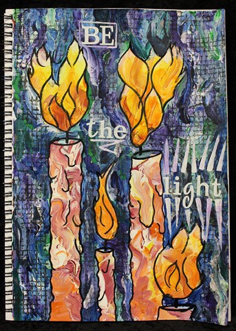
Art Journal Page - Be The Light
I did this page for a MOJO Challenge on Artistic Creationz Facebook Group. We could make whatever we wanted so long as it included the phrase "Be the Light".
I decided to make another art journal page, again using what I had learned from Donna Downey, but this time I did some extras on the page as well.
The finished page... "Be The Light".
Given the title, I knew before I started what image I wanted. I didn't know exactly how it would look, but I knew it would be some kind of candle.
I started with a background of warm acrylic paints - yellow, orange and red with white gesso. I drew the candles and flames in with charcoal pencil and then coloured the background with a cool palette of acrylic paints - light blue, dark blue, green, teal and purple, together with white gesso.
Once this was all dry I went over the charcoal lines with black Indian Ink, including adding some more detail to the candles for melted wax drips as well as the flames.
I wasn't happy with the colours of the flames, they didn't really look like flames. I added some water soluble oil pastels in white, yellow, mustard, orange, and red. I blended these with my Zig water brush and then my finger to get more the colouring I wanted but without hiding the underlying blending of the acrylic paints.
To darken the background so the "light" would stand out more, I stamped using a Glitz Distress Stamps - grid stamp and black acrylic paint dauber. I stamped by hand rather than using an acrylic block as this allowed me to stamp only in the areas I wanted around the candles and flames, rather than in distinct rectangles.
I added the title using some white glitter alphabets from Making Memories and highlighted these with some white acrylic paint. I was trying to have these quite an opaque white, but when it had dried the underlying colours had tinted the white a little and I do prefer this to the stark white.
Close up of the flames. The underlying striations in the acrylic paint show through really really well, particularly in the bottom of this uppermost flame.
This flames looks considerably brighter with the water soluble oil pastels added than they had looked with just the acrylic paints.
I really like the way that some of the gesso appeared to have a "cracked" paint look in some places, as seen in this close up of one of the candles.
Close up of the grid stamped with the black acrylic paint, using the Glitz Distress Stamp. I also love the way this cool palette looks like paua (abalone) shell, particularly with the black highlighting.
You can see the underlying colours coming through the white "light beams".
Monday, June 17, 2013
Art Journal Page
I've finally been working on some more pages in my art journal. Here is the first page.
I used the techniques that I learnt from Donna Downey at Creative Adventures Downunder 2013, and repeated the exercises that we did in class, though this time I started with a cool palette of colours - light blue, dark blue, green and purple acrylic paints mixed with white gesso.
When I drew the image this time, I drew discrete images rather than one continuous line. I then coloured the background once again but this time with a warm palette of colours - yellow, orange, red and hot pink acrylic paints with white gesso.
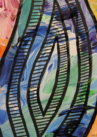
When I went over the lines I had drawn with Indian Ink, I extended these inside the image to add additional dimension, then added texture to the image with fine detail lines. Doing this, brought back memories of being a teenager and doing many a pen and ink drawing for art class.
Close up of some of the detailing as well as the texturing of the background.
I really love the way the colours mixed yet still retained their vibrancy in this painting.
After I had finished my art page I created an extra background by swirling and dabbing the leftover paint onto another page. I REALLY love the way this background turned out and I will definitely be doing something more with it soon.
Subscribe to:
Posts (Atom)