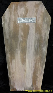
Well technically they were coffin cards... but that wouldn't have raised as many eye brows.
This month my step daughter Alysha turns 21. She decided very early on that she wanted a party and the theme of the party would be Zombies.
The invitations therefore needed to be appropriate to the theme, so after some googling for Halloween ideas, coffins were the stand out idea to try. As some invitations had to be posted out around the country, I wanted a flat coffin design rather than making three dimensional boxes which would probably be squished along the way through the postal service.
I found a pattern for a bi-fold card in a coffin shape. I wanted a little bit more design than this, so I adapted the pattern to a tri-fold card still in the same coffin shape. The folds are all on the long side of the coffin. As I had to make 30 invitations, I cut a template for the card from plastic so that all invitations would end up the same size and shape.
This is the card as it looked when taken out of the envelope. Each card was cut by hand from white cardstock. The outside of the card was given a wood grain effect using acrylic paint and Tim Holtz Distress Stains.
I cut small rectangles of recycled cardboard to size then covered them with metallic silver duct tape. I then ran these through my Cuttlebug using the Cuttlebug RIP Tombstone Embossing Folder from the combo set of the same name. I had to be very careful with the placement to ensure only the "RIP" was embossed in each instance. Each embossed plate was then run through my Xyron 150 before being adhered in place on the front of each card.
The left side of the card was opened and the right side then showed scratch marks to show the Zombie trying to escape from their coffin... cool touch I know. The scratches were made using my Tonic Studios Tim Holtz Retractable Craft Scratcher Tool.
Inside the right side of the card I adhered a small rectangle with contact phone numbers for the RSVP. Inside the card was a separate coffin shaped piece of kraft cardstock which had all the important details printed on. I utilised the SF Gushing Meadows Font to highlight the theme in a couple of places on the invite... doesn't it just look like dripping blood!! Both the insert and the RSVP slip were also edged in Walnut Stain Distress Ink.
The card opened out to show the outside and the wood grain effect. The wood graining was intentionally done to follow the line of each section of the card.
The inside of the card was vintaged using liquid Walnut Inks in Walnut and Terracotta which I watered down further to give an aged look. Close up the effect is that of white fabric which has become stained and aged through time.
I really love the finished look of these invites and both aging techniques as well. I will definitely be using these techniques again in other projects!


2 comments:
incredible Paula. What a fabulous idea for an invite.
Thank you Dawn. I think they turned out really great too!
Post a Comment