Showing posts with label Mini Album. Show all posts

Wednesday, January 22, 2014

Christmas Craft Challenge 9 of ? (Nearly there)

I had Tai as my secret swap partner on Artistic Creationz. Along with some scrappy goodies I made her an altered box and coordinating paper bag mini album filled to the brim with tags of all sizes.
The box started out as a shoe box that I cut down in height by about half. I loved the finished height though I also would have liked it to be just a little bit taller as the mini album only just fitted inside it... so no room for anything else. 
The patterned paper used for both the box and the mini album was a Rosie's Studio set "My Favourite Recipe" from The Warehouse. I used coordinated dimensional stickers from the same set in the mini album as well. 
Does that just look so sweet... quite retro 50's style. And just a simple layered flower embellishment on top. 
 The little paper bag mini album that really isn't all that little... it's about 2 1/2" thick. The covers were recycled cardboard which were covered with patterned paper to coordinate with the altered box. With leftover scraps from the album pages I made some coordinated rosettes using my Sizzix Tim Holtz Rosette and Mini Rosette Dies. I also die cut some doileys using a Couture Die from some photocopy paper that I had distressed with tea and coffee. I then misted the die cut doily with Lindy's Stamp Gang "Don't Eat the Golden Snow" Mist.
I covered the spine of the album with masking tape... kind of retro looking. I coated it with Distress Inks which I heat set then covered all of the spine and onto the covers with Golden Matte Medium to stop the masking tape from lifting over time. 
 The album includes five pages with pockets and flaps on each page.
 Above and below you can see one of the full size flaps on each page. Not counting the front and back inside covers or tags... there are four pages for photos or journaling for each of the five paper bag pages... so a lot of retail space is built into the album.
You can also see the pockets on the pages here. To the left is the back of the page where I have tucked in the largest of the three sizes of tags. To the right is the front of a page which has pockets both on the binding side and along the bottom running the length of the paper bag.
Inside each paper bag there are also full size decorated cardstock tags... more space!! 
Above are all five pages with the pocket tags all partially pulled out.
The smaller tags and descriptions of the techniques used to decorate the tags can be found in the next blog post. 

Monday, July 29, 2013

Book of the Undead

If you have been following my blog or even just looking back over previous posts, you will have seen a few posts on my step-daughter's Zombie themed 21st birthday.
In this post I wanted to share the mini album I created for her for one of her presents. Her main present from her Dad and I was going to be a little late, but I wanted her to have something from us on her birthday. In the past it has become standard party practice for us to pull out a visitor's book for everyone to leave us a message, but this time I decided to create something that was personal to her and that went along with the Zombie theme.
We gave it to her earlier in the day and then left it out at the party so that family and friends could leave a message in it for her. We will print out some pictures as well and then she can add these to her book along with any cards or other memorabilia she wants to keep.
The book includes three signatures of five leaves of Kraft carstock (10 double sided pages per signature) bound and stitched with bakers twine. I held the three signatures together by entwining the tails of the bakers twine in the spine as well as adhering them together with structure strips that I usually use in any construction pieces I make.
The cover was recycled cereal boxes covered in Kraft cardstock. I thought about using chipboard but settled on the cereal boxes as I wanted the album to have a flexible cover almost like a soft cover Moleskin journal as this would give it a more aged looked quicker.
I decorated the front cover with letters cut using the Cuttlebug "Olivia" alphabet dies. I ran all the letters through my Xyron 150 to make them self adhesive - my tool of choice for anything like this as I know they are guaranteed to stick without fail!! Once they were adhered in place to form the title "Book of the Undead" I smeared a light layer of Atelier Modelling Compound around and over some of the letters.
The back cover I also smeared with a thin layer of the modelling compound with my palette knife, then I used the end of the blade to dig scratches down the length of the album as if it had been used as a shield against attacking Zombies.
Once the modelling compound had dried I generously coated the cover all over with Lindys Stamp Gang Mists.
I used - Starburst Set - Sweet Treat - colours - Cadbury Milk Chocolate and Dark Chocolate Truffle; Starburst Set - Haunted Halloween - colours - Hags Wart Orange and Screamin' Banshee Black and Moonshadow Set - Blue Label - colours - Long Johns Silver, Golden Doubloons, Jolly Roger Red and Crow's Nest Copper.
I used the colours generously across the cover in patches of colour for texture. In some areas one colour was lighter than another and in some areas I purposely over-sprayed to create areas with drippage. The drips of blood were created by dripping Lindy's Stamp Moon Shadow - Jolly Roger Red mixed with Dylusions Cherry Pie Spray Ink.
I carried the blood drips into the signatures inside as well as adding some "blood" spatters on the odd page through the journal.
To finish off the cover I edged the spine and both covers as well as lightly accenting the die cut book title with Tim Holtz Distress Inks in Vintage Photo and Walnut Stain.
To add the pages throughout the journal, I distressed the edges of each page (quite vigorously) with my Tim Holtz Distressing Tool and Tim Holtz Tonic Scratcher Tool. I then applied generous amounts of watered down Tsukineko Walnut Ink and Terra Cotta Antiquing Solution which I left to air dry overnight and the next day. (I applied so much that the signatures were actually sitting in a pool of excess liquid which soaked up into the porous pages through the distressed edges over night).
Once everything had dried and the signatures were adhered inside the cover, I stamped images throughout the journal using various stamps... most of which were my recent purchases at SENZ. You can see more of them here. I then added a generous supply of journal blocks and tags which I had printed out from a number of digi-printables websites. These included Ephemeras Vintage Garden, Prima Marketing and How to Haunt Your House (Dot) Com. All images used were "freebies".
I really loved the end result so much that I could have quite easily kept it for myself. I did giver her the album, but may just have to make another one for myself.
Two versions of the front cover - taken with and without the camera flash. The picture above without the flash, shows more of the detail of the lettered and depth of the colour but the picture below taken with the camera flash just shows off all the brilliant luminosity of the micas in the Lindys Stamp Gang Mists and is probably a more true reflection of the actual colours. It shows the more "leathery" look the journal cover has.
This time the back cover with and without camera flash. Same as the front cover, more detail above, but more shimmer and a truer colour with the flash. The bottom picture also shows the "scratches" more clearly.
Just a couple of the pages from inside the journal. You can see the dripping blood above. The intense red from the Dylusions Ink Spray blended with the shimmer and depth of the Lindys Stamp Gang Starburst Mist to give me a really fabulous looking red blood which just stood out from the Walnut Ink and Kraft Cardstock.
This page really shows the beautiful distressing and aging I was able to achieve from the watered down Walnut Ink and Terra Cotta Antiquing Solution. I love the "water stained" look combined with the drippage, blood stains and stamped images. And then the printables images all fussy cut and edged with Tim Holtz Distress Inks just finish the book off.
Sorry only a couple of pages, as I only finished the morning of the birthday party... so didn't have much time for photographing it. I did take a video of it, but I'm not sure how clear that turned out as I used my web-cam. I'll add a link to my YouTube channel once I have posted the video.

Friday, June 14, 2013

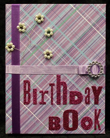
Birthday Book

I've had this project finished for a while now, but couldn't post the pictures as it was my Mother's birthday gift and I couldn't be sure whether or not she would see it. I finally gave Mum her belated birthday present last night (only a month and a bit late). She would have received it earlier but they've been telling us for three month that they were coming up to Auckland (from their home the other end of the country) and only just made it now.
I decided to make a couple of presents so will share them with you. Be sure to come back tomorrow to see the second part other present.
Mum asked for a book to record the family's birthdays in. (Yes she needed it as she keeps forgetting when the kids' birthdays are). The only condition was that I had to include everyone's birthdays BEFORE I gave it to her.
I made the cover from chipboard and covered it with patterned paper from the KaiserCraft "Magic Happens" paper pack. I added some ribbon to decorate the covers as well as a ribbon closure. 
I adhered a beaded flower stem I made onto the front to add a little blingy decoration and finished it all off with a glitter alphabet title... a woman can never have enough bling!!
I had to include this picture as it took me so many attempts to get the glittery look!!
The pages are made from C4 envelopes which I trimmed down to 6" (only about 1/4" chopped off). I then covered each side of the envelope with a selection of patterned papers from the pack which I had distressed the edges using Tim Holtz Distress Inks - Walnut Ink. The pages were adhered into the cover using structure strips as a flexible spine.
I cut a semi-circle pull tab in the top of each envelope to make getting the birthday list for each month out of it's respective envelope. I added a small journal block onto the front of each envelope that I had stamped with the month.
I cut cardstock to a size that would fit inside each envelope then printed onto both sides of the card the days of the month for the birthdays to be entered into. I finished these off with a corner punch before stamping a matching month name.

Sunday, June 2, 2013

Creative Adventures Downunder - Part 5

The second big name tutor over from the US for the Creative Adventures Downunder Event 2013, was Teresa Collins, a name I am very familiar with in terms of her products as I stock several ranges in my shop.
Teresa was due to teach us two classes as well over the event.
My first impression of Teresa... beautiful long blonde hair, gorgeous smile that just lights up her face and OMG is she expecting to wear heels that high while teaching all day... and the answer was YES!!
Like Heidi, Teresa is incredibly open and forthcoming about her private persona. I certainly appreciated the openness and honesty as well as the story behind her designs and creations. I have to confess that I haven't really thought much about why I scrapbook other than the fact I enjoy the creativity as well wanting to keep a record of our life and events for future generations. So hearing Teresa's reasons for why she scrapbook's has certainly given me food for thought as to why I scrapbook and what I really want my scrapbooks to say.

Class 1 - Memories Layout:
In this class we created a two page layout using some of Teresa's "Memories" range. Right from the start Teresa was very insistent that although we were following her page design, we were more than welcome to change it or step it up however we wanted. As someone who NEVER follows a recipe this was somewhat of a relief to me... so I did!!

Once again the class was quite speedy, especially when for those of us who did extra things such as inking the edges of embellishments, that were outside of the page design. I was impressed with the explanations Teresa gave us about some of her page designs. Not only did she give us the "why" of the page design, but she also gave us a number of different ideas as to "how" we could then use the pages she had designed. This showed me that she had put a great deal of thought not only into the image design, but also how the pages and other products could be best utilised by the end user of her products.
Like all my other classes, I didn't get the layout finished and I definitely still need to add some photographs, but I was still pleased with the way the double layout turned out.

Class 2 - Far & Away Travel Journal:
This class was our final class of the event. Despite this, the enthusiasm level was still very high from all of our group. This time we used Teresa's Far and Away collection. I had one complaint about the kit and that was that one of the cardstock pieces wasn't cut well and I ended spending far too much time resolving this problem. Part of this was my being such a perfectionist and crooked lines and edges really bug me but I accept that sometimes when you are making kits in bulk there are going to be one or two bits that goes a little awry. It wasn't a big deal (despite the fact that is noted a comment in here) but it was a flaw in the otherwise great class.
Once again Teresa used her "this is my design, but change it up however you like" class structure. Although we were sent the photo requirements prior to the event, she did still offer alternatives for those who didn't have photos (like me) so you didn't feel completely out of place or unable to bind your finished project.
Again the class was a little rushed but that was because half of the class time was reserved for the binding of each of the journals. Although I didn't get mine bound there as I have my own binding machine at home, it was certainly essential for everyone else who was not so lucky to have the access at home.
The travel journal pages expanded out to see all the pages created. This includes a sheet of plain cardstock which I have not shown below as well as some of Teresa's mini file folders which we didn't do anything to, so additional photos have not been included of these either.
The front of the journal is supposed to be two photos backed on to each other... but as I didn't have any photos, this is for now the front page. I just LOVE the pack of bling - "Tell Your Story - Medallions". So totally gorgeous... I could have used a dozen packs of these!!
Very simple treatment but doesn't it just look so smart!
Page 2 -  the addition of the border strips just really finished this page off. More of the gorgeous bling. One thing that has come through from all of the classes is simple ways of adding extras photos onto the one page though the likes of mini file folders, openables and photo-flips and this page is no exception.
Page 3 - another simple to way to add lots of pictures without having to add a lot of extra pages or bulk; and very cute with the use of the ribbon to hold it closed. With these being pockets they are also ideal for holding some of all the memorabilia you collect while on your holiday. I love the variety and the number of borders included in the pack (we received a full pack which included 12 different borders).
Page 4 - pocket pages are perfect for mini albums regardless of the theme. You always end up with odd or unusual things that you want to keep but which you may not want to put any holes in and pocket pages are the perfect solution to storing these and keeping them within the album.
Page 5 - I love this as an alternative way of using up some of those journal block pages that so many companies are now including as a part of their collections. Rather than cut them all up into individual journal blocks, cut them into a larger block of four journal blocks and use this as a page.
Here I am still looking haggard while the lovely Teresa looks cool, calm and collected... yes I aspire to look this pulled together!!

Saturday, July 7, 2012

Altered Box Swap

Part 2 - The gift I received in return.


In exchange for the altered box I made for Faith, the following is the wonderful gift I received from her in return.
I gave Faith a wide range of options for how to decorate my box. Something dark, moody, elegant or steam punk. And this is the "Elegant" Altered Box and goodies that she created for me.
Isn't this just beautiful and truly "Elegant". The paper Faith used to cover the box is flocked which just adds to its elegance. The lace and rhinestones on the lid, really just finish the look.
The stunning view when I removed the lid... over flowing with goodies.
And lined inside as well... just had to show this because it looks just as stunning empty!!
Three bundles of ribbon. I love the decorated pegs that Faith used to store the ribbons on. 
Set of 4 coordinated stick pins. (Sorry fuzzy picture) I love the roses beads on these as well as the pearl heads on the pins.
Look at all these charms... heaps in here!!! Keys, crosses, wolf, wings, fleur de lis... and many, many more.
There are actually four of these amazing fabric flowers. Two black and two white. Beautiful... I love Faith's flowers!!!
And then this stunning, amazing, totally glorious mini album...
... with all sorts of photo mats...
... and pockets...
... and a mini album inside the mini album...
... and even more amazing pages.
Stunning!!!

Friday, July 6, 2012

Altered Box Swap

Part 1 - My creation


I've just completed a partner swap on Crafting Passionz Forum and would've posted these pictures earlier, but didn't want to let the cat out of the bag before my partner, the lovely and talented Faith, received the finished gifts.
The theme was agreed between the respective partners and Faith wanted something that looked like it was made of metal... this I found out AFTER I'd just been out and bought a paper mache box from Spotlight... oh well... time to get creative.
The only requirement was the box needed to be a minimum of 6" x 6". The box I bought was quite a bit bigger than this but then I wanted to be able to put a couple of long die cuts in it, so purchased with that in mind.
I painted the box with silver acrylic paint inside and out. I then distressed the corners with the Tonic Studio Tim Holtz Distress Scratcher Tool on all sides to show wear then coloured the distressed areas with Tim Holtz Distress Ink in a selection of colours. 
I adhered strips of cardstock covered in metallic duct tape and scratched around the side of the lid and finished the front with a metallic label plate held on with mini silver brads.
I attached patches of cardstock I covered in metallic duct tape then ran through my Cuttlebug to emboss. (I will post a tutorial on this soon.) I adhered some strip bling ribbon around the edge of the lid as well as the bottom edge of the box. Finally I added some washers to decorate the corners of the lid.
Inside I adhered some metallic mesh to the inside of the lid. This can be used to hold things on mini hooks or things like dangly earrings. Although you can't see it, I also lined the bottom of the box with a silver mesh material which I loosely adhered to the bottom to create a billowy cushion for all the little extras, some of which are pictured below. 
I die cut four butterflies from kraft cardstock. One I left blank, then from left to right - crystal glitter paint, Radiant Rain - Yellow Rose, and Acrylic Paint - Champagne (even though it looks silver).
I found a couple of mini tins in an emporium type shop. This one I added some self-adhesive silver glitter ribbon and a butterfly. Inside I stashed some ribbons.
This tin I decorated with some Making Memories double sided adhesive die-cut flowers and some blue fine glitter. Then finished each flower with a mini rhinestone.
Inside this tin I put a doiley (to flash-up the bottom) as well as a small hanging charm and a couple of rosettes that I had inked before gluing together. I used the Sizzix Paper Rosette by Tim Holtz and Sizzix Mini Paper Rosettes dies.
I made an over-sized matchbook with ribbon closure to hold securely a set of six stick pins. I'm always concerned about sending stick pins to anyone, so make sure that the sharp ends are always pushed into some foam for protection and safety. The foam is hidden by the bottom front flap of the matchbook.
Inside I enclosed these stick pins. I really loved the finished pin with the chains.
I completed the goodies with a pair of matching mini albums with a hand-sewn butcher's twine binding seam. Each album has mini pockets front and back complete with little tags tucked in. The papers I used were all in silvers and grays with many from the Teresa Collins Timeless and On the Edge ranges which you can purchase from my shop. Check back soon for a tutorial on how to make these mini albums.