Showing posts with label Tools. Show all posts

Friday, February 13, 2015

Art Journal - Illustrated Alphabet - A is for Abstract

Having come up with inspired idea for a theme for my A - Z Art Journal, I then sat down to come up with my list of techniques and styles in preparation for creating page 1... the letter "A".

Some might say this is cheating but I have to beg to differ. I did this step because...

  1. I am a planner and organiser type personality;
  2. I have in mind some specific techniques and products that I want to try and I wanted to make sure that they were included... and I didn't forget about them until I got down to X, Y and Z.
  3. And because when I started to think about the list, I realised that some letters are really hard to come up with art styles and techniques for... like "Q" and "X"... so the planning stage gave me an opportunity to answer the difficult questions... up front.
  4. And because this was something I could do at work in my lunch break. (30 minutes is not really long enough to pull out paints and paint brush especially if I want to video my creative musings.)
Now before anyone starts pointing fingers and asking me what about the cover page... which I mentioned in the first video of the series about preparing the album... yes I have purposely left this until further down the track.

I happily, openly and with full disclosure admit that I am a perfectionist. I'm a Virgo. It comes with the territory. Having confessed this... I am also happy to add that I have learnt that this little personality trait means I tend to put a great deal of pressure upon myself because I have such incredibly high expectations of myself... sometimes unachievably high expectations. Over time and with a great deal of soul searching, I have learnt ways of reducing the pressure I place on myself and one of them is by not doing the first thing that you will ever see on a project, or in a book... well first. I allow myself time to get into the groove of things until such time as I can really feel the inspiration and motivation and MOJO are right there, in this moment and now is the time. I'll let you know when that time arrives...!

So let's get down to business...

Products Used:
  • Pre-gessoed page (Faber-Castell Gesso)
  • Fibatape - Drywall Joint Tape (Available at Hardware/DIY Store)
  • Printed Deli Wrap
  • Liquitex Matte Gel
  • Golden Fluid Acrylics - Pyrrole Red; Pyrrole Orange; Hansa Yellow; Quinacridone Magenta; Burnt Sienna; Green Gold; Teal; Ultramarine Violet; Ultramarine Blue; Phthalo Green (Blue Shade); Phthalo Blue (Green Shade)
  • Golden Acrylic Glazing Liquid (Gloss)
  • 2B Pencil
  • Stabilo "All" Pencil Black
  • Faber-Castell Gelatos - Lemon; Banana; Mango; Tangerine; Blood Orange; Red Cherry; Chocolate
  • Viva Decor /Inka Gold - Gold
  • Faber-Castell PITT Artist Pens - Walnut Brown; Black
Tools Used:
  • Palette Knives (various styles and sizes)
  • Paint Brushes (various styles and sizes, including Zig Water Pen)
  • Royal Sovereign Ltd - Colour Shaper #2 Taper Point - Firm
  • Water Spritz Bottle
  • Paint Palette
  • Tim Holtz Tonic Scissors
  • Baby Wipes
Process Steps:
With the theme of "Abstract" I knew I wanted this page to be bright and out there and in your face and I knew I had to have a bloody great big "A" on it, but that was pretty much all I really had in mind when I started out.
  1. Cut and adhered down some strips of drywall joint tape. I cut the tape different lengths and widths and stuck it down. Even though it is self-adhesive, I did go over the tape with some matte gel, just to be on the safe side.
  2. Tore up some of the printed deli wrap and adhered this in place with the matte gel as well. I wasn't too specific, just overlapped some of the pieces from both of these two steps.
  3. Put some drops of the warm paint colours directly on the page, spritzed a little water, then covered the entire page in colour blending the paint and water just with my finger tips.
  4. I wanted the colour to be more intense, so following the colour blocks laid down in the previous step with the acrylic paint, I added some coordinating gelatos over the top blending them in with a little water and again just using my finger tips. Some areas ended up getting three or four layers of gelatos while some only needed a couple of layers. Once I was happy with the colour intensity, I heat set the gelatos so they wouldn't move as I added the next layers.
  5. I sketched in my "A" with the 2B pencil, then went over these sketch lines with the Stabilo All Pencil when I was happy with the size and form of the outline. I then lightly painted in the pencil lines with a water brush to turn this from pencil lines into permanent India ink lines.
  6. I painted a couple of layers of white gesso inside the letter with a small brush so I would have a blank canvas to add the next layer onto. (I did actually like the plain white letter and was tempted to just leave it white but didn't think this was "abstract" enough like that.)
  7. I selected my cool colours and put three drops of each colour into my paint palette, then added equal amounts of glazing fluid. I mixed these thoroughly then painted a light coat in a random patchwork type design using a small paint brush. (I will confess that I was quite disappointed at this stage and was tempted to wipe the paint off and go back to just plain white but then I remembered that that wouldn't be abstract enough so I decided, ahh well, there's no turning back now, so just make the most of it.)
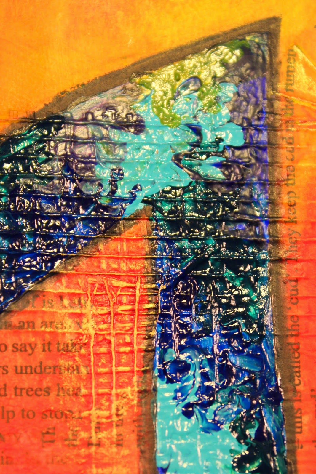
  8. I wasn't happy with the look from the paint brush so I decided to experiment with a fine tipped colour shaper. These are like a paint brush, but instead of having a brush made out of individual fibres, they have a rubber head shaped like a brush head. I figured if nothing else, at least it should be easier to clean than a paint brush. (Can you spot Miss Perfection's ugly head making an appearance??)
  9. When I tried adding the paint using the colour shaper, I couldn't get an even paint layer. Some parts came out ultra thick and some were thin and almost watercolour like. I tried emphasizing the blended areas where two paint colours met and rather than making the blended a smooth transition, I encouraged the two colours to blend, but still remain distinct. (Sorry but this bit really needs to be seen to be understood). The other thing I noticed was that this technique was making my acrylic paints act as a faux oil paint and even though they are very small peaks and troughs, the dimension is nonetheless still very evident. 
  10. Just to clarify... I am no oil painter. I don't have the patience to wait for the oil paint to dry and I'm too much of a perfectionist that I'd never get my brushes, palette knives and palettes clean enough to actually do any oil painting. My mother however, loves oil painting. (A debate that will last forever between us as neither of us will ever concede to the other's product of choice.) As a child and teenager, I used to watch her paint with oils. I watch how she created dimension using both brushes and palette knives to add interest to her sea scapes and sunsets and I guess somewhere along the way I may have learnt some techniques from her even if I did (please forgive the term) bastardize them to use with acrylic paints. Anyway I really love the end result!
  11. Once the paint inside the letter had dried I went around it again with the Stabilo All Pencil and water brush just to darken up the framing.
  12. I added some gold highlights on the raised bits of the drywall joint tape that were still just the background colours.
  13. To frame the piece I added some Chocolate gelato around the edge of the page and blended this with my finger. I then added a thin line of PITT artist pen which I also blended in with my finger and finished with edging the external edge with black just to hide any lighter bits that I might have missed earlier.
  14. I added the title "Abstract" again using the Stabilo All Pencil and water brush.
I really love the end result of the page especially the faux oil painting technique. Will be definitely trying that again!

 The finished Art Journal Page.
 Above and below - close up of the faux oil paint texture, made using fluid acrylic paints and glazing fluid.
 I really love the distinctive blending I was able to achieve with this technique, using the fine tipped colour shaper.
 Gold accents to highlight the texture of the drywall joint tape.
And a hand lettered title to finish the page.

Monday, July 15, 2013

Retail Therapy

I did manage to find a few things at SENZ that took my fancy so indulged in some retail therapy... all be it new tools for the studio (in general).
MARTHA STEWART CRAFTS - SCORING BOARD
I've been looking at getting a scoring board for a while now and have been considering which one to get. In the end I decided I wanted this one because of the more detailed scoring lines compared to some other designs available on the market. It has a flip up storage area for the bone folder as well as an envelope guide which sits discretely underneath the board while not in use.

COUTURE CREATIONS - STAMP SETS
 Words Words Words Collection
Nice typography for all three stamps; nice words/sayings and I loved the possibility of using all or part of the "Thinking of You" stamp as desired.
 Ornate Garden Collection
I was drawn to this stamp because I can build up various images to create a picture of a hanging birdcage enabling me to create countless variations using the one stamp set. Love the versatility of this stamp set!
Busy Background Collection
I love any typography stamps - definitely a weakness of mine. Fell in love with the bottom stamp as it's different almost like a code-breaker collection of letters and numbers. Also liked the cute music background.

CRAFTY INDIVIDUALS - RUBBER STAMP SHEET
Bottle Collection
I fell in love with this stamp the moment I saw it... and then had to fight off another couple of ladies who also liked it. I've never seen anything like it which is probably why I loved it so much. This will definitely be getting plenty of use!
KAISERCRAFT - CLEAR STAMPS
 Botanical
More instant love. I really liked all these stamps from KaiserCraft and couldn't make up my mind so bought all of them. (Well not all, but a fair few!!)
I can see all of these stamps being used on tags and as borders on both layouts and in mini albums.
Love the text on this stamp, especially that it has a ledger look to it.
 Windsor
What can I say? I'm a sucker for text on anything. I did particularly like the newspaper background look of this stamp.
Postmarks
I'm a sucker for a nice postmark. Think it goes back to my days of stamp collecting as a kid. 
 36
More typography, and I loved the way this image went "off the page". Great border stamp!
Perfume
More typography, more off the page... love the idea of the perfume bottle as the main feature.
RUBBADUBBADOO - UNMOUNTED RUBBER STAMPS

Portico Plans
This was the first stamp that caught my eye. Loved the architectural detail in the image. When I saw the deal for the weekend I just knew I had to buy this stamp. (Buy three, get the fourth free... who could resist.)
I bought all four stamps unmounted, and yes I have flipped the images digitally so you can read the detail in the stamp as well as in the image of the stamp.

Palmer Bachelder
I can't resist vintage advertising and love the size of this stamp - approximately 3" x 4"

Cashmere Bouquet
Same as above... love!!
Hatchet & Gimlet
No picture of the stamp as it's winging its way to me as I type. They ran out of stock but posting one to me. Another vintage advertisement... irresistible.
DYLUSIONS - INK SPRAY
I have wanted to get some of these from the first time I saw them being used on YouTube. Couldn't find any so have had to wait patiently. The toughest choice I had to make was which colours to select as I really wanted them all. Will definitely be building up my stocks of these!!
L - R: Dirty Martini, White Linen & Cherry Pie


These two camera stamps are from my friend Faith - she has them for sale. 
They are itty bitty stamps only about 1 1/4" wide and 7/8" tall in two different designs. Perfect for anyone doing Project Life. If you want either or both, let me know and I can pass on your details. Very cute!!

I could have bought A LOT MORE, especially Dylusions and stamps and templates and flowers and papers but I had to limit my budget. Still I am over the moon which what I was able to get. As always it did pay to look around and compare prices as some items were available at a number of different stalls and for a variety of prices but then that is always the way!!

Wednesday, October 10, 2012

DIY - Swatches

This past weekend I taught a couple of classes at the Caz Dezign Scrapbook Retreat. You can see the class samples here. My creations on the day will be posted in a soon to follow blog.
Rather than have a class where the participants had to follow what I showed them exactly to the letter, so we all ended up with the same end product, I gave everyone options throughout the class such as colour combination of inks they wanted to use, selection of beads for their stick pin, colour of flowers to use etc. 
I provided the products, special tools and inks for the ladies to use but the risk of this was that they would not be familiar with what each colour of ink and mist would look like actually on the paper just from looking at the respective ink pad or mist bottle. I decided to create some swatches for the colours so everyone could pick their respective colours based on what they would actually look like, rather than me trying to explain what the end result might look like. 
I trolled the internet, as you do, for some ideas and found a couple of really great ideas on different swatches but the one that I really liked was created by "Madgrans Moments" as it showed three distinct looks for Distress Inks.
For each colour of Distress Ink pad I cut three 2" x 2" cardstock squares. I then inked them as follows:
  • Ink direct to cardstock
  • Ink swirled on with foam ink applicator
  • Ink swirled on with foam ink applicator then spritzed with water and dried, finished with a stamped image in the same colour
Why these three - because the looks are so different using exactly the same ink pad.
Once all the squares were dried I then attached them onto a backing rectangle of cardstock and adhered the name of the ink which I had printed using my label maker. To finish I punched a hole in one corner and then threaded them onto a binder ring. 

Once I'd completed the swatch I then created once for my Glimmer Mists, glazes and special paints. These swatches were smaller as I didn't need the three different versions of the same colour. When they were all dried, I threaded these all onto a separate binder ring.


I love both of these colour swatches and think they will be useful for more than just in classes. I can now take my swatches with me when I go shopping and not buy colours I already have, whereas it would be totally impractical to take all my ink pads or mist bottles with me. My swatches will also make it easier when deciding what colours to combine for tags or layouts. 

 Be sure to check back on my next blog post as it is post number 250!!! I will be giving away some blog candy to a lucky blog reader so it will definitely be worth the visit!!

Friday, May 4, 2012

Organising Embossing Folders

I saw a brilliant idea for storing Embossing Folders, I think on Pinterest. (My apologies to the person with the brilliant idea, I wish I could remember where I saw this, but it escapes me. If I find you again, I will give you the credit you are due.)
It was so functional that I've just set up my Embossing Folders in a similar storage system which I'm sure you will love as much as I do.
Previously I stored my embossing folders in their original packaging, so I could see what they looked like, mixed in with my dies in several shoe boxes. I didn't know what I had and at times had more than a little difficulty finding what I was looking for. In order to find a particular embossing folder I usually needed to pull everything out of the shoe boxes and search through them all one at a time. My storage system just wasn't working for me.
Then I found this idea which not only stored the folders considerably better, it also provided a means for me to quickly check the folders I had to find what I was looking for... like I said... BRILLIANT!!
First thing... get rid of the packaging, well put it into a box for re-purposing at a later date.
Second thing... Sort out all the different sixes of embossing folders and the collate them some how. I ended up with four groups - small (2" x 2.75"); medium (A2 size); large (5" x 7" and anything bigger) and finally borders (any for the edge of a page or a card). 
In collating them, I put themes together (mainly Christmas) and then sorted everything else by type - e.g. words, collages, nature, everything else.
I then cut up some A4 lightweight cardstock into quarters. The sample I copied from had used luggage tags, but I couldn't see any benefit of trimming the quarters down further, that just meant more work for me. Sure they looked pretty, but I'm of the less is more, stop organising, get doing school of thought.
I thought ahead a bit here, and labelled each quarter of cardstock before I embossed it, with the name of the embossing folder (and collection if appropriate) so that I could reference back as to what I had actually used for a project. Doing this before hand mean I didn't have to worry about where I then embossed and trying to leave space for the name.
The next step was to run every Embossing Folder through my Cuttlebug machine with one of the quarters of cardstock to give me a sample of what each folder looked like. I was able to fit 1 medium or large, 4 small or 5 border embossing folders per quarter.
I then labelled both the embossing folder and the embossed sample with a matching number. This means I can flick through my samples, find the look I want, check its number and go straight to that embossing folder as they are all stored in numerical order by size in ONLY ONE shoe box.


Like I said... a BRILLIANT idea!!

Monday, December 12, 2011

Christmas Craft Challenge 2011 - Day 12

Gift Tags


I finally got these started and finished over the weekend which meant I could then get all the presents wrapped for the family which in turn means I can now stretch out my legs under my crafting desk... FINALLY!!
Can I just say I am about over all the production line scrapping stuff for the time being. Just the last thing to do to finish off my Christmas cards, which I need to post this week if people are to get them in time and then I don't want to have to do anything production line style for several months!!!
Still it was all worth it when you see the gift tags I made. Now these are the ones for the family presents that I hinted at in my earlier blog on the Christmas Tags I made for the swap at Crafting Passionz.
Our theme for Christmas Day is Santa if you recall from my earlier blog on the invites I made for Christmas Day lunch at our house. So what could be cuter than little Santa Hat shaped Gift Tags.
Here is a close up of one of them. They were simple to make (once I had thought through my methodology) and used Bazzill Red Cardstock and Bazzill White Cardstock. The white is double thickness with the red hat sandwiched between two white pom poms and bands.

  • Cut red cardstock into 3" x 12" strips - I used three full sheets to make 60+ hats.
  • The base width is 2 1/2" so I marked these increments along the bottom edge then repeated along the top with an offset of 1 1/4" so my peak would be in the centre. (I didn't rule the lines just marked the end of each cut and eye-balled.)
  • Using my trusty trimmer I then cut my triangles out. You can cut 8 triangles out of each 3" x 12" strip.
  • Cut 1 1/4" x 12" strips of white cardstock.
  • Punch 1" circles from the white strip - you can safely cut 11 from each strip. Be sure to double the number of circles that you cut so you can sandwich the peak of the triangle between two circles.
  • I then cut strips of white 3/4" x 12" which I further cut down to 3/4" x 3" - again double the number of these as well.
  • Using your trusty corner rounder punch, shape the corners of the white hat band. I started using my corner rounder... one corner at a time. Then I remembered I have a Zutter Corner Rounder which can cut through heavy card and chipboard. Using this I could cut four at once, though I did try to stick to only three. This was MUCH QUICKER!!!
  • Run all the white circles and strips through your Xyron... this is so much easier than having to glue or tape each piece individually. When doing anything production line style... quicker and more efficient is always better!!!! (And helps to keep you SANE)
  • Stick it all together. I started by adding the bands to the hats first - both sides of all hats. Then repeated with circles... both sides all hats. This was also my check that I had cut enough to pair/match everything up.
  • You can leave them like them and just tape them onto the gifts or continue on with the next step.
  • Using trusty Crop-O-Dile hole punch cut holes through the centre of each pom pom. Be sure to make sure the hole you punch is the right size for the eyelet you will be adding... obvious I know (well it's supposed to be, but some of us have blonde moments when its a little late at night and your are starting to see red triangles and white circle blurring before your eyes!!)
  • Using the other bit of the trusty Crop-O-Dile squish the eyelet in place. You might like to make sure you have enough eyelets of the size and style that you need at hand otherwise just use creative license like I did and use whatever you have that fits. I did stick to white, red, silver and black - yes I was getting desperate by this stage)
  • Cut tie to length (I did mine 15cm or there abouts - sorry mixing my metrics and imperials... its how I work)
  • Tie both ends in a knot, thread through eyelet and loop ends through the loop so you have something to hang the gift card from.
  • Write your To and From on the front and/or back of the card and attach to the present.
  • Optional extra - send the present to me, especially if its scrapbooking related
A selection of the various eyelets...
There were a few others... but they didn't fit into the pretty pattern LOL
Finally attach to your present.