
The answer to all these questions and more is further down the page... but please don't skip down straight away, you might miss something interesting.
If you've arrived at my blog because you follow it or you stumbled onto it by some random twist of fate then welcome, welcome, welcome. If you haven't checked out my video, then you really must as it shows you how I created this art journal page, albeit at a great rate of knots.
I'm typing this up while I wait for the aforementioned video to upload to YouTube... I call it multi-tasking... and as it just takes so long to upload it's also a boredom prevention for me at least.
This week's page was "B" for Background. If you think the page looks unfinished, and I totally respect your assessment if you do, then that's okay. To some extent I agree with you. I could have done a lot more, even just a few more things to finish it off... but, having said that, I also disagree on the grounds that because the page is all about "backgrounds" then that is what I wanted to show and I didn't want a lot of embellishing to over power the back grounds... they are after all the "stars" of the page.
The page was created over a couple of days as I allowed for some drying time overnight, particularly for the moulding/texture paste to dry. As much as I just love my heat tool, I do find that with texture paste all it tends to do is bubble up when you try to force dry it. I have used this to my advantage on earlier art journal pages to give me some puffy looking circles I had wet embossed onto my project but in general it's not something I tend to create all that often. I also tend to take my time when I'm creating so I can enjoy the process. I know I will never win any speed creating prizes, cos that's just not my style.
So let's get down to business...
Products Used:
- Pre-gessoed page (Faber-Castell Gesso)
- Die-cut Chipboard "B" approximately 6" x 3 1/2"
- UmWow Studio - Star Confetti
- Faber-Castell Whipped Spackle
- Liquitex Matte Gel
- Lindy's Stamp Gang Magical - Tiffany's Blue
- Pearl Ex - #685 - Spring Green; #686 - Turquoise; #687 - True Blue & #688 - Misty Lavender
- Lindy's Stamp Gang Mists
- Flat Fabio - Danny Zuko's Denim (1)
- Starburst - Tibetan Poppy Teal; Screamin' Banshee Black; Hydrangea Blue; Whale Watch Blue; Sea Grass Green; Freaky Franken-Lime; Ponderosa Pines Olive; Tiffany's Blue and Lucky Shamrock Green (9)
- Moonshadows - Ethereal Emerald; Gossamer Gold; Buccaneer Bay Blue; Mystic Malichite and Tawny Turquoise (5)
- Prima Color Bloom - Lime Wedge; Summer Sky and Storm Cloud (3)
- Heidi Swapp Color Shine - Chartreuse (1)
- Tattered Angels Glimmer Mist - Gold and Monster Mash (2)
- Tim Holtz Adirondack Color Wash - Stream (1 - total 22)
- Tsukineko - Versamark Ink Pad
- Donna Salazar's Mix'd Media Inx Embossing Powder - Denim
Tools Used:
- Mechanical HB Pencil
- Palette Knife
- UmWow Studio Mask/Stencil - Star Confetti Mask
- Cake/Clay Modelling Tools
- Small head and large head paint brushes
- Heat Tool
- Tweezers
- Upsy Daisy - Joyful Jots Acrylic Stamp Set
Process Steps:
As soon as I had decided my theme would be background techniques, I knew I wanted to create a page that showed off a number of very distinct and very different styles / techniques but with a cohesion to the overall look of the final page. I decided that the best way to "blend" the various styles would be to blur the edges between one technique and the next rather than leave them in distinct boxed areas. The second key tool to creating a cohesive look would be my use of colour to draw the various components into one complete unit and my all-time favourite way to add colour, is to use mists and sprays.
- Starting with my pre-gessoed page, I aligned the chipboard "B" on the page and drew around the edges so I knew where I could and couldn't add texture to my page.
- Starting in the bottom left corner (using the visual heavier weight to anchor the page), I started to randomly adhere pieces of the chipboard Star Confetti using the matte gel. I started with the larger pieces first then gradually selected smaller and smaller pieces adding them between the larger pieces as well as "fading" out from the heavier centre of the chipboard area in the corner of the page.
- In the top right hand corner I then added some more stars using the coordinating mask/template - Star Confetti with some whipped spackle. This was a little bit trickier to stay outside of the "B" shape, so I did have to clean up a little over flow so that it didn't impede the chipboard "B"'s ability to lie flat.
- In the top left hand corner I spread some whipped spackle out with my palette knife then I drew wavy lines into it to create texture reminiscent of tree bark or vines. The inspiration for this technique came from Aaron on his YouTube Channel - Imperfect Impulses. I made sure to bring this right down the page to inter-weave the pattern amongst the upper-most stars which I had purposely left more open than further down the page.
- In the final corner I wanted to experiment a little with pre-colouring some of the whipped spackle. I put a generous couple of scoops into a small resealable container then added some colourants - magical and pearl ex powders being mixed together to try to get the perfect colour. Side note - although the colour was quite nice, it just wasn't what I wanted (not that I really knew what I wanted). Rather than keep blending for the sake of experimenting, I decided to settle for the colour created - for the time being.
- I spread some of the tinted whipped spackle onto the remaining space around the "B". Using a icing/clay moulding tool with fine corrugations on it, I created a series of peaks and valleys which kind of swirled from one point out in slightly different directions. I think it looks almost like the veins of a feather, not the fluffy ones, but the slick, flat feathers that kind of look fused together.
- At this stage I left all the gel and moulding paste to dry overnight.
- I wasn't happy with the intensity of colour in the tinted moulding paste, so I added some more of the magical and pearl-ex in small patches across the tinted area then using a small brush I spread the colour across the surface making sure to get the additional colour both in the valleys and peaks of the surface. I then dusted off any excess with a large soft headed brush. Much better and the shimmer considerably more visible as well.
- Step 9 is the colouring of the page and through it's just listed as one step here, in reality it's a lot of little steps all rolled into one for the sakes of brevity. I did all of the rest of the colouring of the page using various mists and sprays - 22 different colours to be exact. Do you have to use that many - no. Use what you have and what you like. You can give the impression of having more colours than you really have, by varying the intensity of the spray that you use. Spray a lot in one area but only a little in another. Spray from different heights. Dry in between layers or mix colours while they are wet. This all combines and mixes and mashes to create a totally unique and individual look that no one else will ever be able to recreate - not even you. My first layer of colour is usually the only layer that I cover the entire piece. After that it's usually a patch or a section only. I generally also use between one and three colours before drying with my heat tool. I may cover the entire page or only a portion before I dry the colour as well. And I use my heat tool as well as tilting my page to assist with mixing and blending the colours. Just keep layering with more mists/sprays and more colours or add more of the same colours until you reach the look that you like.I have been known to add so many layers I lose count not to mention not knowing how long this step takes. The final layer is also usually a light layer across most or all of the page with either a silver or gold just to add that final touch of opulence. For this page it was a light mist of gold.
- Phew nearly there... last step was to add the title - "Background". I knew the fit for the alphabet stamps I was using was going to be very tight width wise. I laid them all out along the backbone of the "B" and they didn't quite fit - but only just. The only way I would be able to make it fit would be to ink and stamp each letter individually then eye-ball how much space I wanted to leave between it and the next letter. If I was using a coloured ink, not too big a deal, but as I was using a clear ink to then heat emboss, I had to create each letter start to finish before moving on to the next one. Otherwise I wouldn't have been able to get the spacing right because I couldn't see the letter I'd just stamped. Usual process for this... stamp with VersaMark ink (my ink of choice for embossing but you can use whatever you prefer). Generously sprinkle with embossing powder - usually I sprinkle directly out of the pot but I wanted a little more control over where the powder landed given there was just so much texture on this page. Using a wide palette knife allowed me allowed me to do this. Shake off the excess embossing powder and clean up the image with a small paint brush then heat set with my trusty heat tool.
And that's all there is to it. I didn't add a border to the page this time as I didn't feel it needed it and the texture is so strong that I don't think it would have actually looked right.
I love this finished page. It's very me, very much my style as far as backgrounds. And I have lots of texture myself... (If you've ever met me, you'll get what I mean LOL).
There are some photos below and of course you can see the finished product in the video, but neither seems to capture the colours how I see them in real life... not sure how to resolve this... maybe you all just need to pop on over to New Zealand to check it out yourself!!

Top left hand corner of the page. The bark / vine look inspired by Aaron from Imperfect Impulses (believe it or not). I definitely need to try this technique on a tree form to see if I can create realistic looking tree bark... challenge issued!

Love the colour blending and striation. This also shows how two distinct techniques / styles blurred / ran together rather than being segmented by a harsh border.
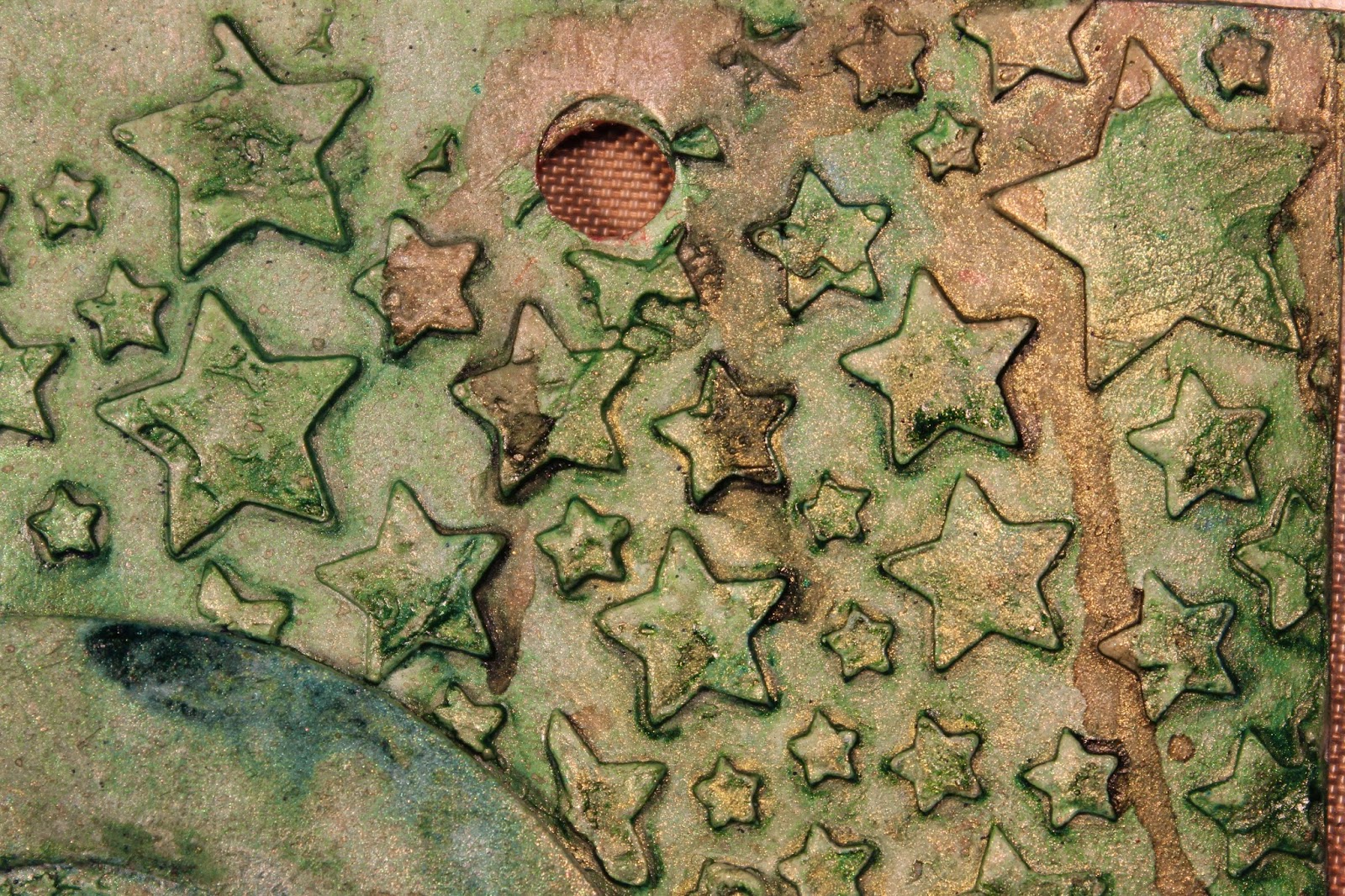
Stars created using mask / stencil from UmWow Studio.

Stars created using die cut chipboard Star Confetti from UmWow Studio. This has got to be my favourite section of colouring. I love the deep, dark, moody blue-ish black look with just a hint of gold to break it up.

This has got to be my favourite textured part of this page. I think it almost looks like a peacock feather. I'm really pleased with the way the colouring worked out. The rivulets of colour were intentional and looked even better than I expected.

Heat embossing so that the letters would stand out a little as colour wise they almost blended into the background which is what I wanted.

Love, love, love this grungey, distressed style.

The next few photos are all about showing the dimension of the page created by the varying techniques used. It may also have been just a little of me playing with perspective when I was taking these photos.

Hmmmm more of the delicious moody blues.

This piece looks even better from this angle.

Love these stars. The green looks slightly warmer, more golden but still a great colour. Love me some green!!

Considering this was merely a filler upper of a gap, I'm really pleased with the way they turned out. I had no expectations so the final look is awesome. Almost looks like craters on the moon LOL.

Maybe another one of those mysterious perspective photos that just slipped in...

At last the final page in all it's glory. Love it, even if I do say so myself! Just wish the colouring looked a bet closer to reality.
I do have the following products available in my online shop. Be sure to get yours before they are all gone. If you haven't already subscribed to my YouTube Channel please be sure to head over and click the button. I'd hate for you to miss out on any other pages I create for this A - Z Illustrated Alphabet Art Journal of Art and Craft Styles and Techniques.

Lindy's Stamp Gang Starburst Set - Sweet Treats - I used Tiffany's Blue from this set but the other colours in the set are equally gorgeous in their own right. I've just had some new sets arrive so these will be going up on the website this week.


No comments:
Post a Comment