Monday, July 29, 2013

Book of the Undead

If you have been following my blog or even just looking back over previous posts, you will have seen a few posts on my step-daughter's Zombie themed 21st birthday.
In this post I wanted to share the mini album I created for her for one of her presents. Her main present from her Dad and I was going to be a little late, but I wanted her to have something from us on her birthday. In the past it has become standard party practice for us to pull out a visitor's book for everyone to leave us a message, but this time I decided to create something that was personal to her and that went along with the Zombie theme.
We gave it to her earlier in the day and then left it out at the party so that family and friends could leave a message in it for her. We will print out some pictures as well and then she can add these to her book along with any cards or other memorabilia she wants to keep.
The book includes three signatures of five leaves of Kraft carstock (10 double sided pages per signature) bound and stitched with bakers twine. I held the three signatures together by entwining the tails of the bakers twine in the spine as well as adhering them together with structure strips that I usually use in any construction pieces I make.
The cover was recycled cereal boxes covered in Kraft cardstock. I thought about using chipboard but settled on the cereal boxes as I wanted the album to have a flexible cover almost like a soft cover Moleskin journal as this would give it a more aged looked quicker.
I decorated the front cover with letters cut using the Cuttlebug "Olivia" alphabet dies. I ran all the letters through my Xyron 150 to make them self adhesive - my tool of choice for anything like this as I know they are guaranteed to stick without fail!! Once they were adhered in place to form the title "Book of the Undead" I smeared a light layer of Atelier Modelling Compound around and over some of the letters.
The back cover I also smeared with a thin layer of the modelling compound with my palette knife, then I used the end of the blade to dig scratches down the length of the album as if it had been used as a shield against attacking Zombies.
Once the modelling compound had dried I generously coated the cover all over with Lindys Stamp Gang Mists.
I used - Starburst Set - Sweet Treat - colours - Cadbury Milk Chocolate and Dark Chocolate Truffle; Starburst Set - Haunted Halloween - colours - Hags Wart Orange and Screamin' Banshee Black and Moonshadow Set - Blue Label - colours - Long Johns Silver, Golden Doubloons, Jolly Roger Red and Crow's Nest Copper.
I used the colours generously across the cover in patches of colour for texture. In some areas one colour was lighter than another and in some areas I purposely over-sprayed to create areas with drippage. The drips of blood were created by dripping Lindy's Stamp Moon Shadow - Jolly Roger Red mixed with Dylusions Cherry Pie Spray Ink.
I carried the blood drips into the signatures inside as well as adding some "blood" spatters on the odd page through the journal.
To finish off the cover I edged the spine and both covers as well as lightly accenting the die cut book title with Tim Holtz Distress Inks in Vintage Photo and Walnut Stain.
To add the pages throughout the journal, I distressed the edges of each page (quite vigorously) with my Tim Holtz Distressing Tool and Tim Holtz Tonic Scratcher Tool. I then applied generous amounts of watered down Tsukineko Walnut Ink and Terra Cotta Antiquing Solution which I left to air dry overnight and the next day. (I applied so much that the signatures were actually sitting in a pool of excess liquid which soaked up into the porous pages through the distressed edges over night).
Once everything had dried and the signatures were adhered inside the cover, I stamped images throughout the journal using various stamps... most of which were my recent purchases at SENZ. You can see more of them here. I then added a generous supply of journal blocks and tags which I had printed out from a number of digi-printables websites. These included Ephemeras Vintage Garden, Prima Marketing and How to Haunt Your House (Dot) Com. All images used were "freebies".
I really loved the end result so much that I could have quite easily kept it for myself. I did giver her the album, but may just have to make another one for myself.
Two versions of the front cover - taken with and without the camera flash. The picture above without the flash, shows more of the detail of the lettered and depth of the colour but the picture below taken with the camera flash just shows off all the brilliant luminosity of the micas in the Lindys Stamp Gang Mists and is probably a more true reflection of the actual colours. It shows the more "leathery" look the journal cover has.
This time the back cover with and without camera flash. Same as the front cover, more detail above, but more shimmer and a truer colour with the flash. The bottom picture also shows the "scratches" more clearly.
Just a couple of the pages from inside the journal. You can see the dripping blood above. The intense red from the Dylusions Ink Spray blended with the shimmer and depth of the Lindys Stamp Gang Starburst Mist to give me a really fabulous looking red blood which just stood out from the Walnut Ink and Kraft Cardstock.
This page really shows the beautiful distressing and aging I was able to achieve from the watered down Walnut Ink and Terra Cotta Antiquing Solution. I love the "water stained" look combined with the drippage, blood stains and stamped images. And then the printables images all fussy cut and edged with Tim Holtz Distress Inks just finish the book off.
Sorry only a couple of pages, as I only finished the morning of the birthday party... so didn't have much time for photographing it. I did take a video of it, but I'm not sure how clear that turned out as I used my web-cam. I'll add a link to my YouTube channel once I have posted the video.

Sunday, July 28, 2013

Fifty {Two} Shades of Grey - Week 30

Another one for the crafters or builders out there... if that's not a big hint then I don't know what is.
It's kind of obvious if you look closely, squint your eyes and get the laptop screen just so... and then sort out the lighting because I've intentionally shot this photo so it looks darker than it is in reality...
Why it's two metal rulers of course. Though I was being tricky by putting more than one in the picture and adding the reference to builders... did it work?

Zombie Cakes??

I know it's not strictly crafting is the paper crafting sense of the word, but this week I have been creating with flour and eggs and stuff... well more specifically pre-prepared frosting and a box of cake mix... did I mention I'm not really a baker??
This weekend is my step-daughter, Alysha's 21st birthday and she asked if I would make her birthday cake. As I mentioned in a previous post the theme for the party is "Zombies" so it had to be a theme appropriate cake design.
I trolled the internet for a few weeks and came up with some ideas of what I could potentially "attempt" to create.
Then when I was a SENZ I spoke to the lovely cake lady on the Absolutely Crafty site about my ideas and asked for some product suggestions. She suggested some GoBake Easy Frost and Flavacols with some Satin Ice Fondant. Being the experienced baker I am (NOT) I took in everything she said, bought what she suggested and went from there.
So here is the end result...
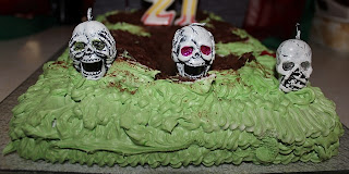
And with the candles added...
The cake was made in two pieces... and is two different types of cakes.
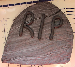
The "Tombstone" is a rice bubble and marshmallow cake - the "in thing" for cake toppers so I'm told. I made the rice bubble cake in a shallow tin and left it to set for an hour or so.
I cut the cake to shape and lopped off the bottom at an angle so it would automatically lean to one side as if the tombstone had been disturbed.
While it was setting I blended some white and black Satin Ice Fondant to get a marbled grey colour which I rolled out large enough to completely circle the entire rice bubble cake.
I then added some more black fondant to make a darker grey fondant to make a very poor "RIP" for the front. I then left this to dry for a couple of days, turning it over once to allow the back of it to dry as well.
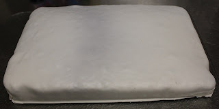
The next day I made the second part of the cake. I bought a Betty Crocker Devil's Food Cake Mix which came with a prepared chocolate frosting, so made it up according to the instructions on the packet. I baked it in the same pan I had used for the rice bubble cake so that I knew they would be the same size.
I rolled out some more of the Satin Ice white fondant and layered this over the chocolate cake.
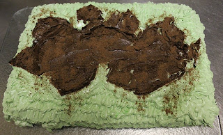
Then I made up the GoBake Easy Frost mix I had bought at SENZ and added icing sugar and some green food colouring to colour it for the "grass". I tried not to blend the colour too much so that I would get some variations of green for the grass but when I piped it onto the cake that it all blended anyway turning from this vibrant green to a mushy pea green.
I piped the grass around the sides of the cake then started up onto the top of the cake as well. After a couple of loops of the top of the cake, I sliced the fondant down the length of the cake in a zig zag pattern and piped frosting onto individual pieces of fondant. I then folded back the pieces of fondant over itself leaving exposed chocolate cake in the centre. I repeated this step for the entire cake.
I spread the prepared chocolate frosting that came with the cake mix over the exposed cake as well as the "inside" of the peeled back fondant for the exposed dirt from the Zombie escaping the grave site.
To finish off the this bit of the cake, I lightly sprinkled milo powder over the chocolate frosting as well as a little sprinkling on the grass as if it was bits of dirt that had been spilled out.

Overnight I left the cake on the bench, though had to get creative to keep the cats and any sticky fingers from touching the cake without ruining all my hard work...
The morning of the party I put the two cakes together and then added the final touches. Some drops of GoBake Raspberry Flavacol to look like drips of blood and the candles.

I couldn't resist adding these candles as well as the "21" candles... they were just too perfect!!
My step-daughter loved the cake and that was all that mattered. It didn't taste too bad either.

Monday, July 22, 2013

Fifty {Two} Shades of Grey - Week 29

Hopefully this will confuse you a little bit...
From this picture it could be anything... though to be honest it looks a little suspiciously like tiling on a wall. Anyone who knows my house is probably running doing a quick run through room by room looking for something akin to tiles on the walls or the floor and by now is probably starting to scratch their head...
But you see I'm trying to get a little bit trickier now... make you work for the correct answer... make me work harder to find something to confuse you... is it working?
Have you given up yet?
Okay... if you didn't recognise it and you're not a crafter then you are forgiven...
It's my Tonic cutter.

Wednesday, July 17, 2013

In my spare time I made 30 coffins...

Well technically they were coffin cards... but that wouldn't have raised as many eye brows.
This month my step daughter Alysha turns 21. She decided very early on that she wanted a party and the theme of the party would be Zombies.
The invitations therefore needed to be appropriate to the theme, so after some googling for Halloween ideas, coffins were the stand out idea to try. As some invitations had to be posted out around the country, I wanted a flat coffin design rather than making three dimensional boxes which would probably be squished along the way through the postal service.
I found a pattern for a bi-fold card in a coffin shape. I wanted a little bit more design than this, so I adapted the pattern to a tri-fold card still in the same coffin shape. The folds are all on the long side of the coffin. As I had to make 30 invitations, I cut a template for the card from plastic so that all invitations would end up the same size and shape.
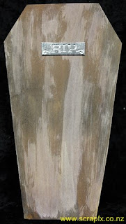
This is the card as it looked when taken out of the envelope. Each card was cut by hand from white cardstock. The outside of the card was given a wood grain effect using acrylic paint and Tim Holtz Distress Stains.
I cut small rectangles of recycled cardboard to size then covered them with metallic silver duct tape. I then ran these through my Cuttlebug using the Cuttlebug RIP Tombstone Embossing Folder from the combo set of the same name. I had to be very careful with the placement to ensure only the "RIP" was embossed in each instance. Each embossed plate was then run through my Xyron 150 before being adhered in place on the front of each card.
The left side of the card was opened and the right side then showed scratch marks to show the Zombie trying to escape from their coffin... cool touch I know. The scratches were made using my Tonic Studios Tim Holtz Retractable Craft Scratcher Tool.
Inside the right side of the card I adhered a small rectangle with contact phone numbers for the RSVP. Inside the card was a separate coffin shaped piece of kraft cardstock which had all the important details printed on. I utilised the SF Gushing Meadows Font to highlight the theme in a couple of places on the invite... doesn't it just look like dripping blood!! Both the insert and the RSVP slip were also edged in Walnut Stain Distress Ink.
The card opened out to show the outside and the wood grain effect. The wood graining was intentionally done to follow the line of each section of the card.
The inside of the card was vintaged using liquid Walnut Inks in Walnut and Terracotta which I watered down further to give an aged look. Close up the effect is that of white fabric which has become stained and aged through time.
I really love the finished look of these invites and both aging techniques as well. I will definitely be using these techniques again in other projects!

Tuesday, July 16, 2013

Altered Torso Update

My altered torso had her big reveal at SENZ. I've still not decided if she is complete or whether I want to do more work on her, but I want to show her as she looked for her first public appearance.
Here she is... yet to be named... my altered torso, revealing her Steampunk Theme. Her base is a paper mache torso I purchased from Spotlight. You can see the treatment I gave the blank base in this YouTube video on my channel.
The outfit she wears is made of patterned paper and recycled cardboard with loopy brads and ribbon for the laced enclosures.
This angle had to be my favourite as it shows all the highlights of the design... the pleated skirt, the lacing, the die-cut gear decorations...
Front on showing the intricate lacing and die-cut gear details. 
The bodice was all hand pieced in a technique very akin to making a bodice from fabric. I started with a paper pattern to get the shaping and sizing of each piece then cut the respective pieces of bodice pattern from the patterned paper I had chosen. Each piece was then individually coloured and highlighted using Tim Holtz Distress Inks before being adhered in place. 
You can see some of the intricate piecing involved in making the fitted bodice above.
The skirt was first pleated by hand, then coloured with Tim Holtz Distress Inks. The edges of each pleat were also individually accented with Walnut Ink Distress Ink to accentuate the pleats. 
Pleating was the only way I was able to get a "fitted" look to the skirt using a material that essentially had no give in it. Paper doesn't stretch like fabric nor does it really confirm to a particular shape without some kind of manipulation or adherence.
Close up of the pleating in the skirt. 
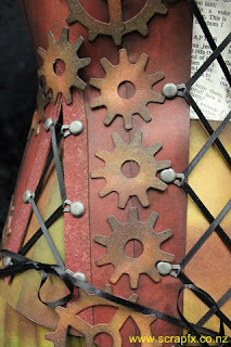
The front and side lacings, were all done with Nickel Loopy Brads and a 4mm black ribbon. It took some time to get all three lacing gaps even yet taut enough to hold the bodice in place.
 The side lacings were both accented with "V"s of Grunge Board to provide additional stability while utilising the flexible properties of the grunge board.
The cog accents were all die-cut from recycled cardboard packaging using the Sizzix Tim Holtz Gadget Gears die. They were then individually coloured using Tim Holtz Distress Inks to coordinate with the colours used in the bodice and skirt.
 
The detailing of the cogs was carried around the sides of the torso as well. 
 I love the way this picture shows off the shaping that I was able to achieve even using paper all through the shaping of the paper pieces. I also am really pleased with the way this photo in particular shows off the shading of each piece of paper from the Distress Inks. As well as the colouring aspect, the Distress Inks not only gave the paper a leathery feel and improved the flexibility of the paper while trying to manipulate it around the curves of the torso but it also seemed to make the paper stronger and less prone to tearing than it had been before the Distress Inks were added. 
The final cog on the lower edge in the centre back of the bodice.

Monday, July 15, 2013

Retail Therapy

I did manage to find a few things at SENZ that took my fancy so indulged in some retail therapy... all be it new tools for the studio (in general).
MARTHA STEWART CRAFTS - SCORING BOARD
I've been looking at getting a scoring board for a while now and have been considering which one to get. In the end I decided I wanted this one because of the more detailed scoring lines compared to some other designs available on the market. It has a flip up storage area for the bone folder as well as an envelope guide which sits discretely underneath the board while not in use.

COUTURE CREATIONS - STAMP SETS
 Words Words Words Collection
Nice typography for all three stamps; nice words/sayings and I loved the possibility of using all or part of the "Thinking of You" stamp as desired.
 Ornate Garden Collection
I was drawn to this stamp because I can build up various images to create a picture of a hanging birdcage enabling me to create countless variations using the one stamp set. Love the versatility of this stamp set!
Busy Background Collection
I love any typography stamps - definitely a weakness of mine. Fell in love with the bottom stamp as it's different almost like a code-breaker collection of letters and numbers. Also liked the cute music background.

CRAFTY INDIVIDUALS - RUBBER STAMP SHEET
Bottle Collection
I fell in love with this stamp the moment I saw it... and then had to fight off another couple of ladies who also liked it. I've never seen anything like it which is probably why I loved it so much. This will definitely be getting plenty of use!
KAISERCRAFT - CLEAR STAMPS
 Botanical
More instant love. I really liked all these stamps from KaiserCraft and couldn't make up my mind so bought all of them. (Well not all, but a fair few!!)
I can see all of these stamps being used on tags and as borders on both layouts and in mini albums.
Love the text on this stamp, especially that it has a ledger look to it.
 Windsor
What can I say? I'm a sucker for text on anything. I did particularly like the newspaper background look of this stamp.
Postmarks
I'm a sucker for a nice postmark. Think it goes back to my days of stamp collecting as a kid. 
 36
More typography, and I loved the way this image went "off the page". Great border stamp!
Perfume
More typography, more off the page... love the idea of the perfume bottle as the main feature.
RUBBADUBBADOO - UNMOUNTED RUBBER STAMPS

Portico Plans
This was the first stamp that caught my eye. Loved the architectural detail in the image. When I saw the deal for the weekend I just knew I had to buy this stamp. (Buy three, get the fourth free... who could resist.)
I bought all four stamps unmounted, and yes I have flipped the images digitally so you can read the detail in the stamp as well as in the image of the stamp.

Palmer Bachelder
I can't resist vintage advertising and love the size of this stamp - approximately 3" x 4"

Cashmere Bouquet
Same as above... love!!
Hatchet & Gimlet
No picture of the stamp as it's winging its way to me as I type. They ran out of stock but posting one to me. Another vintage advertisement... irresistible.
DYLUSIONS - INK SPRAY
I have wanted to get some of these from the first time I saw them being used on YouTube. Couldn't find any so have had to wait patiently. The toughest choice I had to make was which colours to select as I really wanted them all. Will definitely be building up my stocks of these!!
L - R: Dirty Martini, White Linen & Cherry Pie


These two camera stamps are from my friend Faith - she has them for sale. 
They are itty bitty stamps only about 1 1/4" wide and 7/8" tall in two different designs. Perfect for anyone doing Project Life. If you want either or both, let me know and I can pass on your details. Very cute!!

I could have bought A LOT MORE, especially Dylusions and stamps and templates and flowers and papers but I had to limit my budget. Still I am over the moon which what I was able to get. As always it did pay to look around and compare prices as some items were available at a number of different stalls and for a variety of prices but then that is always the way!!