Wednesday, March 27, 2013

True Blood... well Fake Blood really

I wanted to do a little something for a friend of mine, Chelle, over in Australia. We've not known each other that long but just clicked the moment we met and have just kind of adopted each other as sisters ever since.
We have the same taste in music, television, movies and our senses of humour are the same, warped and wicked and dry and sarcastic and not everyone gets it... but I digress...
We are both AVID True Blood fans so it seemed natural that what I sent her should be something along those lines.
I really love the way this turned out... not quite how I planned it... had a bit of a oppsy... but I managed to cover it up and I think it works.
The cover opened up to see the front and the back. 
I used Bazzill White cardstock and left it completely plain. I measured the size I wanted, scored a 1/4 inch spine and folded it to form a mini folder. 
I then mixed equal parts of Semco Acrylic "Classic Red" and Pebbles Inc "Red" to get the shade of red that I wanted for my blood, then thinned the mixture out with water to get the consistency I wanted in order to get the drips. 
Front cover... complete with mistake and cover up.
In order to create the drips, I loaded a reasonably fine paint brush with some of my liquid blood then scraped the bristles along the top of the cardstock effectively wiping the paint off the bristles, all while I held the cardstock upright to encourage gravity to do its job. 
This was somewhat of an exercise in patience. I made sure I didn't overload the brush each time as I didn't want all the drips to flow down to the bottom. For the shortest drips, I used one or two "scraping" of liquid blood. For the medium drips was three or four "scrapings" and the longest drips were five or six "scrapings" of blood.
Close-up of my "finger prints". 
I don't think I will ever make it on the police force. I struggled to get clear finger prints... even after a few trials on scrap paper LOL - but then as we all know I am a self-confessed perfectionist and I usually think I can do things better!!

Saturday, March 23, 2013

Found poems, art journals and challenges oh my...

I've been thinking about these three things for a while...
Found poems... are poems you find in previously written texts by highlighting certain words in a page of text for instance from a classic book. They can also be made up from individual words found from various different sources such as magazines, which you put together to form a poem. Your new poem can then be decorated and adorned however you like.
I've seen pictures of found poems on blogs and Google and Pinterest (of course) and was both fascinated and amazed by them. And so creating some for myself, very quickly jumped onto my crafting to-do list (and stayed there for a while, undone).
Art Journals - another thing on my every growing to-do list. Again something I have admired in all the usual locations. I've watch YouTube videos on how to create them and various new techniques, but still it has sat on my to-do list. If you're not familiar with art journals they are basically your own random artistic creations usually done in a book or three. There is no rhyme or reason, no plan other than to provide a space for you to let your creations inhibitions go so you can just express yourself.
And finally challenges... well more specifically the weekly MOJO challenge on the Scrappers Obsessionz Group on Facebook. We've been a little remiss the past few weeks as people have been busy so we haven't had a challenge. And I've not participated in some of the weekly challenges for various reasons. So the past week I'd noticed that we hadn't really been posting many pictures of our work and I'd been missing the chatter that surrounds the challenge... it brings the members together... even some of the quieter ones who may not say a lot, but will enter into the spirit of a challenge.
So I took the bull by the horns, so to speak, and put up this week's MOJO challenge for the group.
I provided a scanned page of text which was to be used for the challenge as the basis from where everyone's poetry must be found. I explained all the rules, provided links to examples and put the challenge to the group... many of whom had never heard of found poems.
I then created my challenge entry (not that there is really an entry as such and certainly no first place or prize).
My challenge piece is a found poem which I also made as my first art journal page... hence the three in one achievement.
So without any further ado... my first found poem, art journal page and challenge I have issued on the Scrappers Obsessionz Group...

Friday, March 22, 2013

Op Shop Bargains

This morning I had to be up early as the electrician was due to arrive at 7.15 am (OMG) to fix the light switch in our upstairs toilet. I then had to drop one daughter at work by 8.00 am and take her partner for an appointment at 9.00 am. After the appointment I dropped off my passenger at her next port of call and was back in Papakura by 9.45 am-ish.
As I started to head for home I remembered my plan to at some non-determined time visit a couple of local op shops here in Papakura where I live. So a quick u-turn to head back the way I had come and soon I was pulling into the Hospice shop just up the road.
A brief look around... and I soon found myself walking back out with a teacup, saucer and side plate set with purple and blue flowers and "Mother" in gold on it; a couple of lace doileys and three books - not too bad, all for $13.50.
Off I trot back up the road towards home and I call into the Salvation Army shop. This one is even bigger!!! Another quick walk around and this time I am walking back out with... another 9 lace and linen doileys; 2 hymn books, 2 dictionaries and a book of psalms; a box with a flip lid and metal handle and a copper and glass candle lantern and less $30.00 in my pocket.
Did you know that the Salvation Shop offers a loyalty card? Neither did I. Our one does. For every $10.00 you spend you get a stamp... send $100.00 and you get $10.00 worth of goods FREE.
Anyway... thought I would share a few pictures of my bargains and maybe some ideas of what their future might hold.
My friends in the Scrappers Obsessionz Group did an altered teacup swap a couple of months ago and unfortunately I didn't join in, though I really did love the end results. My mother's birthday is coming up in a couple of months and as she does a lot of sewing, I thought I would alter this and add a pin cushion inside the cup so she had something elegant to add her pins to.
 I spotted these three books all had hard covers in really good condition and thought they would be ideal for altering. The "Death of a Warrior Queen" looks quite interesting, so I might have to read that one before altering it!!
 These ones however I bought for their pages. Two hymn books, two dictionaries and a book of psalms. The three smaller books have a very fine tissuey paper in them. The large red hymn book, includes not only the words but also the music for the hymns while the dictionary is always fantastic for backgrounds, definitions for journaling or for die-cutting flowers out of the pages.
 
 Lots of lace and linen doileys. These will all look good on scrapbook pages or mixed media projects.
 Very nice box with a flip lid top. Just thought I could decorate and have it as pretty storage or something.
I ummed and ahhhed over this lantern and had even taken all the rest of my purchases up to the counter to be tallied up. I turned around once more to look at it and decided on the spot that yes I would take it. Talk about impulse buying!!! I'm not sure how but I want to alter this lantern into a show piece for my studio. It probably won't be functional anymore, but I think it will look very cool and very different. You can be sure I will be sharing this with you once I've done something with it.
I just thought this was a really cool thing... so had to share.

Sunday, March 17, 2013

Fifty {Two} Shades of Grey - Week 11

I really hope this one is a bit more difficult to pick what it is.
I really like the look of the stripes which are not part of the item itself but purely a result of it reflecting the things around it, even though it doesn't have a particularly reflective surface. I'd describe it as having more of a brushed metal surface so it would be expected to distort anything it did reflect.
This is my metal water bottle. I use it daily. It travels everywhere with me... out on trips, to work, down in the studio, beside my bed... it follows me like my shadow.

Wednesday, March 13, 2013

Fifty {Two} Shades of Grey - Week 10

Now this might look very similar to an earlier picture... but it's not. Last time was a chip (crisp) packet... this week...
This week is the foil liner of a Cadbury chocolate bar looking directly into the bottom corner... alas after the chocolate is gone. I really liked the blue-ish tone to the grey this time as well as capturing all the wrinkles in the foil which enable or create even more shades of grey from something that is essentially flat and one colour.
Up to date again... :-)

Fifty {Two} Shades of Grey - Week 9

This week's picture is very in keeping with the themes behind the Fifty Shades of Grey books...
Pile of chains from a broken necklace... considerably larger than they are in reality!
I could also have used my new new blog template and header... it was time for a change.

Tuesday, March 12, 2013

Organising the Studio - Papers

It's not that I have been intentionally ignoring you... I've just been busy working (I had a week's temping work and travel to and from work - up to 3 hours a day!!!) and I've been cleaning, rearranging and organising my craft studio in preparation for some upcoming classes and crops.
A couple of weeks ago I managed to pick up a real bargain through an auction website here in New Zealand called TradeMe. You can buy and sell just about anything on there and from time to time I've been known to sell the odd scrap booking product or two myself.
I haven't been on there for a while, not having a great deal of the old folding stuff means you don't really want to look at temptation too much but I went for a nosy just to see what was happening.
Someone had listed some paper racks for sale at a really good price... including a really good "Buy Now" price. The bargain was so good that I bought now.
I contacted the seller and arranged to pick up the one paper rack and somewhere amongst all our correspondence, she mentioned that she had a few paper racks for sale though at the time she had only listed one. I said I would interested in maybe getting a few more from her.
Long story short... I have now ended up with six times the paper displaying/storing capacity I previously had at less than what I paid (wholesale) for the original four racks I had.
The bad news was that I then had to find somewhere to put them all.
After a couple of weeks of deep thought and contemplation I made up my mind what I wanted to do and so over the past week (though mainly this weekend) I've started to rearrange the studio to fit everything in.
I'm not going to show you the before shots quite yet... they will just have to wait until it's all completed and you can see the full effect; but I will show you some part-way through shots as I complete the various areas of the studio.
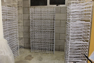
So here are the paper racks and the cubby unit that they now back onto.
I've created a little paper alcove in the corner by my desk. I wanted somewhere out of the way of the laundry area (reduce the chance of any accidental water damage) and out of the general traffic area as these are just wire racks stacked on top of each other. I have two solid concrete block walls and I have created a third wall by using the back of the cubby unit to provide some support - just in case.
The cubby unit previously housed a huge pile of scrap booking magazines and other scrapping junk that to be honest I had really just forgotten about and totally ignored but it is soon going to gain a new lease of life... coming up in a future blog!!!
I've stacked up all the paper racks and tied them together with cable ties for a little more stability as well, and then rearranged them all this morning before stacking them with paper. That was easier said than done as each wall of racks has to be moved as one due to being cable tied together... yes I admit I should have thought about the design aspects first... but we all learn from our mistakes.
Then once I was happy with their placement (and having added another two stacks to the end of the cubby so all the racks now had a home) I then filled them in with all my cardstock and patterned paper.
The end racks and just a hint of the cubby unit behind and the racks that back onto the cubby unit. The racks to the right are less than a third full, so plenty of room here for more cardstock. (I'm slowly building up my Bazzill holding).
 The racks backed onto the cubby unit and one of the end racks.
The racks underneath the window. I intend to give the window a good clean inside and out and then add a net curtain to reduce any chances of fading. Still a few racks free for more paper!!
And the final racks on the far side of the alcove. At the moment these are full of bargain and discounted papers, so some great deals to be had on these shelves alone!!
My perfectionist self already wants to rearrange all the papers and colour coordinate or do something with them, but I've told myself to behave and just leave them as they are for now. I have a lot more cleaning and rearranging still be done and as they are at least now in paper racks I can live with things as they are for now.
It feels great to be able to cross this off my project list!!

Monday, March 4, 2013

Mini Challenge - Altered Puzzle Piece

Many of the girls (sorry yes we are all female and no it's not because we don't want any guys, just that none have signed up) from the Scrappers Obsessionz Group have also joined the SO group on Facebook, mainly because most of us spend far too much time on there. We are looking for new members so please look us up on Facebook or message me here and I can send you an invite to the group.

Someone in the group recently complained about still missing their mojo after the Christmas break so the challenge was laid and thus our weekly Mojo Challenge came about. Joining in is entirely optional. We can join in each week, not at all or only some weeks... which great for those who have some weeks busier than other weeks.

So far I have only managed to join in one week's challenge... though not for a lack of trying - I searched for a week for a antique key to alter to no avail. Any way the week I did join in was for an altered puzzle piece with a Valentine's theme (again I hear you say)...

I started with a chipboard base... the design for the final shape was based on one of my Granddaughter's puzzles. I painted the edges and covered the front with a scrap of patterned paper from my scrap stash. The patterned paper already had glitter accents, but I added a little more Kindy Glitz - Hot Pink to intensify the glitter a little more.
I added a title "Love Life" using white glitter self adhesive letters from Making Memories "Cheeky Shimmer Stickers" - White. I found a heart with wings from an old pre-made embellishments Wedding themed set and added this to the corner. I highlighted the wings with some Kindy Glitz - Crystaline to go with the patterned paper and glitter letters.
I created three charm chains with various charms and beads and added a tiny pink bow to each chain.
And to finish it off I added feathers in bright yellow and hot pink.

It's not strictly a Valentine's theme but it does have a positive, loving message and bright colours always make me feel better, so I think it was appropriate for the challenge.

Sunday, March 3, 2013

Valentine's Swap - Tags

The final swap for the month was for Valentine's Themed Tags.

Valentine's has become a non-event for my husband and I over the past two years... his choice not mine, so to be honest this year I'm a little anti-Valentines (sorry, and yes I don't know why I still signed up for all these swaps either??!!!??). So I guess my tag has somewhat of a dark tip of the hat to the day. (Skulls aren't normally associated with Valentines)
Here are all the tags, lined up. The backgrounds are all a little different, which I love about this technique.
I stamped the tag with newspaper column background stamp from the Glitz Design Clear Stamp Distressing Set Two using Ranger Ink Archival Ink - Coffee.
I then coloured over the top of the tag using Tim Holtz Distress Inks - Spun Sugar, Worn Lipstick, Spiced Marmalade, Fired Brick and Aged Mahogany with my foam ink applicators. I misted the tags with water then dried them all with my heat gun - favourite technique!!!
I stamped the tags with embossing ink and then heated embossed each tag with Detail Embossing Powder.
I hand stitches flourishes based on the Bazzill In-Stitchz "Flourishes" template which I modified to get the look I wanted. I highlighted each of the swirls with a black rhinestones.
I made the rosettes from textured black patterned paper using the Tim Holtz Alterations - Mini Paper Rosettes die affixing red buttons on the front of the rosette for some added spice.
To finish off the tags, I stapled two strips of tulle folded in half into the corner of the tag before gluing three small KaiserCraft roses on top which I had misted with Tattered Angels Glimmer Mist - Candy Corn, Pink Poodle and Lobster.
Here are some close-ups of some of the details.

Saturday, March 2, 2013

Valentine's Swap - Flowers

The second swap for this month was a Valentine's flower theme. Anything we liked, though the request was for three different smaller flowers this time.
Here are the fours sets of flowers I made for the participants in the swap. In addition to the flowers for the swap (and I made four for each person), I also made a small box for each set of flowers and decorated it with more flowers.
The box was my own design and is 2" wide, 3" long and 1" high and was made out of a single piece of paper 7" x 7". I used paper from my lovely 8" x 8" stack of patterned paper from my stash which I used for my nephew's birthday cards the other day.
I designed my box, cut it out and scored all the lines then folded it to create the box. I used my Teresa Collins Mega Runner by Xyron to adhere the sides together to keep the box still a box, even when the ribbon ties are undone.
I finished the box with a ribbon tie which wraps around the box entirely in both directions like a parcel and then added three small roll up flowers cut from cardstock. One set of yellow flowers was inked with Ranger Distress Inks - Worn Lipstick so they ended up looking a mix of the yellow and orangey colours of the other flowers. These were die-cut using the Die-namics Rolled Flower die from My Favourite Things.
Close-up of the inside of the box with the flowers inside. (The ribbons are just tucked in the sides to keep the box lid up so you could see inside without my fingers holding up the lid and being in the picture.)
These flowers were crocheted in a red and pink blended thread to a pattern I have made up myself.  As it's only done with chain stitches, even the most inexperienced crocheter, like myself, can cope with these. To finish them off (and so I didn't need to worry about making sure the end of my thread were tucked in nicely) I threaded the loose ends through the holes of a button and tied the button in place.
I really like the messy (Medusa-like) flower petals.
These are mini rolled roses, similar to the flowers I had previously made and given a tutorial on here. Instead of fabric strips, I used ribbon - some that was leftover from my first wedding nearly fifteen years ago. (See I knew that one day these scraps would come in handy!!!) I added self-adhesive flat backed pearls for the centre of the flowers, instead of the beaded centre I used on the Moulin Rouge themed ones.
Despite the marriage ending, I still have fond memories, so it seemed appropriate that remnants of a happy time be used for a Valentine's themed swap.
For my final flowers, my inspiration was one of my favourite movies. It's the romantic comedy "Bed of Roses" starring Christian Slater. In the movie Christian's character, Lewis, gives Lisa (Mary Stuart Masterson) hundreds of roses in a pale lavender/grey colour - Stirling Roses - (he buys out the entire city!!!). The first bouquet arrives with a card that said "Thank you, for a day of too much perfection". {Swoon!!}
I used the Tim Holtz Alterations Die - Tattered Pine Cone. I die cut the pine cone out of grey cardstock then coloured it with Tim Holtz Distress Inks - Milled Lavender while the pine cone die cut was still in the paper remnants. I rolled the pine cone die cut and shaped it curling the (now petals) to look more like a small tea rose. You can see a tutorial from the man himself demonstrating how to make these beautiful roses here on YouTube.
After adhering the end of the rolled rose in place I curled the petals a little more to finish it off, then highlighted the ends of each petal with a little Tim Holtz Distress Inks - Dusty Concord before lightly painting each petal with Kindy Glitz - Crystaline and a blob of Kindy Glitz - Black Opal in the centre.
I really loved the way these turned out, both in terms of their colour and the shape/size of the finished roses. I will definitely be making more of these to go with the paper roses I have bought to sell through my website. If you are looking for flowers for your layouts and off the page projects, be sure to check out my online store for many wonderful products.

Friday, March 1, 2013

Valentine's Swaps - Stick Pins

I've started the year with a few swaps again with some of the lovely ladies on Scrapping Obsessionz a group for New Zealand and Australian scrappers.

The theme was Valentine's Day and despite not celebrating it this year (bit of a sore point after last year) I still decided to join in the swap as my favourite colour is red and what is more Valentines than red???

We each had to create three stick pins which interpreted our idea of Valentines. As with all my stick pins I wanted to also ensure that they were delivered to the other participants safe and securely, so I also wanted to create Valentine's appropriate packaging.
To package each set of three stick pins in, I cut a heart out of some glittered patterned paper. I originally attempted this with my Fiskars ShapeCutter, but found the paper was so thick (along with the added thickness of being glittered) that I couldn't get a nice cutting line, so in the end I traced the heart shape from my template and cut them out by hand.
On the back I added a modified type of match box. The pins stick into a small folded open ended box at the bottom of the match box. To prevent the pins flipping away from the hearts, I tucked the folded top of the match box in behind a ribbon strip across the back of the heart. From the front it doesn't look like there is anything behind, so it's a nice surprise to turn it around and find all the goodies.
I love this hot vibrant pink colour of the largest bead. I coloured the pin head to match using Adirondack Alcohol Ink in Wild Plum. The secret to doing this and not ending up with alcohol ink all over your hands (and believe me the colour lasts forever, despite vigorous scrubbing) is to add a few drops (I did 6 drops at a time to colour five pins) into the corner of a small plastic bag. I used snack sized zip lock bags.
I dipped each pin head into the alcohol ink filled corner of the bag and swirled it around until the entire pin head was re-coloured. Once coated I stood each pin up in a small piece of foam to dry. I gave each pin about four coats like this to give them a thick, vibrant colour to match the respective beads. Once they were all coloured I then cleaned the stick bit of the pin with Adirondack Alcohol Blending Solution.
Around the main bead of the pink pin, I added two filigree looking bead caps. I then squished these around the bead to cocoon it just using finger tip pressure.
This was the first pin I designed when I started to make them. I wanted to give the look of a heart with an arrow through it... almost like cupid had shot it. I wanted the heart flexible enough to go around the bead, but still be easily discernible as a heart so I used red felt. I traced a mini heart template and cut around the hearts by hand.
After colouring the pin head with Adirondack Alcohol Ink - Watermelon, I threaded the pin through the heart, threaded on the bead and bead cap arrangement, then threaded through the felt heart again to hold everything in place. The felt was enough to hold the beads in place so I didn't add any additional adhesive like I usually would.
The last pin was another simple creation. These I coloured the pin head with a combination of both of the Adirondack Alcohol Inks I had previously used - Wild Plum and Watermelon - in equal quantities.
I attached looped head pins to each side of the heart charm and then wound them around my pliers for a tight coil. I threaded one coil, a flatish sided bead and then the other coil onto the pin so that the heart appears to be backed by the bead, though in reality them are both quite separate.
I really like the simplicity of all three beads in the set. I love the vibrant colours (I'm definitely a colourful character to say the least) and they each have quite a distinctive take on the Valentine's theme.