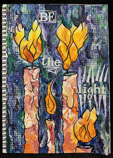
I decided to make another art journal page, again using what I had learned from Donna Downey, but this time I did some extras on the page as well.
The finished page... "Be The Light".
Given the title, I knew before I started what image I wanted. I didn't know exactly how it would look, but I knew it would be some kind of candle.
I started with a background of warm acrylic paints - yellow, orange and red with white gesso. I drew the candles and flames in with charcoal pencil and then coloured the background with a cool palette of acrylic paints - light blue, dark blue, green, teal and purple, together with white gesso.
Once this was all dry I went over the charcoal lines with black Indian Ink, including adding some more detail to the candles for melted wax drips as well as the flames.
I wasn't happy with the colours of the flames, they didn't really look like flames. I added some water soluble oil pastels in white, yellow, mustard, orange, and red. I blended these with my Zig water brush and then my finger to get more the colouring I wanted but without hiding the underlying blending of the acrylic paints.
To darken the background so the "light" would stand out more, I stamped using a Glitz Distress Stamps - grid stamp and black acrylic paint dauber. I stamped by hand rather than using an acrylic block as this allowed me to stamp only in the areas I wanted around the candles and flames, rather than in distinct rectangles.
I added the title using some white glitter alphabets from Making Memories and highlighted these with some white acrylic paint. I was trying to have these quite an opaque white, but when it had dried the underlying colours had tinted the white a little and I do prefer this to the stark white.
Close up of the flames. The underlying striations in the acrylic paint show through really really well, particularly in the bottom of this uppermost flame.
This flames looks considerably brighter with the water soluble oil pastels added than they had looked with just the acrylic paints.
I really like the way that some of the gesso appeared to have a "cracked" paint look in some places, as seen in this close up of one of the candles.
Close up of the grid stamped with the black acrylic paint, using the Glitz Distress Stamp. I also love the way this cool palette looks like paua (abalone) shell, particularly with the black highlighting.
You can see the underlying colours coming through the white "light beams".


No comments:
Post a Comment